Introduction
This week we are live at DataFam Europe in London and we have paired up with Preppin Data to make sure our data is in the best format ready to go for building our visualisation. If you want to take part in the PreppinData challenge, you can find it here.
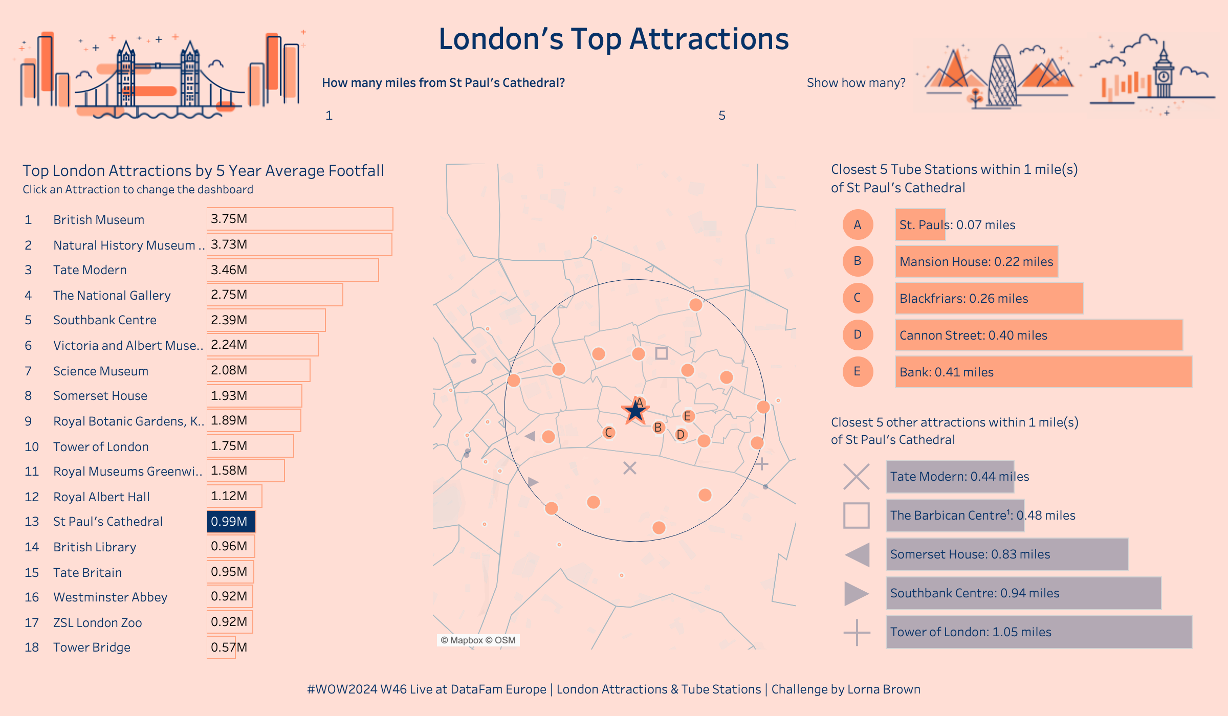
As we are in London, we thought it would be a good time to focus on London's Top Attractions, their popularity, nearest tube stops and other close by attractions. This interactive dashboard will allow you to find an Attraction and the nearest tube stops to help you plan your next adventure.
As it is a live challenge, I am going to break it down into key steps to achieve this dashboard

Requirements
Stage 1 - The Data
- Relate the 3 data sources together, plus add an additional attractions connection
- NOTE: Due to Spatial relationships not being a thing yet, you can just do a relationship calculation of 1 to 1, and the calculations will do the rest
- Also for the other attractions, you don't want the name to equal each other
Stage 2 - The Map
- The map should show a Selected Attraction as a Star
- Tube Stations & Other Attractions within X miles of the Selected Attraction
- Tube Stations & Other Attractions within X * 1.5 miles of Selected Attraction
Stage 3 - The Bar Charts
- Attractions by 5 Year Average Footfall
- Top X Tube Stations & Other Attractions by closest distance
Stage 4 - Putting it together
- Bring all charts onto a dashboard (1200x700)
- Create a Parameter action to enable Main Attraction to be selected
EXTRA
- Create Rank of Tube Stations, Convert to Letters (you may need to +64 within a calculation)
- Only Show Top X Stations & Other Attractions as Letters & Icons on the Map
Dataset
This data set comes from the outputs of the PreppinData Challenge, but can also be found here or https://data.world/missdataviz/wow2024-w46
Images


