A bump chart is a way to examine the rank of what you're analysing over time. In this blog, I'll quickly show you how to build one.
Fields/Data required:
- Date field - as mentioned, what a bump chart does is rank over time. Therefore a date field or some form of time field is required to get insight from a bump chart. The example this blog uses is years as time.
- Measure field
- The dimension field where the field members will be ranked.
Step 1
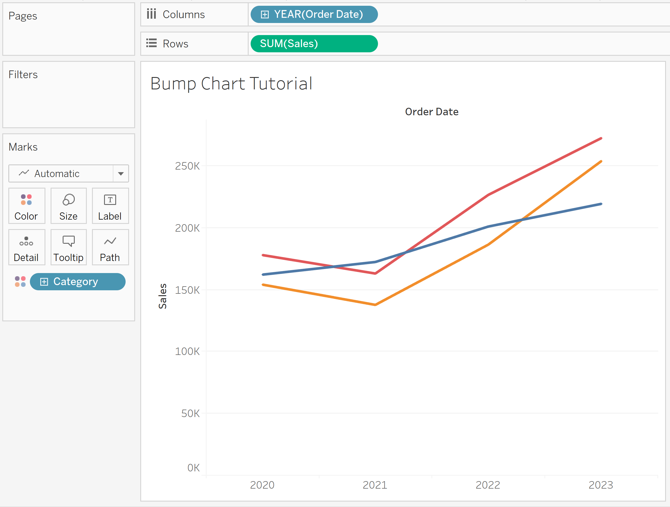
Using Superstore data, drag order date into columns and sales into rows. Then drag category into color.
Step 2
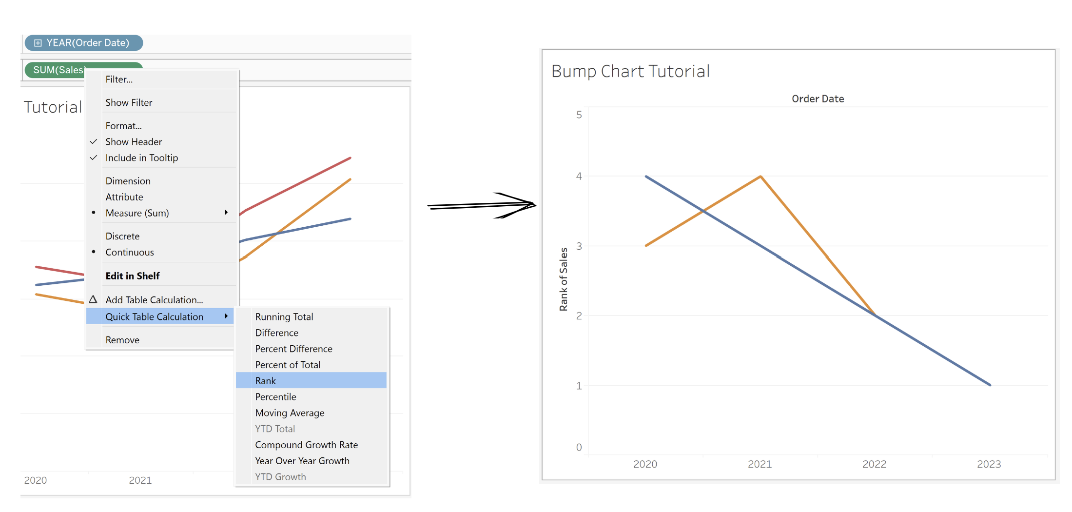
Now, we want to create a rank table calculation by right-clicking sales, quick table calculation, and rank.
Step 3
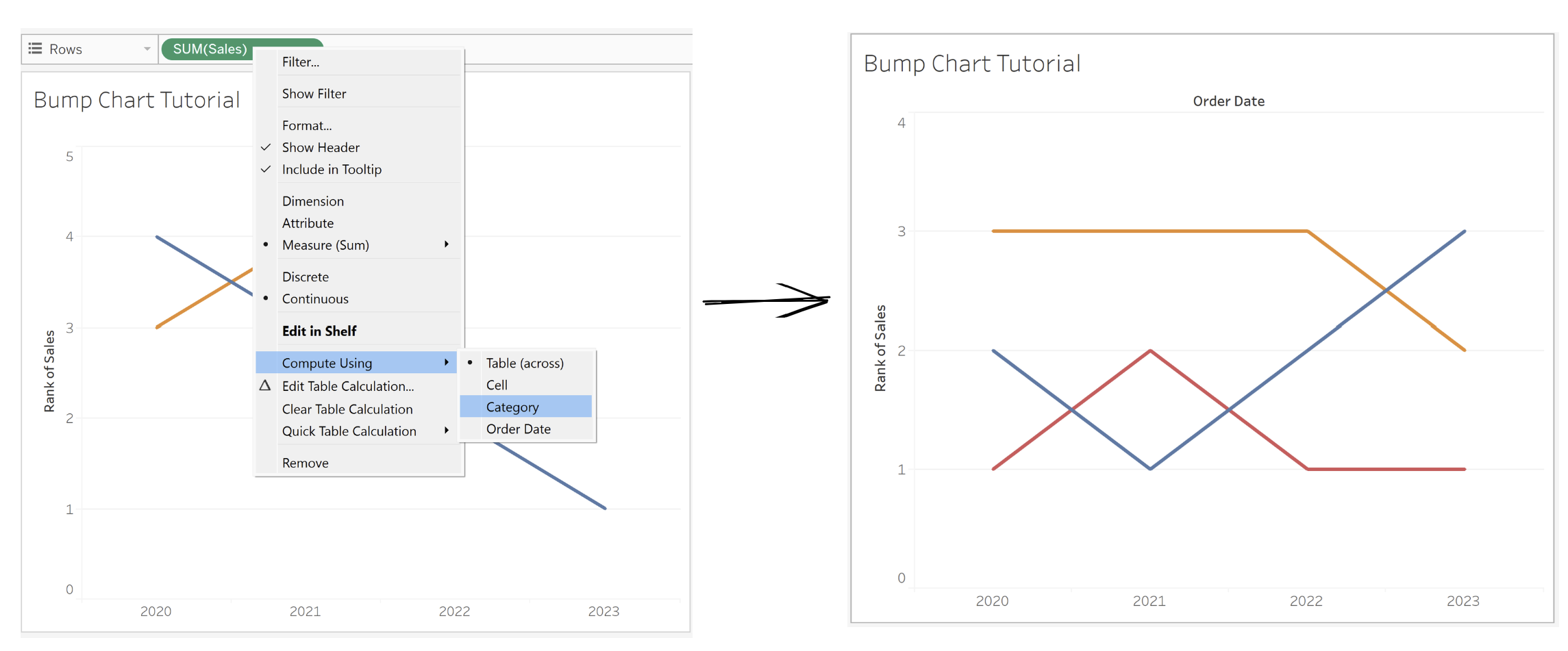
Right click Sales again, and compute using category.
Step 4
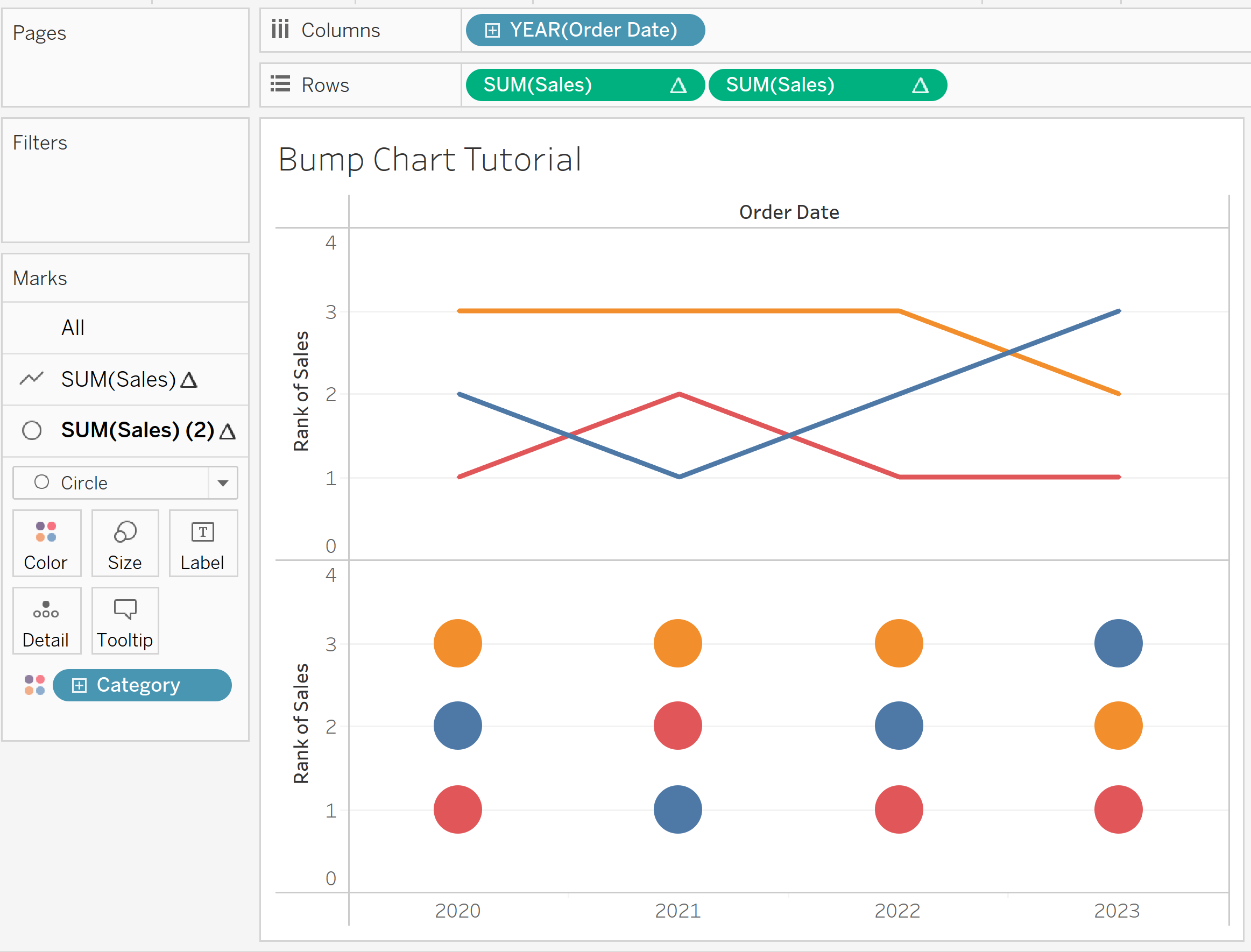
We're almost finished in building the bump chart. Now we simply need to duplicate the sales in rows. Just hold ctrl + drag sales next to sales. This duplicates sales as well as the table calculations we already performed.
Change the second chart marks to circles.
Step 5
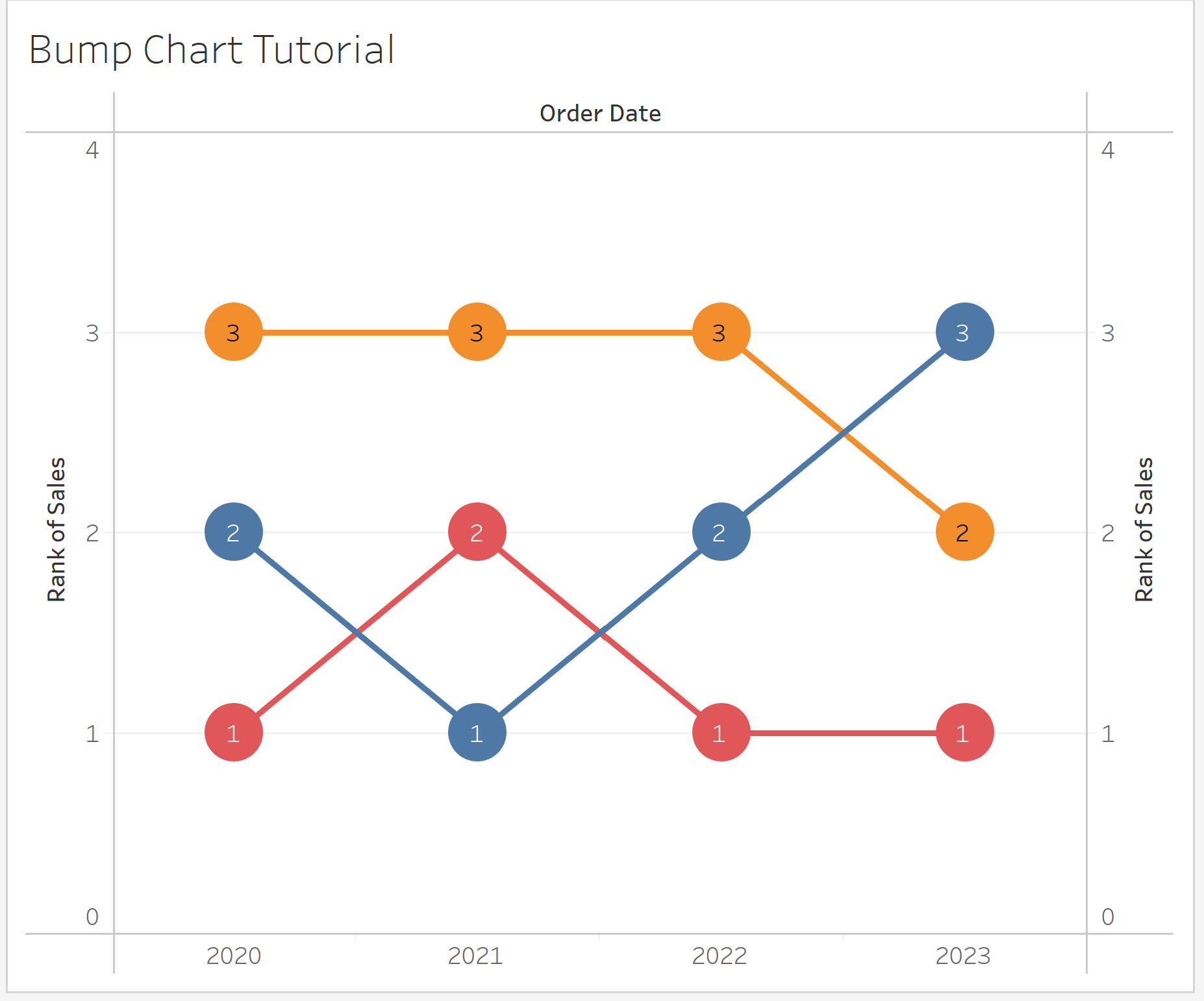
Now dual axis and synchronize axis the charts. You can also show text in the circle chart marks to show the rank.
Step 6
Finally, right-click the rank of sales axis and edit it so that the axis is reversed. This is to put the number 1 at top - i.e. now it goes top to bottom.
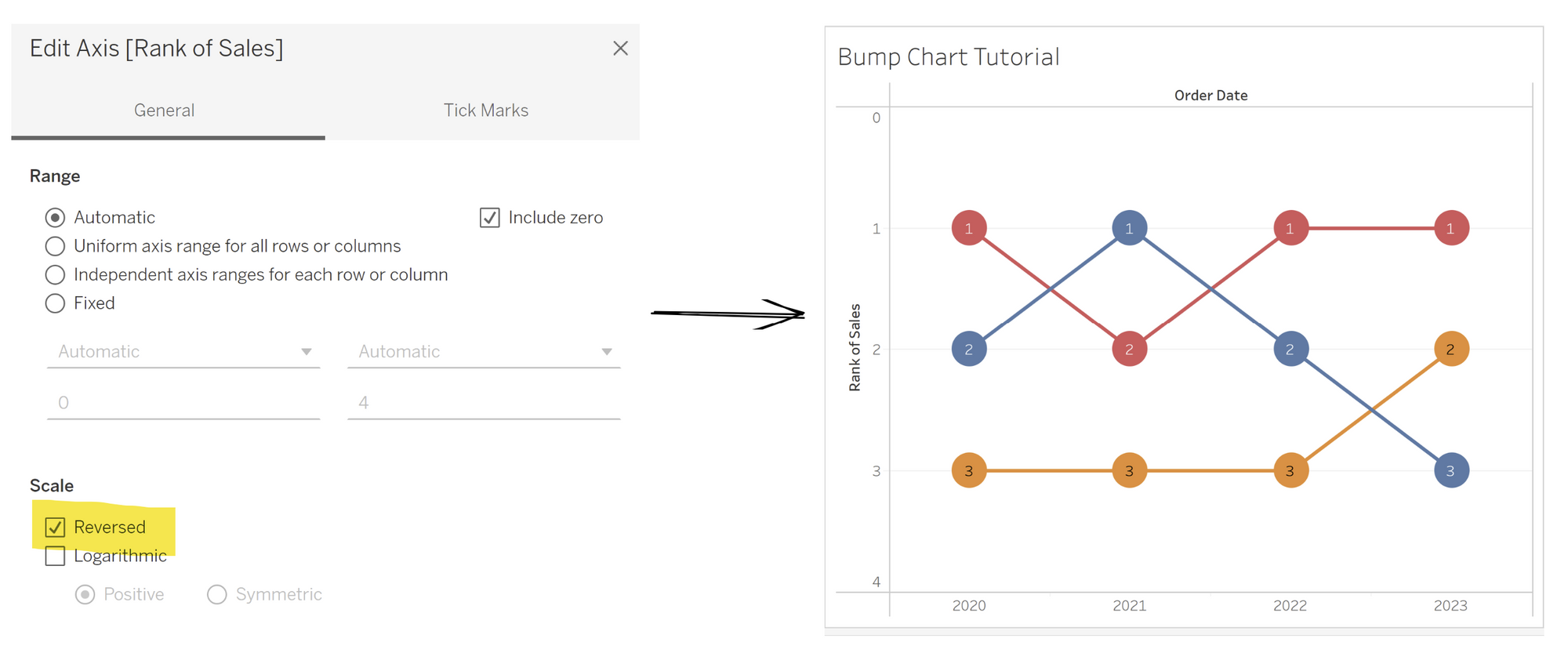
Now our bump chart is complete! You can get rid of the header axis for the rank if you would like as well, since the insights from this bump chart are quite clear.
