


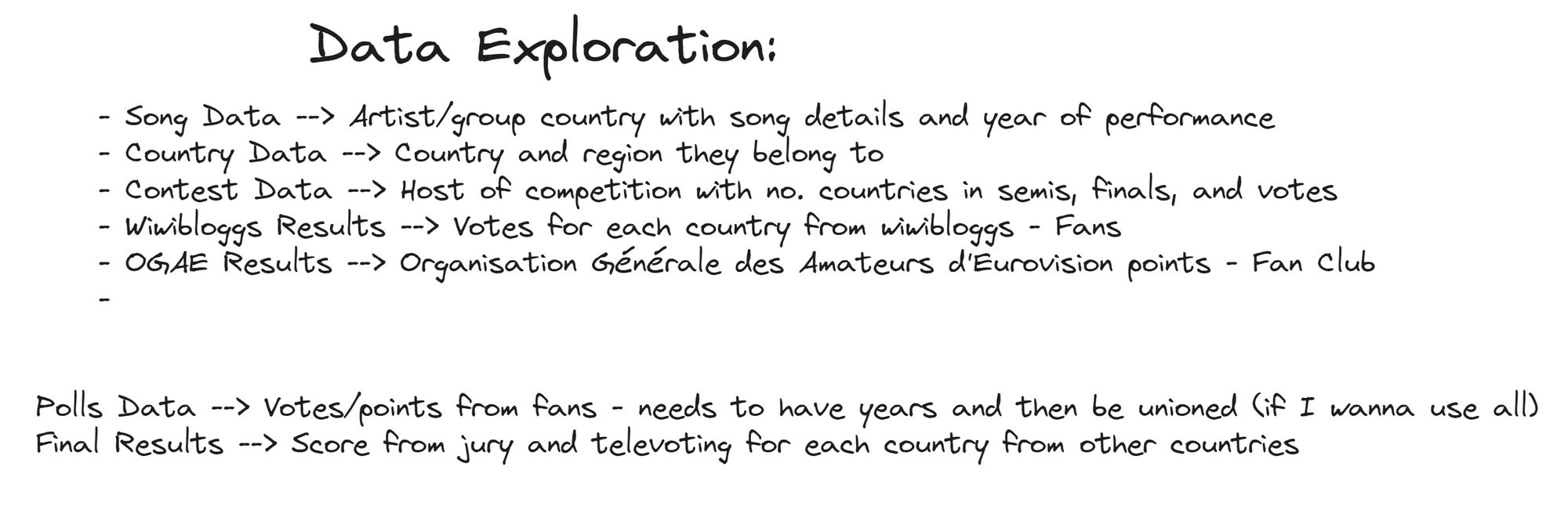
For the penultimate day of dashboard week, we were tasked with building an explanatory dashboard on Power BI with Eurovision data. First things first, was I wanted to data exploration since I wanted to gain an understanding of what I was working with. Here is essentially my thought process with the data exploration:
Since I have little to no knowledge of Eurovision, I needed to do some research to essentially find a question to build my story off of it. With some brainstorming with my colleagues, I was able to have some ideas:
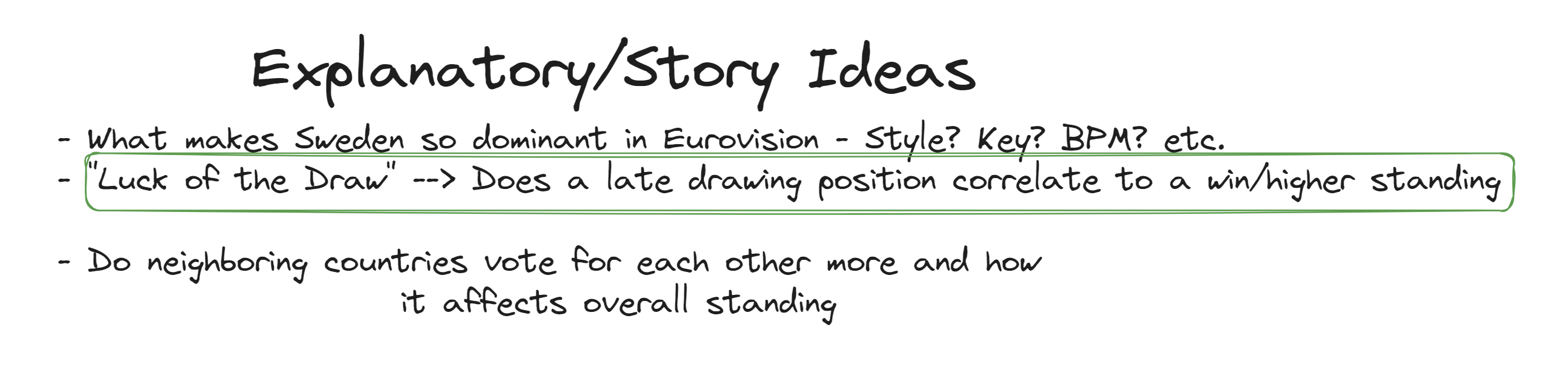
The luck of the draw and neighboring countries were two good ideas I got from the little brainstorming session. After looking more into these ideas/questions online, I decided to go with the luck of the draw idea. After that, I then started sketching out my dashboard (or report if you want to be technical):
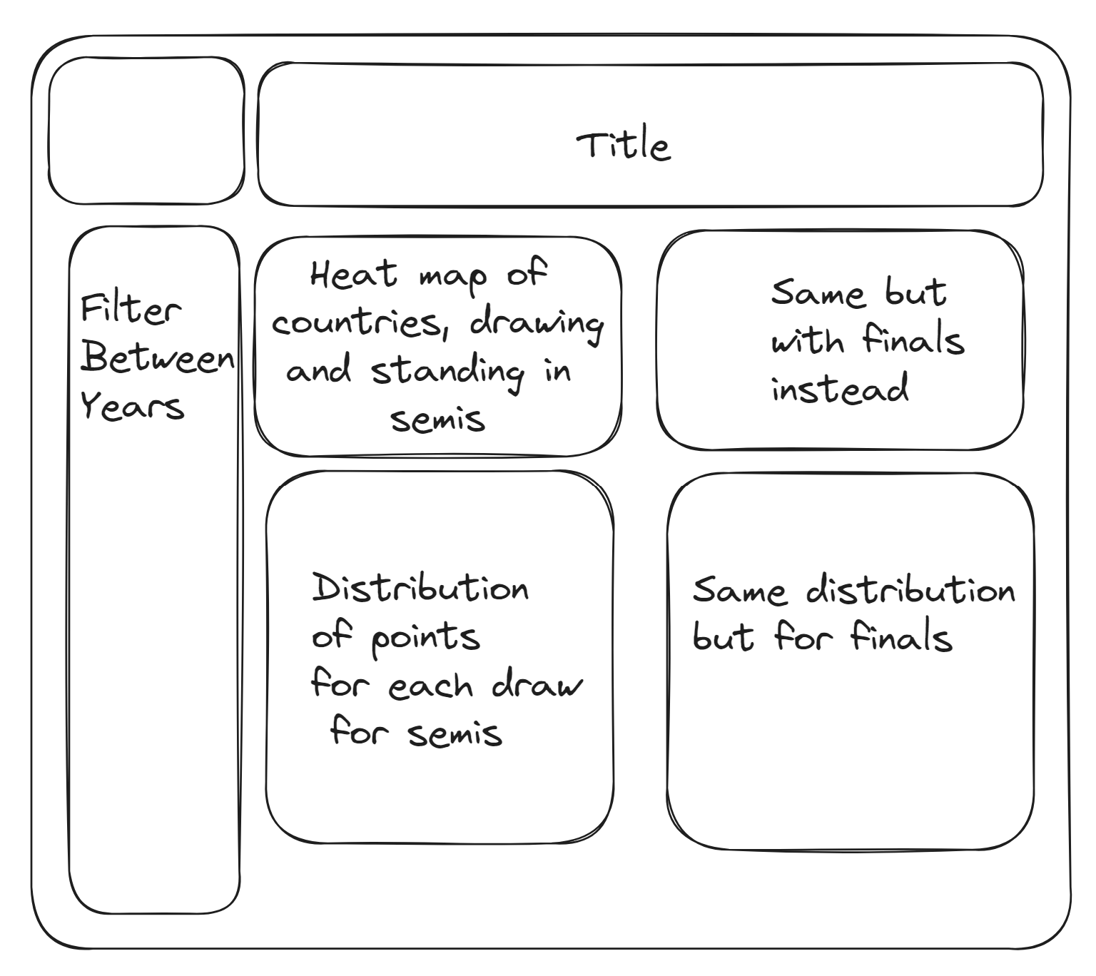
Once I started building charts out on Power BI, I realised a scatter plot would be much better in presenting the correlation between standing and points gained for each country. Here is the finished report below:
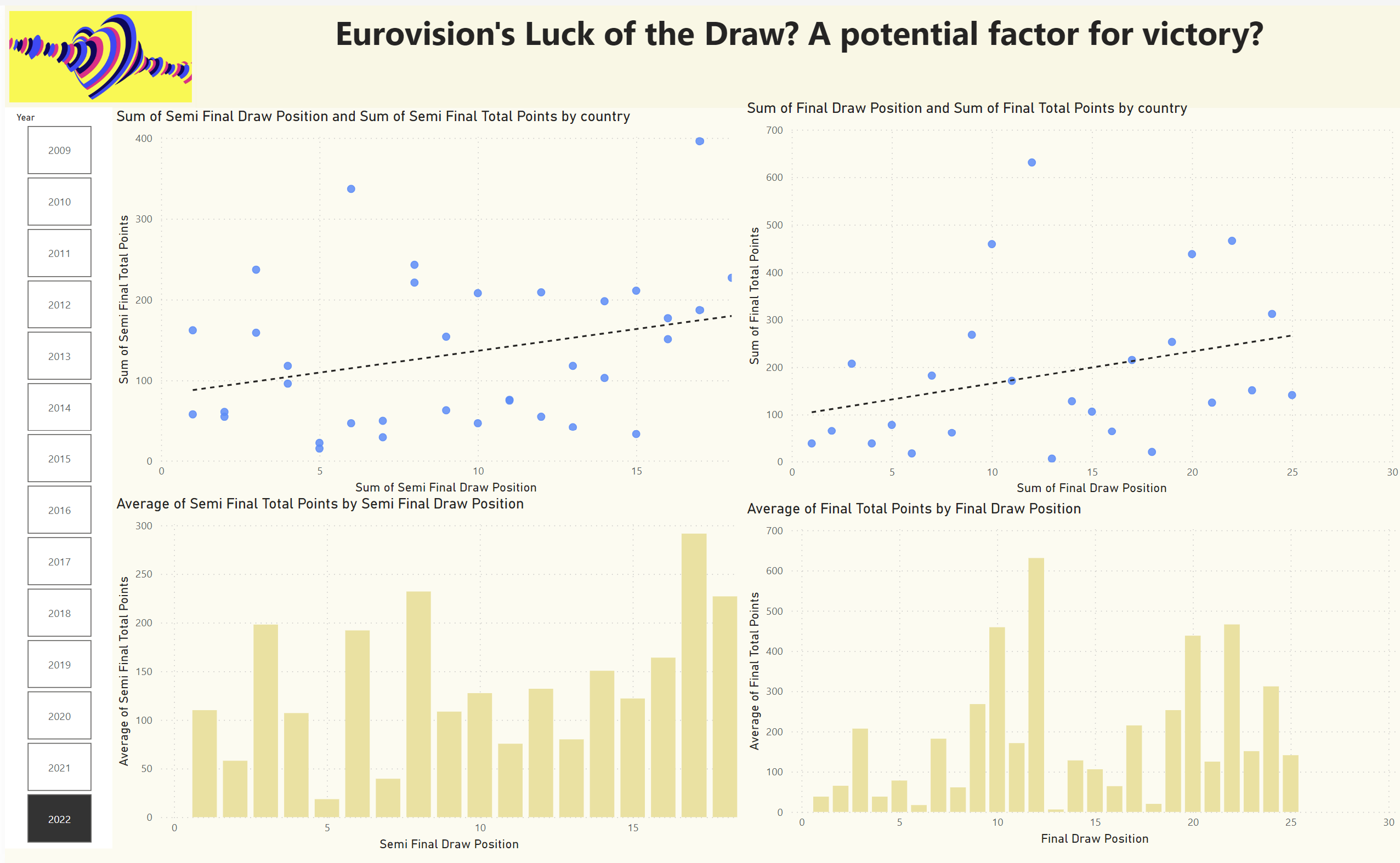
In the last few years, it seems that if you are one of the last performers then there is a good chance of winning the semi-finals. The finals, on the other hand can go either way as some winners are right in the middle of the order or towards the end.
Some formatting needs to be done to tick off the explanatory point as the user will need to click around to find the answer I imposed in the title. Overall, was a good challenge working with Power BI :)