


It's DS39's finale of training kickstarting with us learning about Accessibility. We were required to then present a dashboard based on the topics we learned in pairs. Zak and I were partnered together for our presentation. The context of our accessibility dashboard was re-creating a business dashboard with a user that can only interact with it via keyboard only.
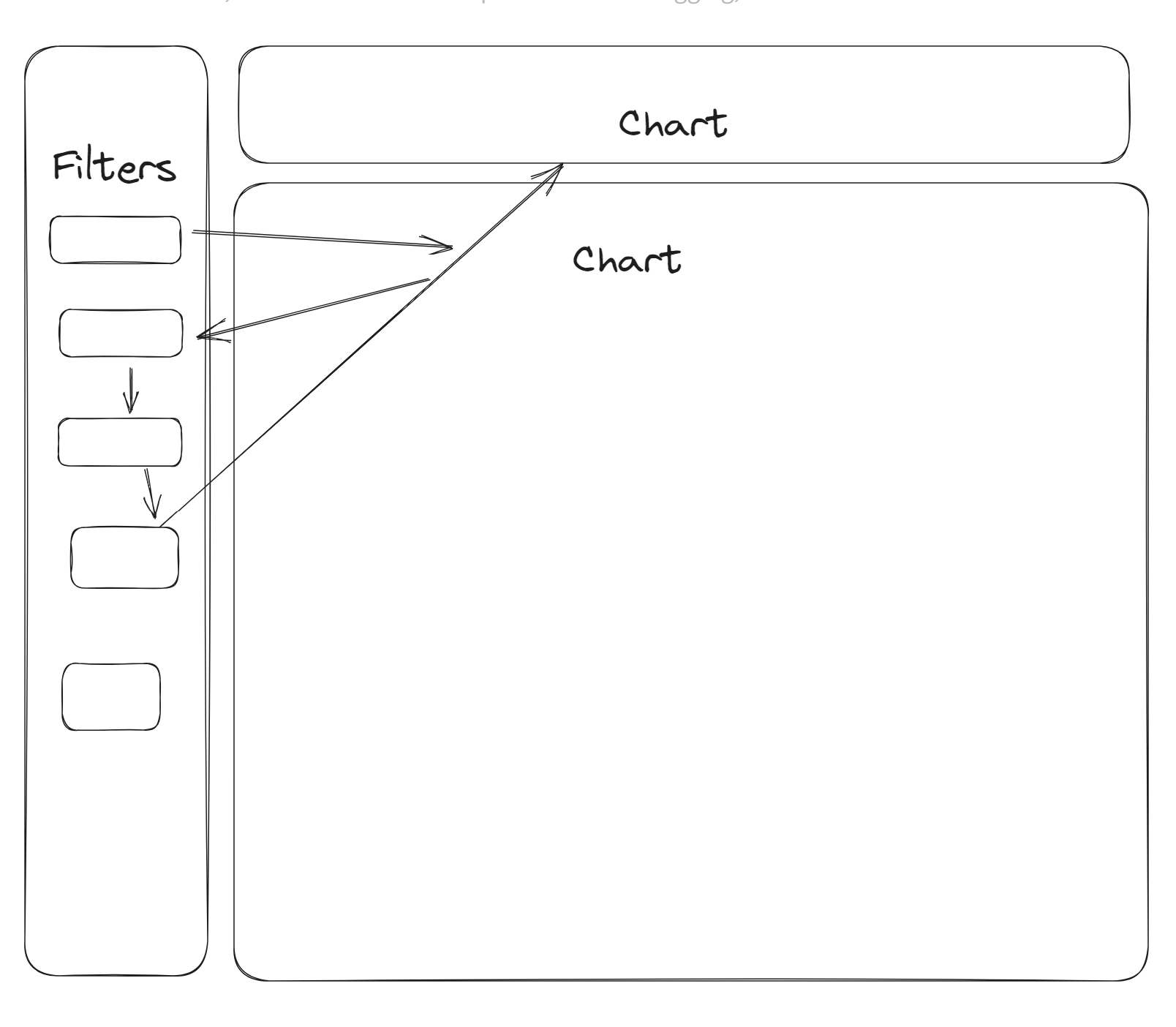
Original Dashboard
Unfortunately, I am not able to share screenshots of the dashboard so I'll talk through some sketches. Essentially a keyboard-only user can only interact with elements of the dashboard through pressing tab. So when interacting with the filters it would tab down to some filters in order but then go on to other elements of the dashboard as shown below:
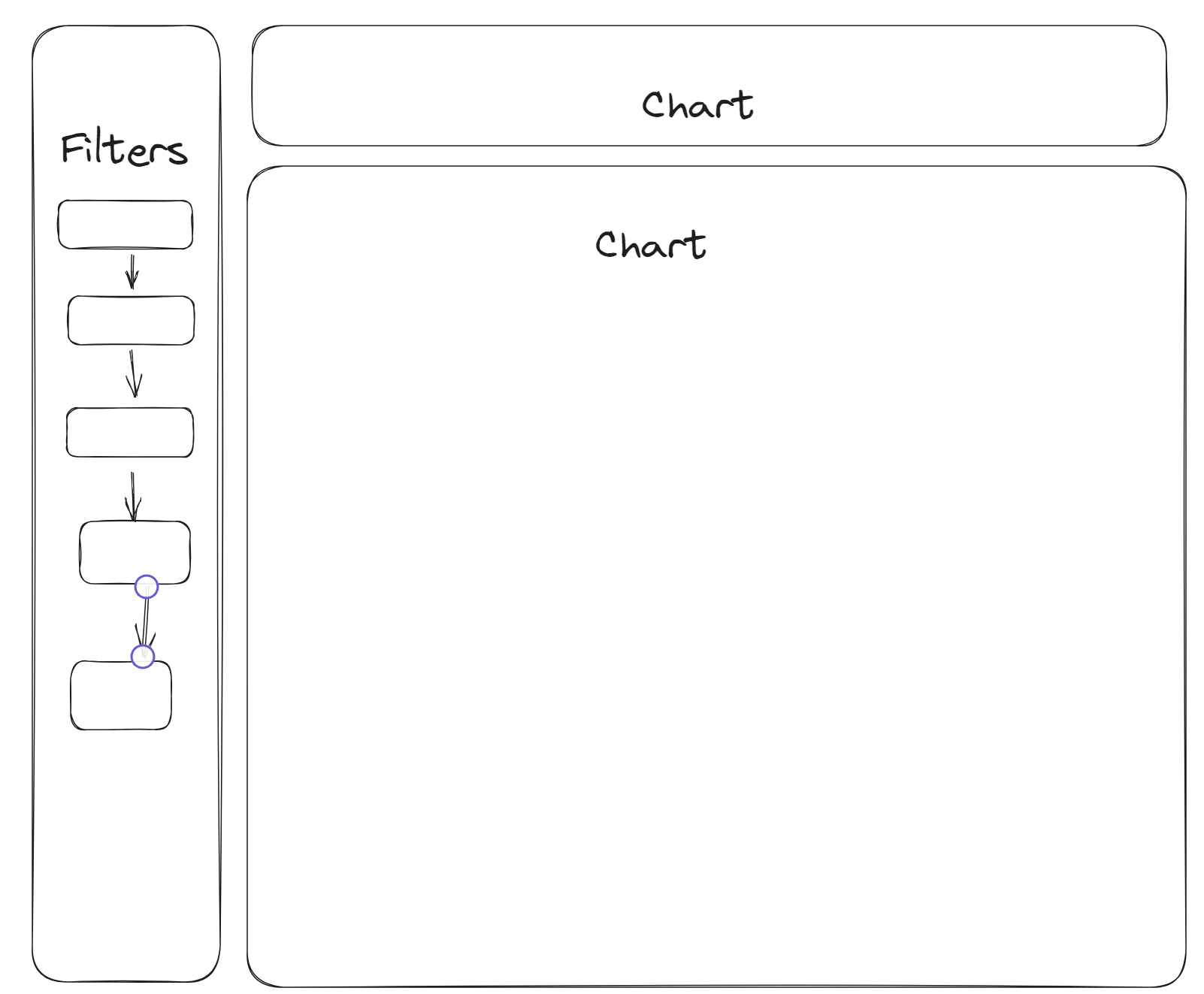
When it should be something like this:
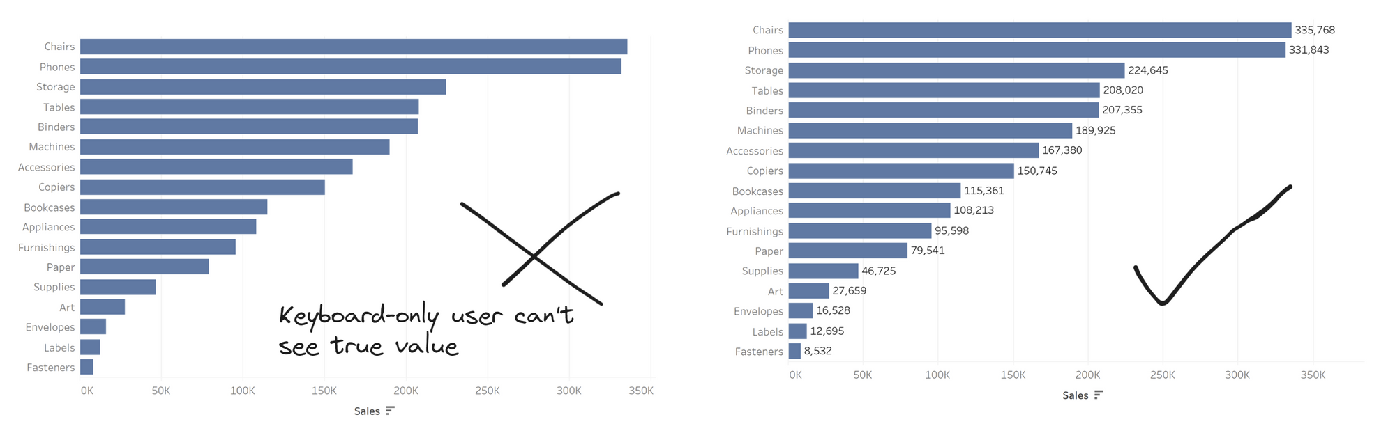
This was something to do with the focus order of Tableau which goes left-right, top-bottom. This is what led to not being to tab linearly through the filters. Another issue was that since this was a keyboard-only user, there was a bar chart with no values on the bar. Normally, someone can hover over the tooltip to find the value of the bar but for someone who can only interact with keyboard only then the value needs to be shown:
The following sketch essentially covers how the dashboard needed to be re-designed for a keyboard-only user that covered other potential issues:
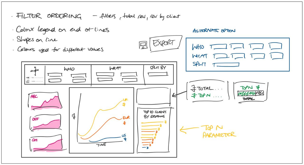
So filters were placed at the top, so that the user can tab through the filters linearly without it going off to other elements of the dashboard. The area KPI's originally had colours that were the same as the line and bar chart, leading to double meaning. So the colour of them were changed to a different/neutral colour. They were also at the top of the original dashboard so they've been moved to be in line with the other charts.
The line charts were also given labels of the latest value, so that the user can see what the latest value of the trend is. Moreover, since the bar chart had a scroll feature since it contained many marks a top N parameter was incorporated. This allowed the keyboard-only user to limit how much they can see within the bar chart. Another chart was placed on top of that bar chart which showed the proportion of the top N compared to the total.
Unfortunately, there were some issues with uploading to tableau server since the keyboard-only functionalities only applied to tableau cloud or server. Therefore, we were unable to test/demo our completed dashboard.
Overall, it was very useful and insightful to learn about accessibility and how it can impact a wider audience that will potentially interact with the dashboards and visualisations we produce.