Last week, for our Friday project we were tasked with revising our original application viz. We had to critique our originals with what was good about it/worked and what didn't and then make a list of improvements to it and implement it. This was a perfect task for us considering throughout that week we had spent learning about data visualization best practice.
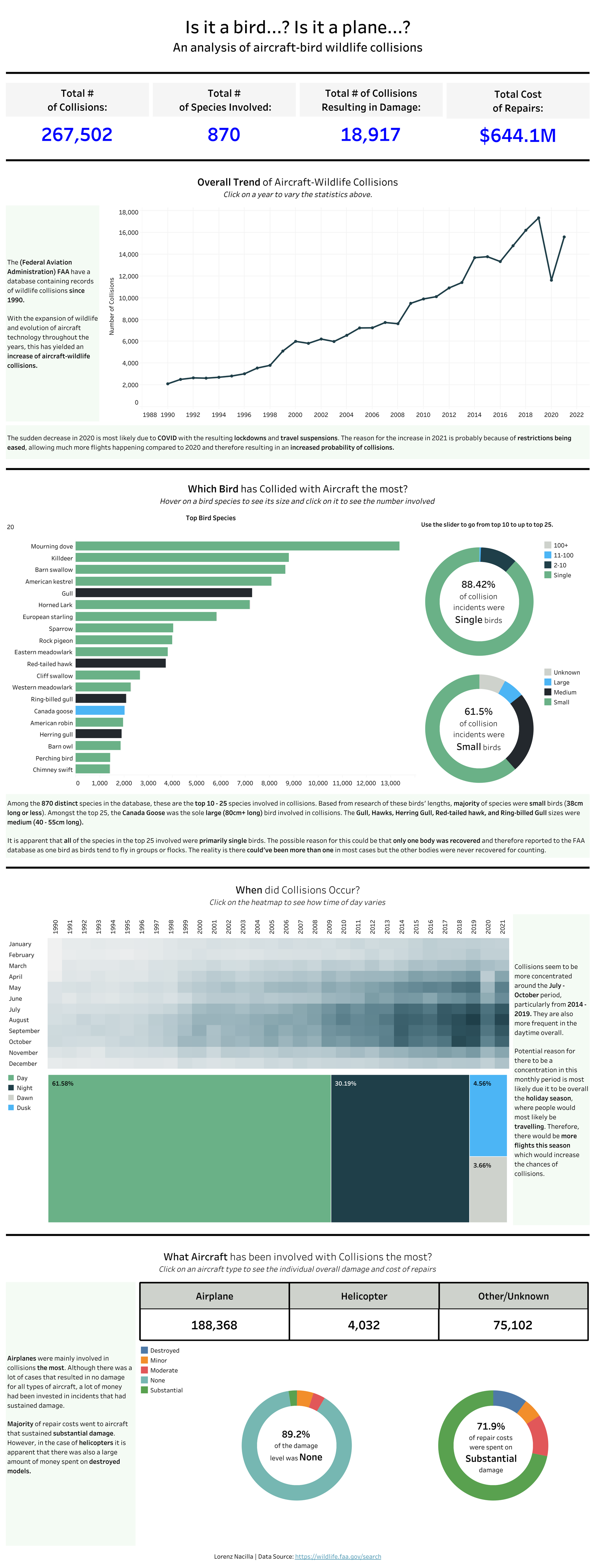
For context, my application viz was on aircraft-wildlife collisions using the Federation Aviation Administration's (FAA) public database. This is my original viz as shown below along with the link as the actual viz has some interactivity.

What worked:
- It was quite an extensive database, so I picked out certain fields I wanted to explore as shown by the KPI's at the top. These KPI's form the foundation of the viz and tell the user what is going to be explored.
- For each question/section, there is interactivity for the user to explore with the data.
- Overall, it is quite a simple and clean design.
What didn't work and Improvements:
- Whilst the title tells the user that it is an analysis dashboard, I could've highlighted that it is an exploratory dashboard in the title as well.
- No legend for the bird species bar chart - Assumed the user would use the same legend with the bottom donut chart in that section. That same donut chart adds nothing to that section.
- Aircraft type section at the bottom has the KPI's as tables when it could be formatted better. Donut charts are also hard to read so chart type should be changed.
- Even though it is a simple and clean design, it is quite 'bland' and some formatting could be done to make it more eye-catching and appealing.
Revised Version
Here is my revised viz.

What's New?
- Using tableau magic I created a color palette using the FAA logo. Essentially it's just a blue theme for a majority for the dashboard. Blue border on the left to add some pop to the overall dashboard.
- The FAA logo has been placed at the top corner as a reference to where the dataset is from and some context to the dashboard.
- Images have been placed for the top KPI's and KPI's for aircraft type at the bottom to draw more attention.
- In the bird species section, the donut chart for size has been removed as it added nothing. The donut chart for quantity of birds has been made into a drill down into the bird species bar chart.
- Donut charts for aircraft type has been changed into bar charts instead allowing for the user to understand the data more easily.
Overall, having learnt about tableau best practices has allowed me to improve my original viz quite a bit.
