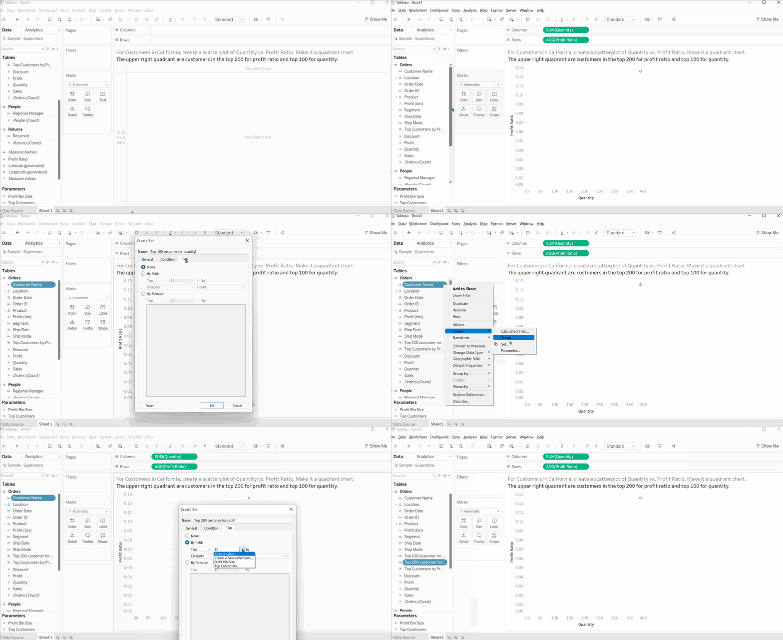
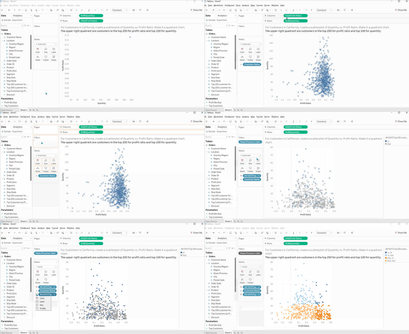
Requirement: For Customers in California, create a scatterplot of Quantity vs. Profit Ratio. Make it a quadrant chart.
The upper right quadrant are customers in the top 200 for profit ratio and top 100 for quantity.
The solutions will be shown below:


Hopefully this blog is helpful:)
