


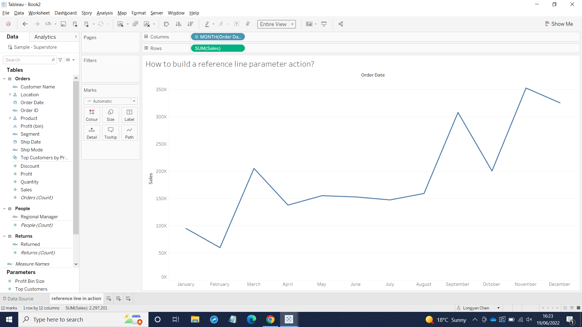
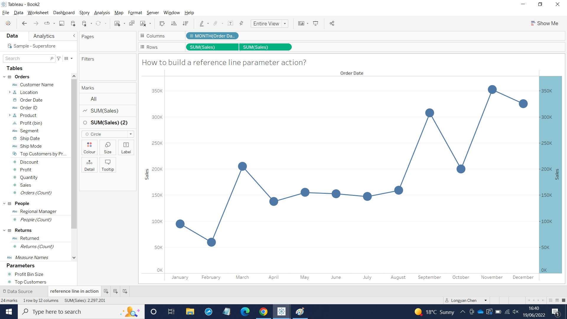
1, I would like to see how sales perform over time, so I right clicked Order Date to Column and I chose discrete Month. Then, I dragged Sales into Row. The graph appeared as below:
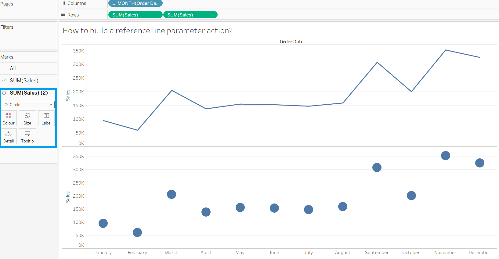
2, I would like to show dots in each Month, so I dragged Sales into the Row once again. I also changed the second Sales line to Circle.
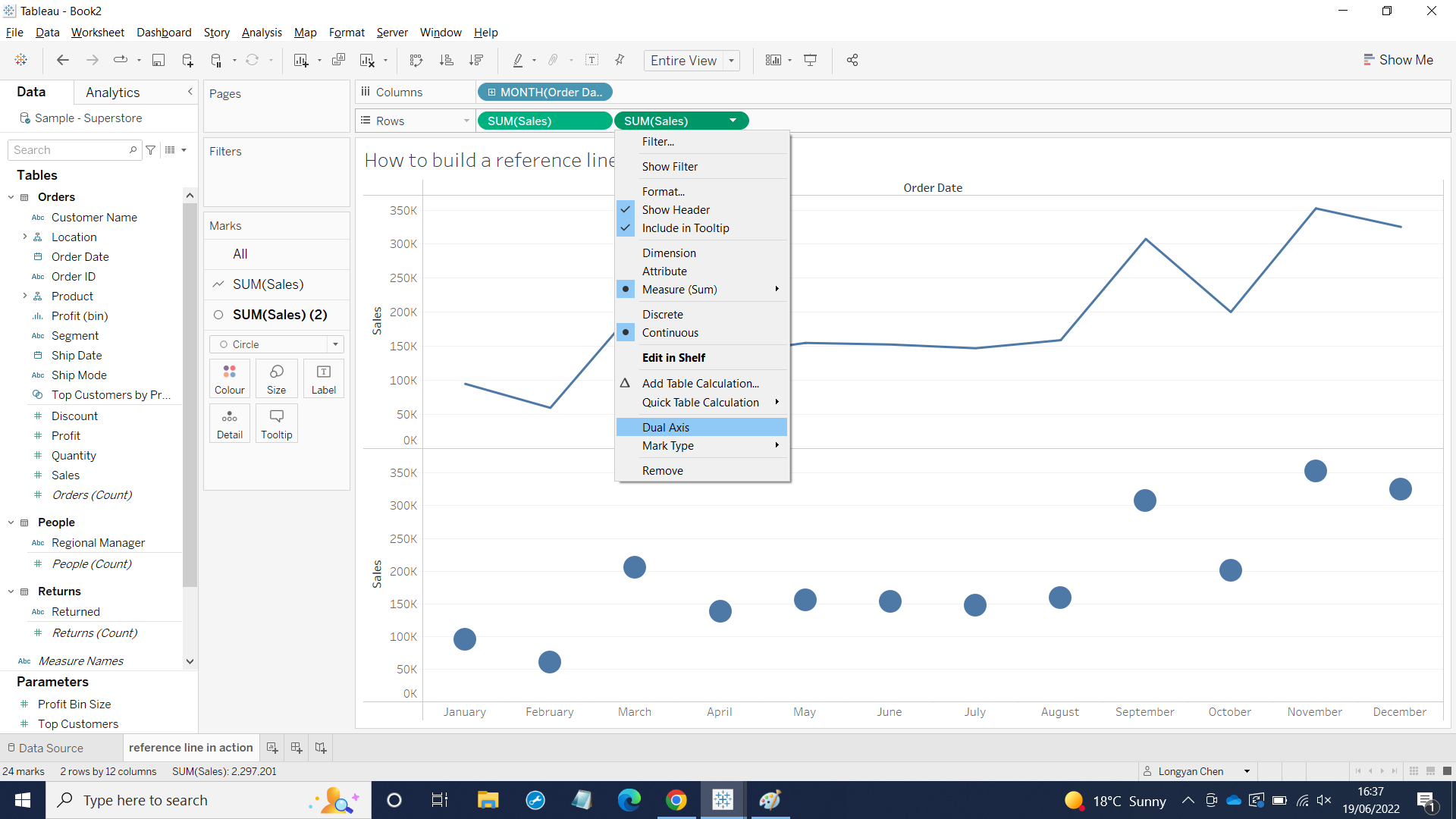
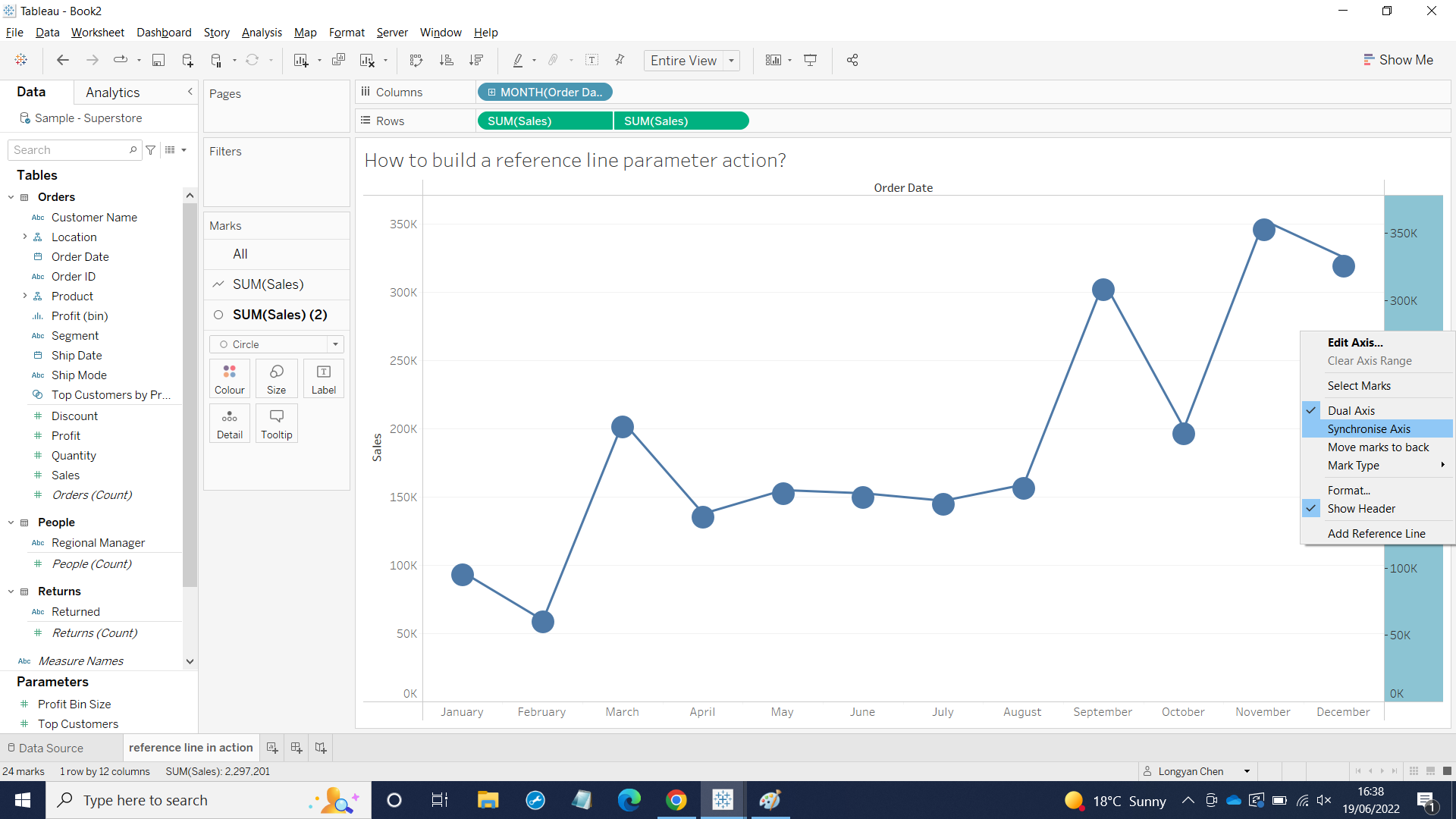
Next, I clicked the drop down menu from Sales and chose dual Axis and right clicked Sales on the right hand side then, I Synchronized Axis.
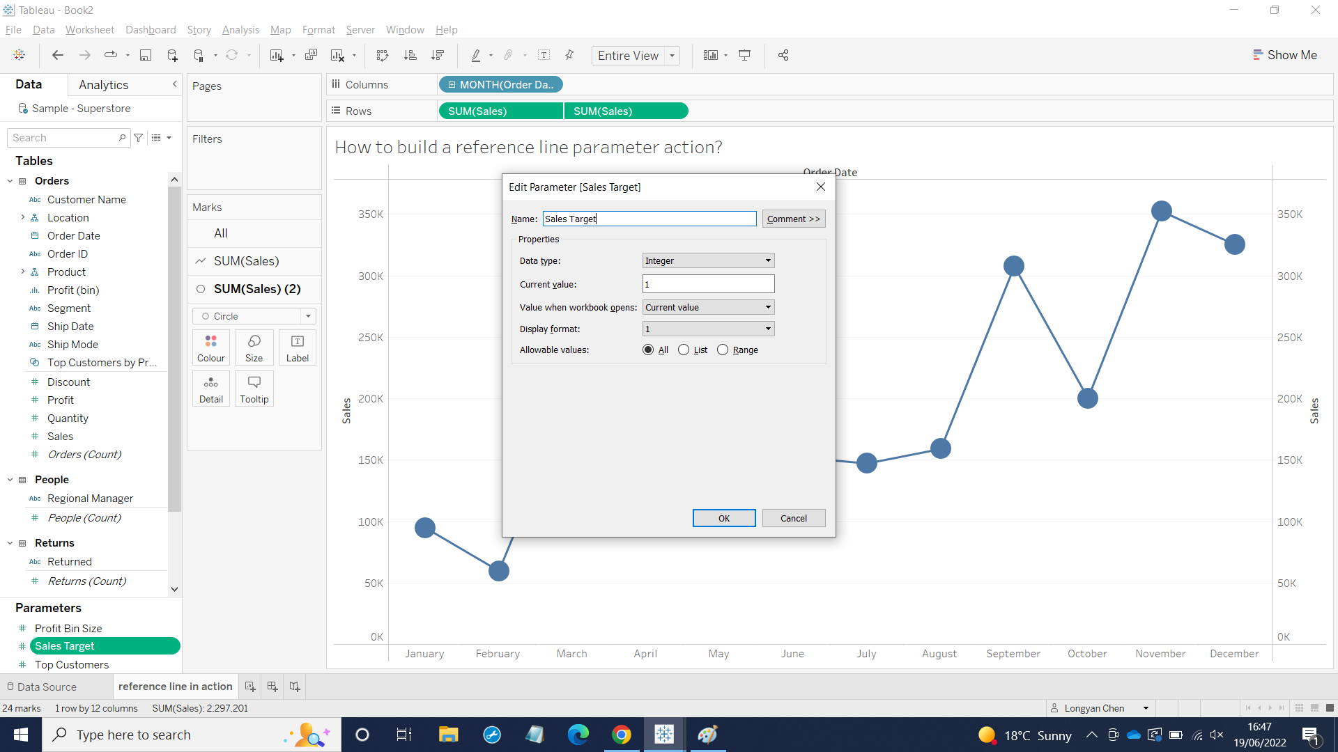
3, I would like to create a parameter named Sales Target and if the months above or below the target, those months will show different colors.
I clicked the drop down menu on the Data Pane that next to Filter icon and chose Create a parameter and then chose the data type Integer and Current value. After that, I clicked on Sales Target on underneath Parameter on the Data Pane to Show Parameter.
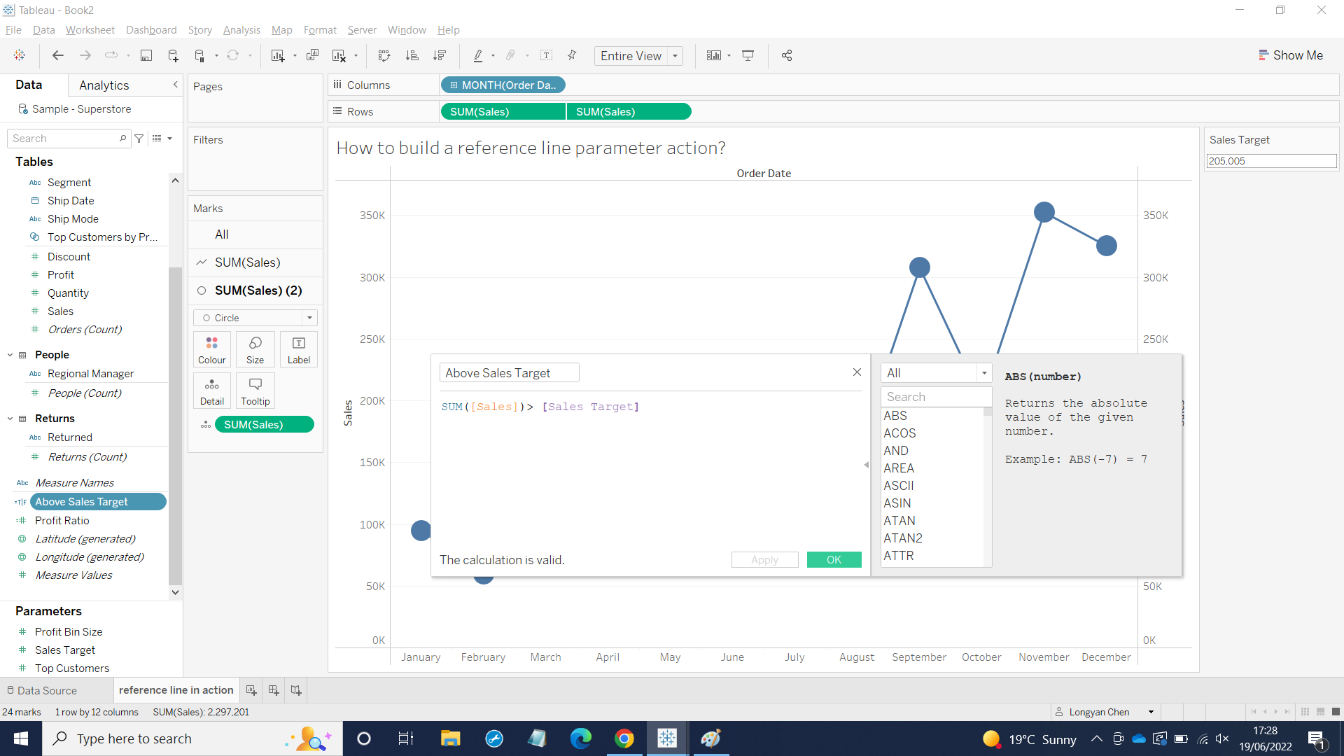
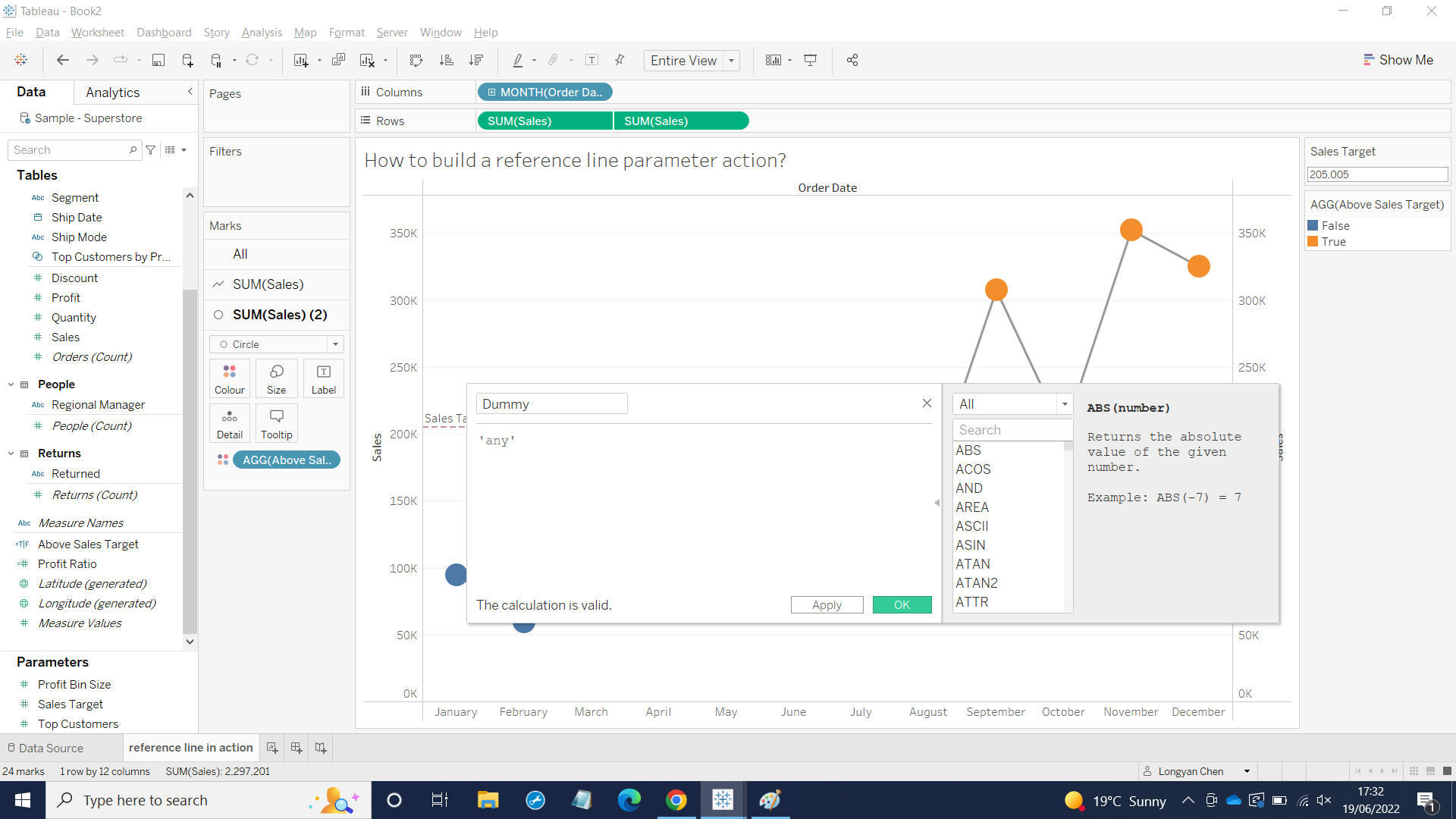
4, I would like to see if Months above the Sales Target show different colors, thus I created a calculation field as below:
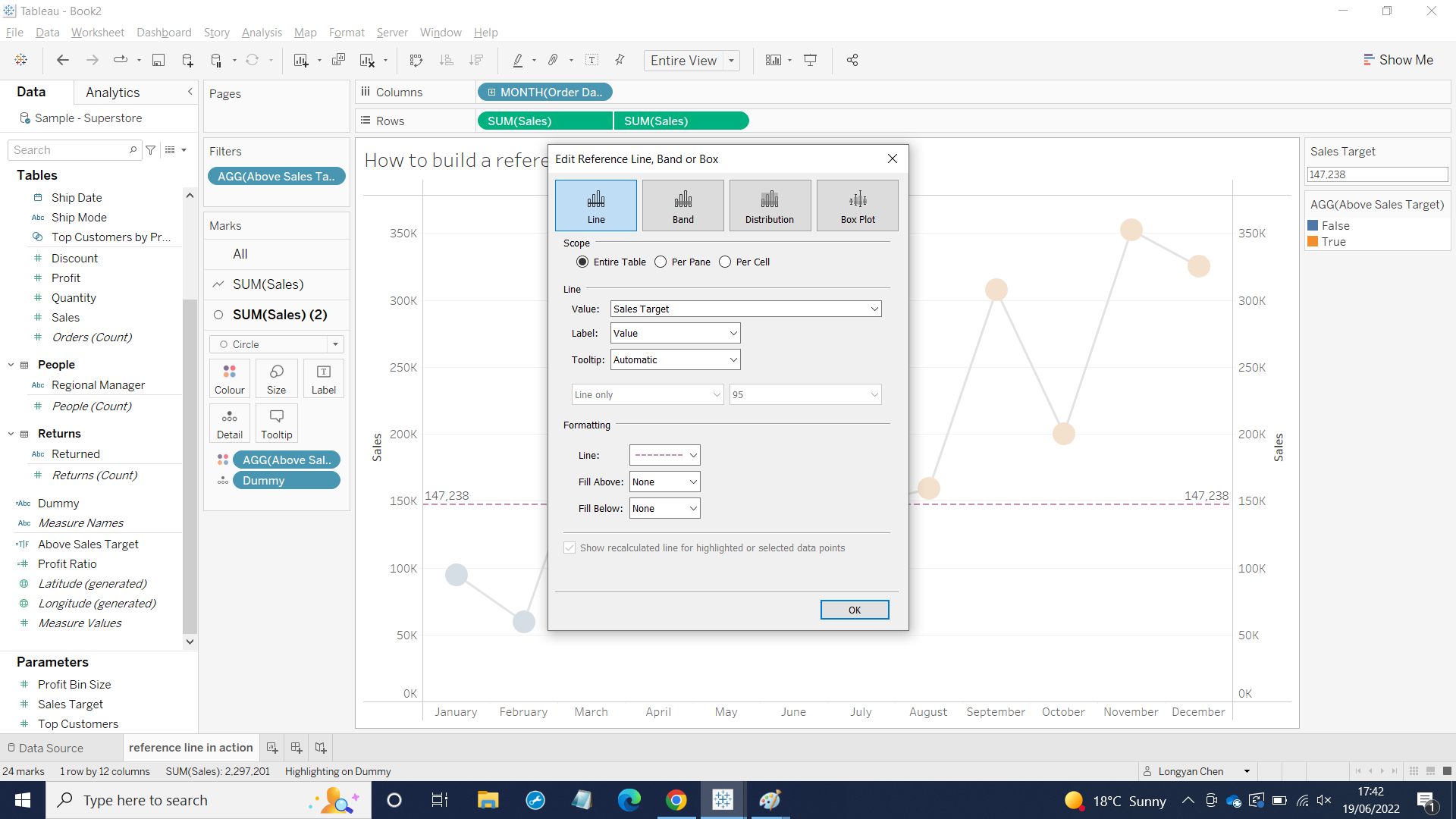
Then I clicked Analytics Pane to drag the reference line into the worksheet. I filled the blank by choose value from drop down menu.
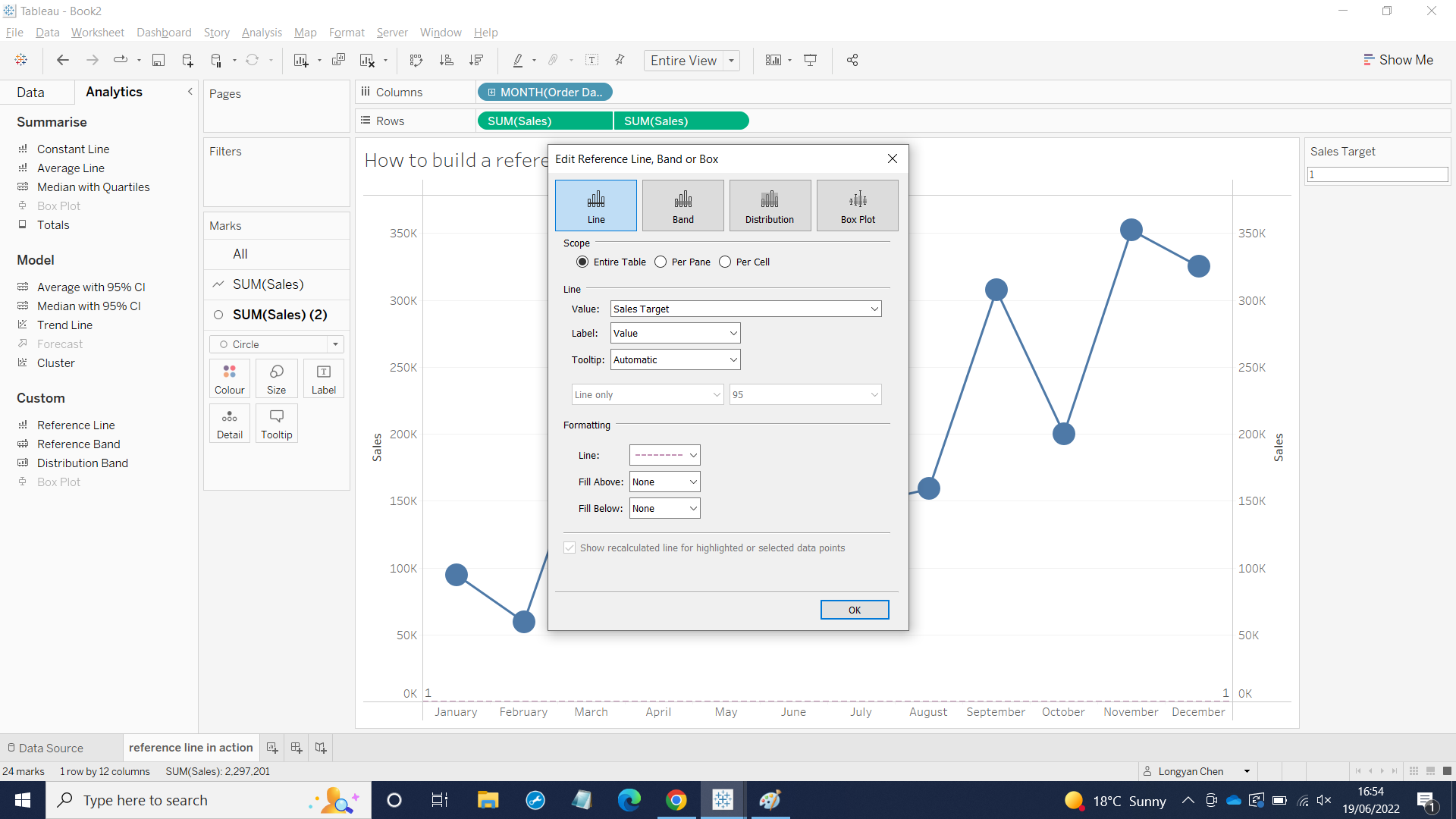
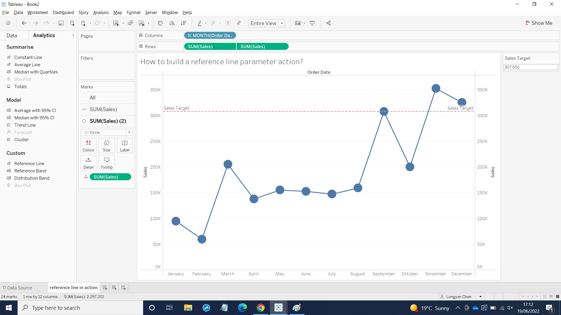
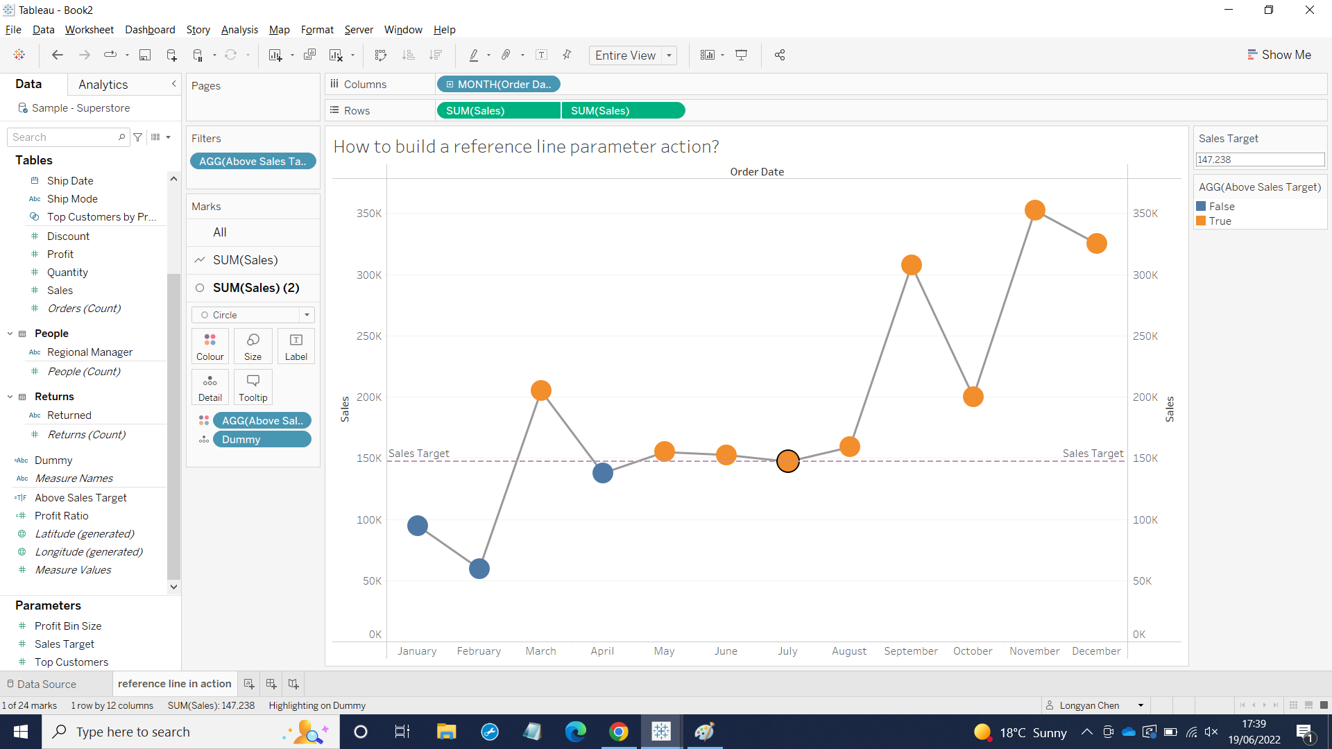
As you can see from the picture the reference line is on the bottom, but I want to show the line is in the middle of the sheet if I click a dot. So I set action for Sales Target - the parameter.
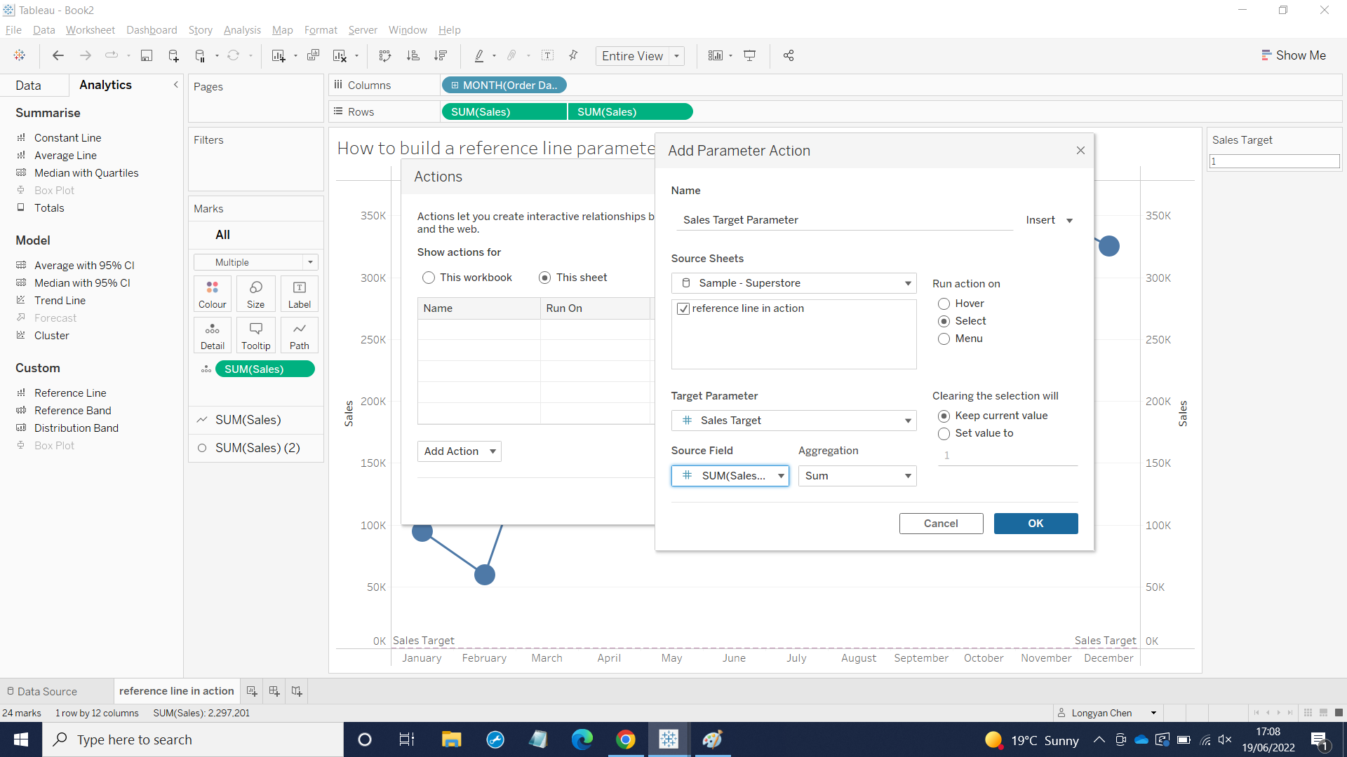
First I clicked Worksheet and chose Actions and clicked This sheet and other values like above and then clicked OK on both pages. Now I clicked one of the dot the reference line showed as below:
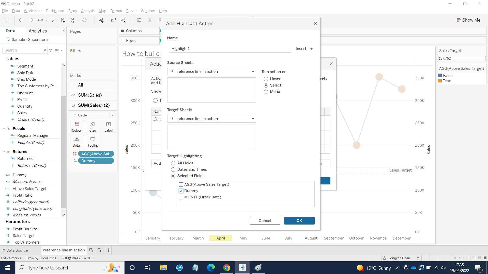
I wanted to see different colors when Sales above or blow the Sales target not grey out the rest of the Months and dragged Above Sales Target into ALL and SUM(Sales)2. I also created dummy in Calculation field.
I also highlighted the dummy by using Actions and dragged dummy into details in All on the View Cards.
I wanted to show value in reference line so I edited.
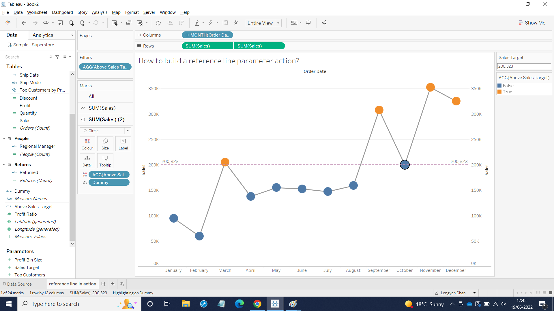
Now everything is done.