


Today's task is to build an accessibility dashboard based on FixMyStreet Pothole data in Glasgow. For those who don't know accessibility, I did google for the definition as blow:
Accessibility is the practice of making information, activities, and/or environments sensible, meaningful, and usable for as many people as possible. A common example of accessibility that we have all likely encountered, is in the context of architectural design.
The requirement:
My plan was to design a dashboard for those who have difficulty in colors. So I tried to keep things as simple as possible. This is how it looks at the end:
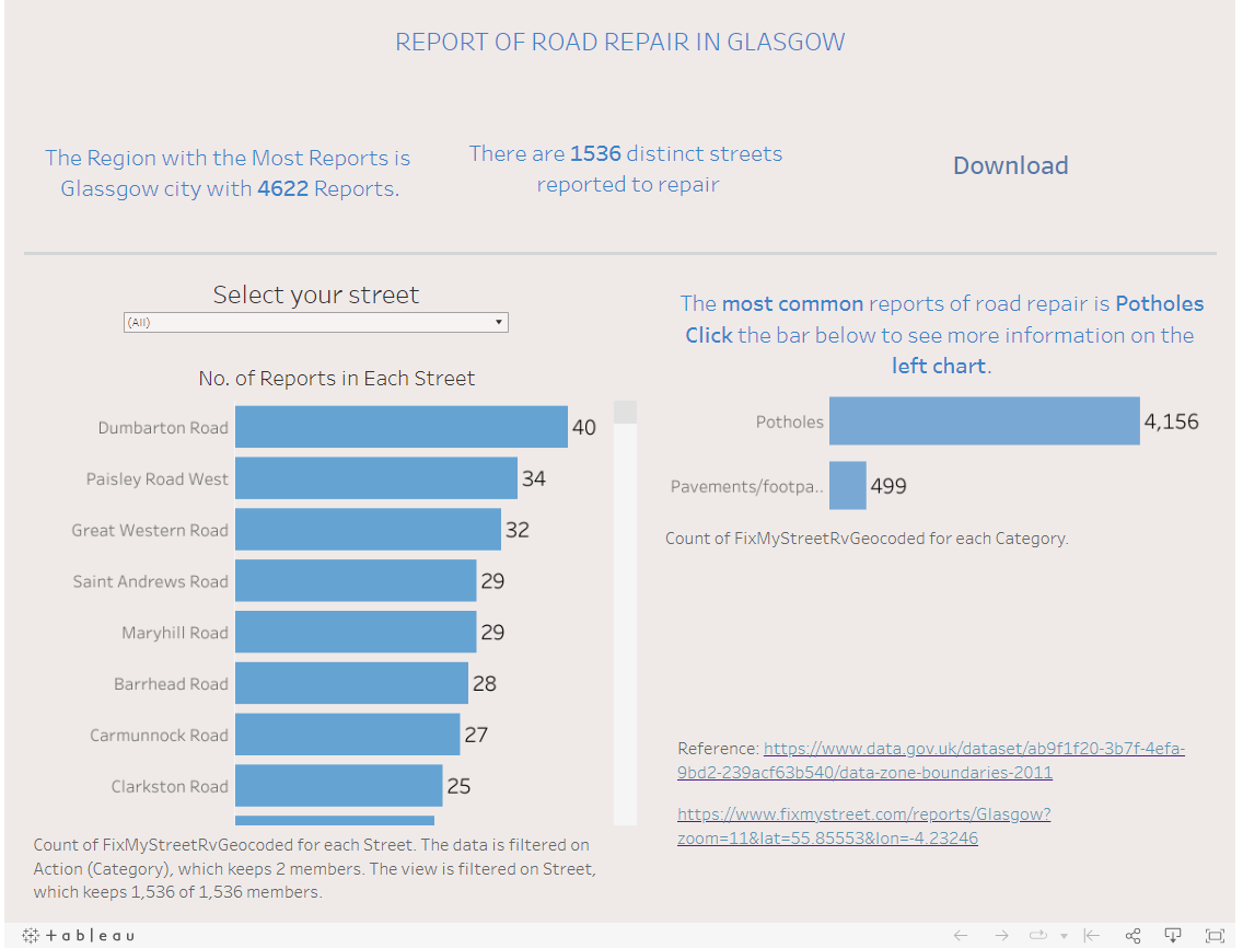
Implements: I only used two different colors for this dashboard. I tried to keep it as clean as possible. The Auto-captions were included and edited to give a better descriptions of what was seen in the charts. I have downloaded color orcle to check the colors on my dashboard as well to see if the colors suit for the users.
Overall, this is a really good experience to me. During the whole time of doing research on this topic, I learned so many things that I have not known before.