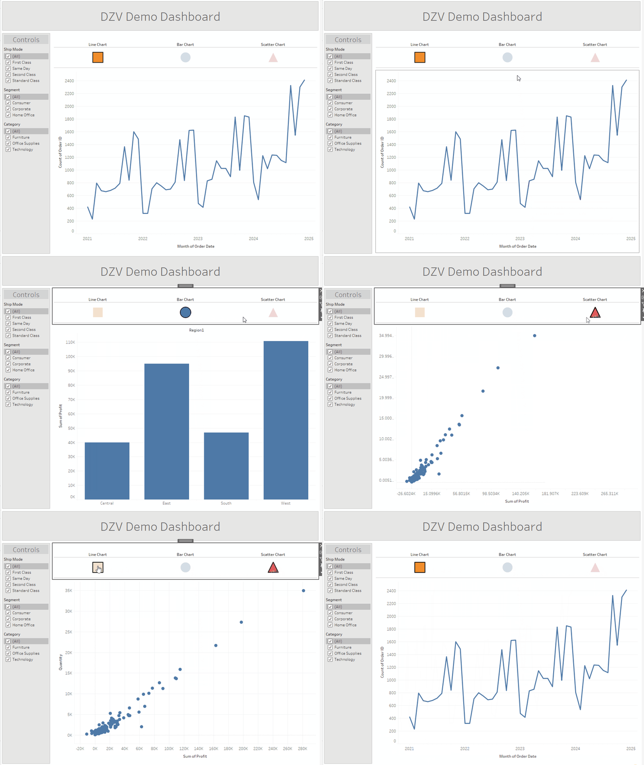
Pre- and Post- V 2022.3
Often, one will find themselves trying to cram a lot of information into not a lot of space. Maybe the client really wants every single chart in one dashboard. Maybe you are limited to a very small resolution. Rejoice! Tableau has heard your cries, and offered a solution. In 2022, Dynamic Zone Visibility was introduced, allowing a user to swap between different views in one dashboard without using tabs or other clunky tricks. As a DZV addict, I'll lay out the simplest way to get the most out of this new tool - as well as how to get by without it in situations where you are forced to work with an older version of Tableau.
Example Setup
For the purposes of this demo, I have created a workbook with three charts that have 2 filters apiece. For ease of distinguishing between them, they are very simply titled Line, Bar, and Scatter Chart. There are three filter types - for Ship Mode, Segment, and Category, and each is present in two charts. That is, no one filter is present on ALL the charts. The dashboard has a title and a simple side bar for the controls fixed in place.
V 2022.3 +
First, you will have to decide how many views you need. This can be changed later if needed, don't worry. Create a string parameter with a list of values. Populate said list with the different views you need.
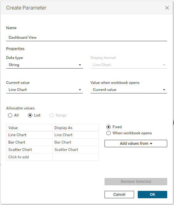
Once you have these parameters, you are going to create a set of simple boolean calculations. You will need one for each unique configuration of displays. To start, let's make one for each chart.
![A set of three calculated fields, each populated with a boolean calculation in the format of the parameter, [Dashboard View], equal to "Line Chart", "Bar Chart", and "Scatter Chart".](https://www.thedataschool.co.uk/content/images/2024/09/dzv-calcs.png)
Now, all that's left is to bring your charts into the dashboard. To start, drop all three in at the same time. When bringing charts with filters into the view, Tableau has a bad habit of stuffing them into a random tiled container behind all your other elements.
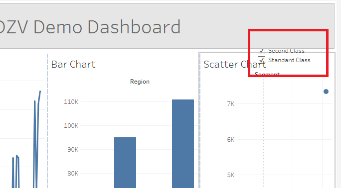
You can easily free them by navigating to this mysterious tiled item in your hierarchy on the left. You can either delete it entirely or just drag it to a more convenient place.
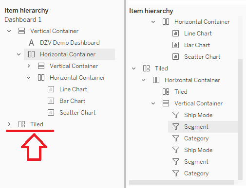
For this exercise, I will move them all to the Control sidebar. Behold, our beautiful dashboard!
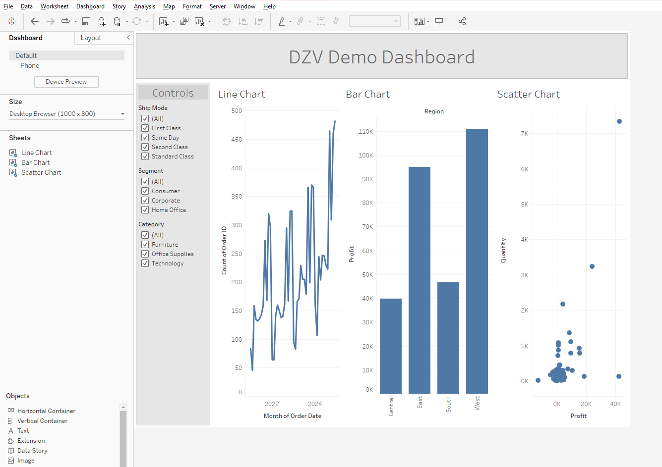
Now, I will admit it's a little cramped right now. But that's what DZV is for! Select a chart, and then navigate to the layout tab in the upper left. At the very top of the menu will be three checkboxes, the third of which will be "Control visibility using value". Check this box.
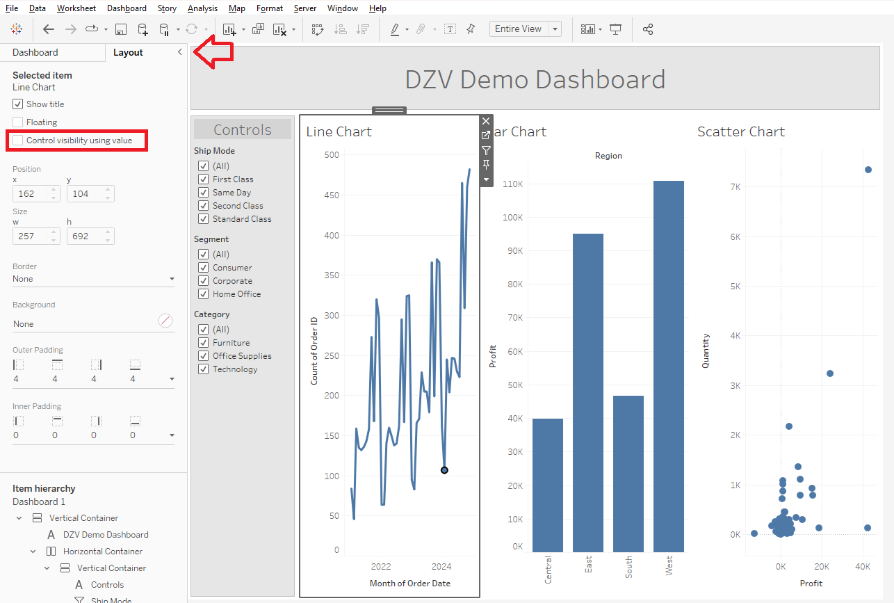
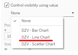
When you do, a drop down menu will pop up with all the DZV calculations we've made so far. In a proper workbook, you will find ALL the parameter-based boolean calculations you've made here, so it's a good idea to include DZV somewhere in the name of the relevant ones to make it easier on yourself. Since I selected the Line Chart, I will, naturally, select Line Chart DZV calculation to go with it.
Repeat this for every other chart. As you do, you will find all but one of them will immediately disappear, until you are left with a view like this.
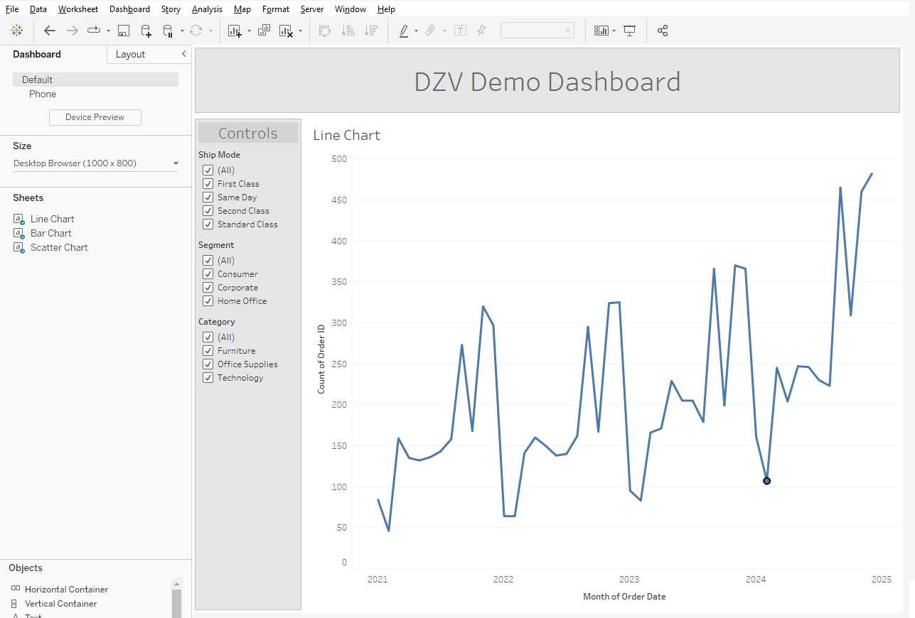
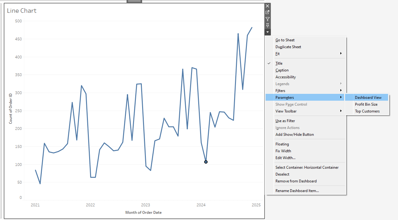
Now, to actually give yourself the ability to navigate between views, select the chart that's still visible. Bring up the "More options" menu, select Parameters, and click the list parameter of desired views we created earlier. This will pop it into the sidebar alongside the filters.
Now, by changing the Dashboard View parameter, you will be able to easily swap between views! Hooraaay.
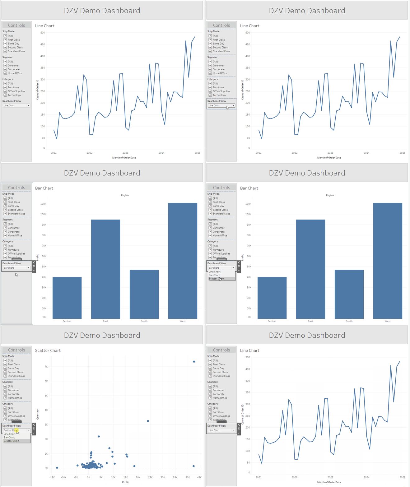
However, in this example, we also have filters for each chart. And not all the filters apply to all the charts, do they? It would be pretty confusing for a user to mess with a filter and see nothing change in the chart in view. So let's navigate back to our charts and fix this.
We're going to create three more calculations that will help make sure that everything in view is relevant to the user. We don't need to change the Dashboard View parameter, because we don't want to add anything new - we are merely altering what is visible in the existing ones.
As I have set up this dashboard, each filter is present on two charts:
Ship Mode is on the Line and Bar Charts.
Segment is on the Line and Scatter Charts.
Category is on the Bar and Scatter Charts.
That means our DZV booleans need to be true in two circumstances. You can do this by either creating positive conditions with OR, or a negative condition, like so:
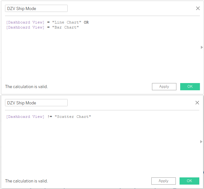
Make such a calculation for each filter. Repeat the same steps as you did for the charts for each filter box. Dynamic zone visibility works with any element on a dashboard, not just charts, including entire containers. You can make groups of charts appear and disappear together without having to individually apply DZV to each one. Remember to make sure you have either applied every filter to the appropriate worksheets, or brought in the specific filter boxes for each individual chart.
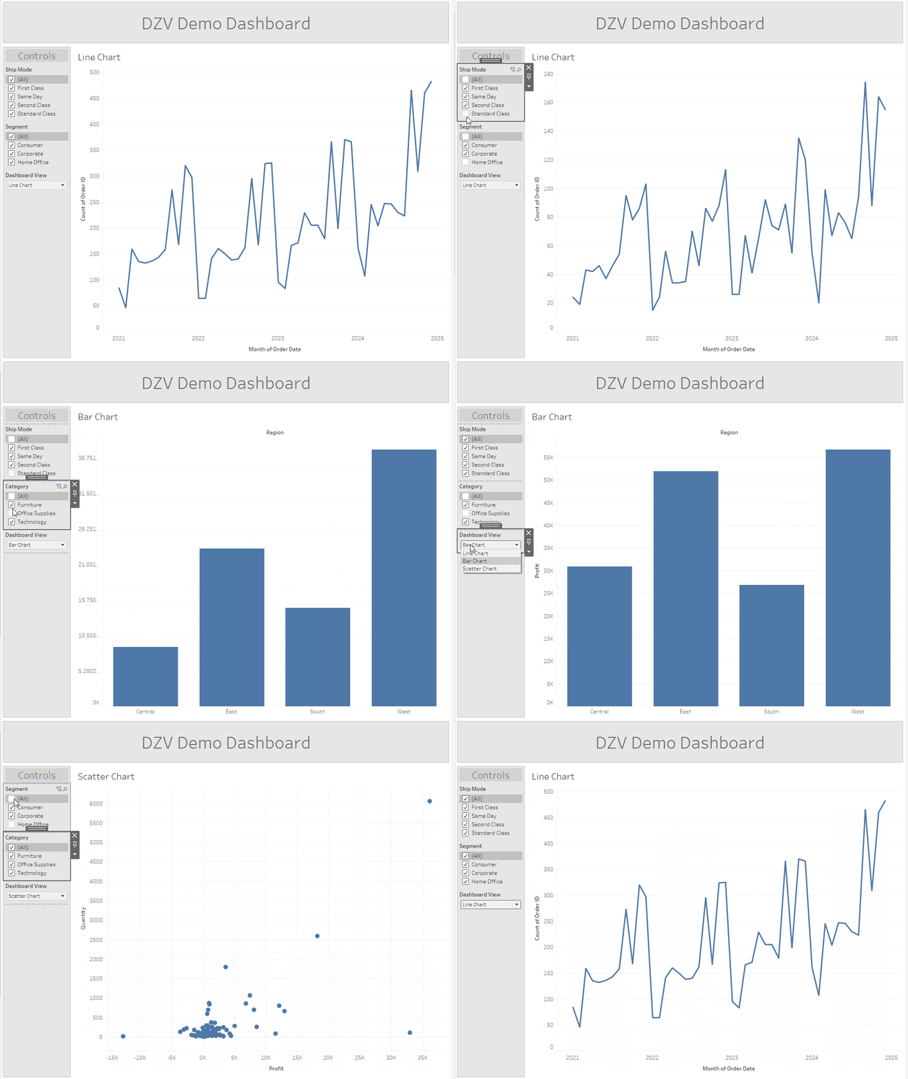
In the end, you will have a dashboard that allows you to swap between three views, including switching between the filters relevant to the chart currently visible.
Pre- V 2022.3
Sometimes, a client will be on an older version of Tableau or Server, limiting the tools you can use. Prior to 2022.3, Tableau did not have native DZV support, requiring a rather inelegant workaround. This method ONLY works with charts, not containers, as it is done through the individual worksheets and not in the dashboard itself. The limitations make it significantly inferior to the modern DZV option, but it will work with all versions of Tableau. We will use the same workbook and dashboard from the last example. As a reminder, it looks like this.
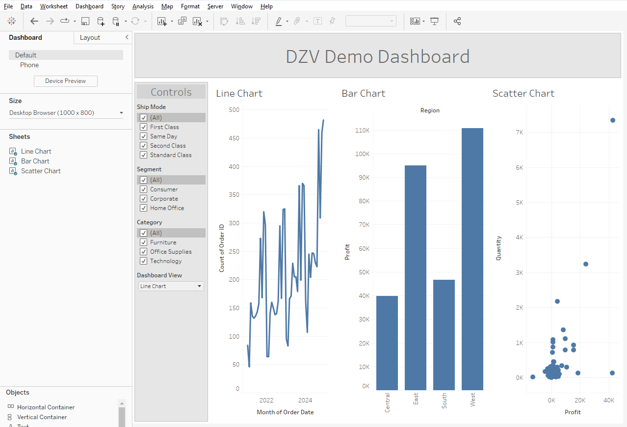
Now, let's make the calculations we need to actually facilitate the chart swapping. Luckily, we can make use of the Dashboard View parameter we already have. We are going to create what looks like a nonsensical, self-referential loop. This is because instead of actually bringing things in and out of view, we will essentially be selectively breaking our charts.
The first calculation will just contain the Dashboard View parameter.
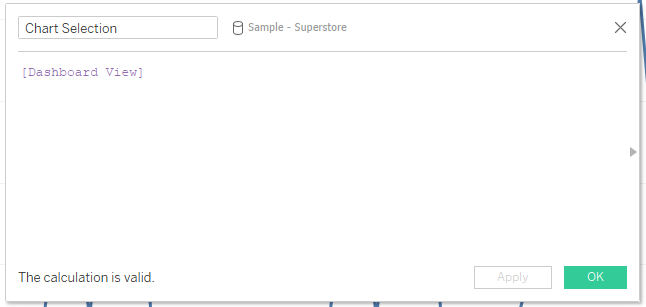
Then, you will make a calculation for each chart that references the field you just made when the parameter is set to the relevant option. You can use an IF or CASE statement here, though since each chart needs its own, it makes more sense to use IF.
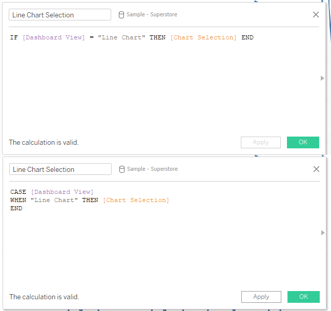
You may notice that this is a very "The floor here is made out of floor" moment, since essentially what we are doing is saying that the Dashboard View parameter is the Dashboard View parameter.
Once you have your calculations, you're ready to set up the selection action. This part has to happen in a particular order, so make sure to pay attention to how you go about it. Navigate to each worksheet, and open the Dashboard View parameter. Set the parameter to the relevant option, and then drag the associated calculations to the filters shelf. If you do this correctly, you should see a dialogue box with a single option pop up, which you will select.
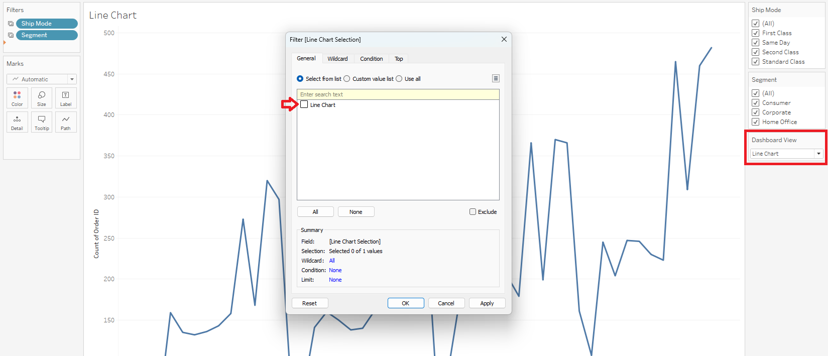
If you do it wrong, you will see a NULL instead.
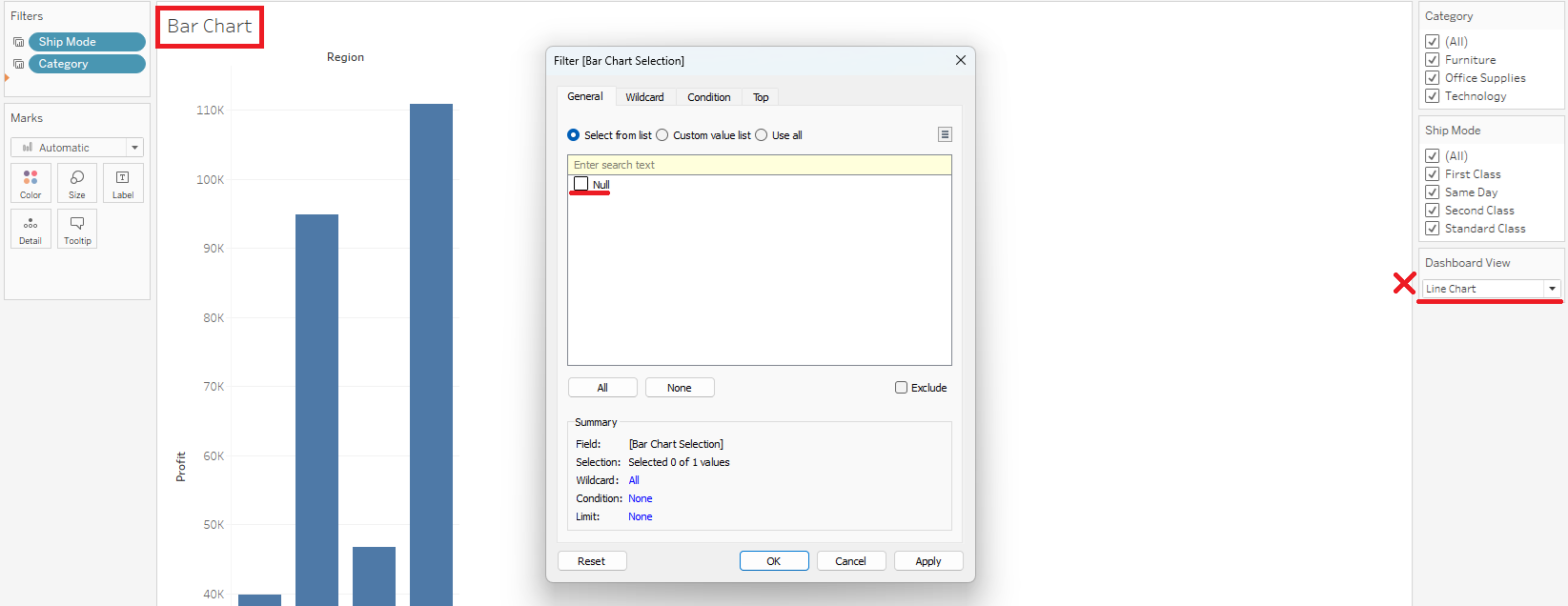
When you move to the next worksheet, remember to change the parameter first, and then add the calculation to the filters shelf.
Now, when you navigate to your dashboard, you will see something HORRIBLE.
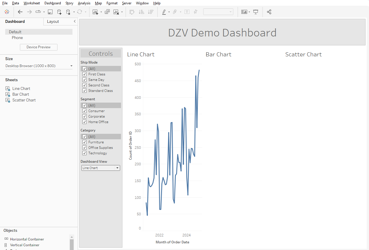
All you have to do is hide the titles of your charts. Now you will be able to change your Dashboard View parameter to reveal each chart.
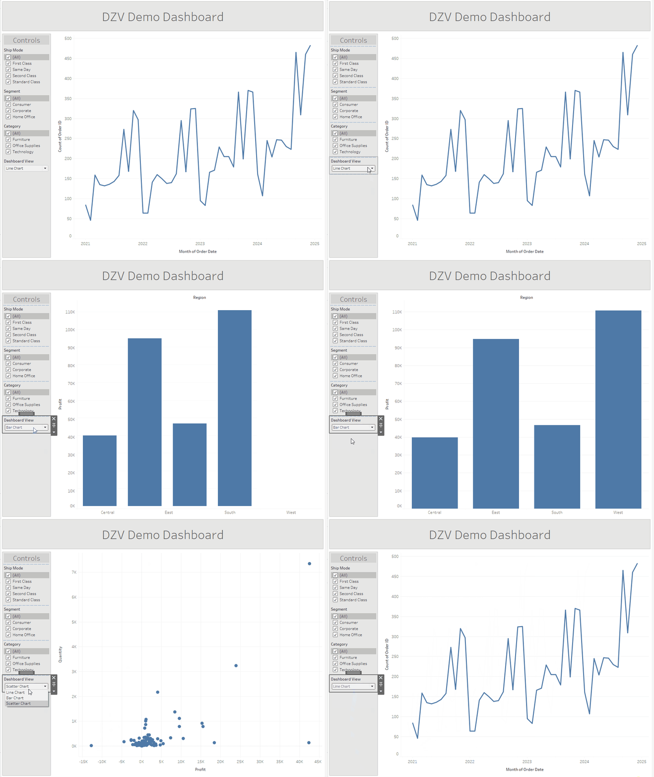
As noted, this method does have the drawback of only working on charts. You will have to create a dynamic chart title if you need one, since the title has to be hidden in the sheet itself to work. You may also notice that since this is not actually collapsing the sheet but merely breaking the chart, reducing it to a single pixel wide white space, each one will be offset ever so slightly.
DZV But Make It Fancy
If you want to jazz up your dashboard a little, you can also create custom buttons to swap between charts instead of relying on the parameter alone. It will be much more annoying to change how many views you have using this method, so it's important to try and make sure you know exactly how many you will need from the jump. It will also require creating an .xlsx or .csv file, so if you are for whatever reason unable to introduce additional data, you will not be able to do this at all.
First, make an excel sheet containing a single column with a row for each view you are going to need. In this case, three - one for each chart. It is very important that these names match those listed in the parameter you created. This will not work otherwise.
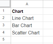
Next, you are going to add this file as a data source in your workbook. It will not be joined in any way to the data sources you are already using. That's right, this method makes use of the dreaded blend. You can do this directly from the worksheet in the Data dropdown menu at the top left. You should end up with something like this:

Now, create a new sheet and select the data source you just added. You are going to add the lone dimension to the columns shelf, filters shelf, and the marks pane. I chose to use both shapes and colors, because beige is over. This is where you can make use of custom buttons, by uploading your own shape palette.
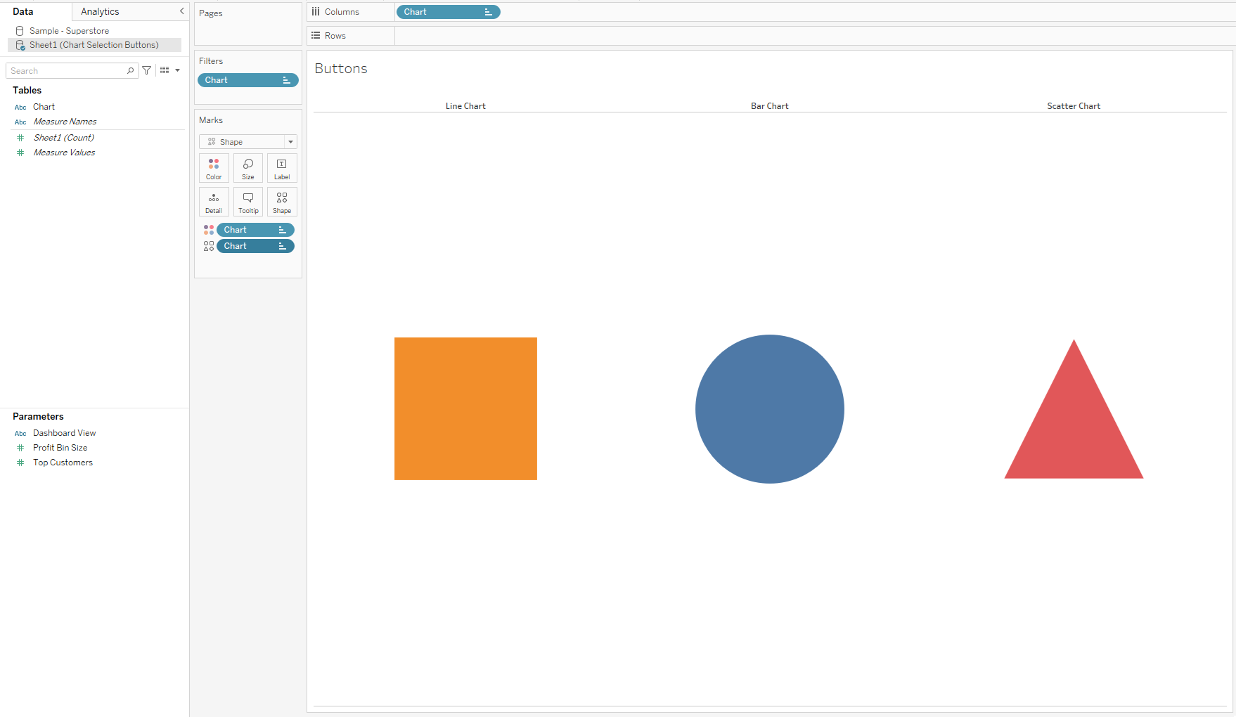
Once you have created this sheet, navigate to your dashboard and add it in. Now we are actually going to turn it on, so to speak. Go to the Dashboard drop down menu in the top left and create a "Change Parameter" action. The Buttons sheet will be the source sheet, the Dashboard View parameter will be the target, and the Chart field will be the source field.
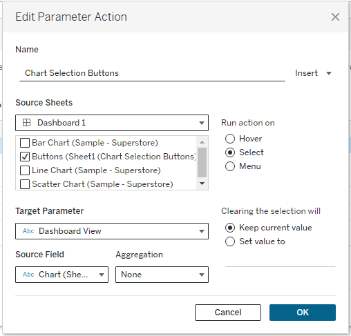
Once you hit okay, your chart-swapping buttons will now be fully functional. You can remove the Dashboard View parameter from the sidebar now and rely fully on the buttons. Snazzy!
