Part 1: The Basics
Data visualization is first and foremost a tool for effective communication. And effective communication via screens is in no small part a matter of aesthetics. It's right there in the name - visualization. However, while most people have an idea of what they do and don't like when looking at something, it's rarely because of an profound understanding of design principles. There is an instinctive element to it. This instinct can work with and against us when trying to create useful and comprehensible dashboards in Tableau. Here, we will be looking at some of the fundamental aspects of dashboard design - the physical arrangement of elements, and the use of color - to see where those unexamined assumptions about what things should look like might be undermining your work.
There is a concept in art called "drawing what you see". It feels obvious, but is extremely difficult to put into practice without training. Have you ever tried to draw an eye, or a hand, or an animal, and found the outcome looked...wrong, somehow? Off? That is because most people do not draw what they see, they draw what they know. You have an idea in your mind of what an eye looks like, and you unintentionally draw on this "expectation of what an eye is" to inform your sketch,.

You know an eye has an iris, a pupil, upper and lower lids, lashes...but the thing on the page is definitely not like any kind of eye anyone you know has. If you can overcome this instinct to draw on preconception, you can become a better artist overnight. Truly look at an eye, and draw only the lines and shapes you are seeing. No eye is a perfect almond. You can't see the entire iris, and the lashes arc and sweep forward instead of radiating like the rays of a kindergarteners sun. Eyelids fold and tuck out of sight, more suggestion than visible skin.

You might not become Michelangelo in the span of a day, but you will definitely notice a difference.
In the same way, creating attractive and easy-to-understand dashboards from a design perspective is often a matter of putting aside what feels right and applying rules that will make it work whether or not you are a talented graphic designer. You don't have to be an artist to make something look nice.
First and foremost, consider the natural travel direction of the human gaze. Have you ever seen one of those posters where the words are positioned oddly, or spaced too close or far apart, and had trouble understanding what it says?

That's because (depending on what language you speak) you will instinctively read in a particular direction, and use visual cues to see where breaks between words are. Often, the cadence of your internal dialogue will be affected as well. Words that are far apart can feel "slower" than ones that are close together.

In the worst case, you might deliver a message you never intended to by placing things close to each other that don't belong together.

The elements of a dashboard should follow the natural flow of eyes across a screen, with text and charts grouped in some way to make it clear which information is related to each other. Don't expect an English speaker to naturally read from left to right. Strategic use of blanks, borders, and dynamic zone visibility will help keep viewers from becoming confused or overwhelmed. A KPI directly above a chart can suggest that the two are referring to the same values, unless there is some kind of visible "barrier" between them. Conversely, a KPI completely separated from a chart will make it seem like the two are unrelated whether they are or not. If you have trouble deciding which information belongs together, ask someone who doesn't know what your dashboard is about to tell you what conclusions they came to from looking at it - without any explanations or assistance from you. If what they tell you doesn't line up with what you intended them to get out of it, and especially if their conclusions are outright factually wrong, it's time for a redesign.
The use of color can be a particular sticking point for those not artistically inclined. What makes certain colors look good or bad together is actually pretty complicated, and color theory and colorimetry are the subject of university courses. Luckily, you don't need to truly understand the rules to know how to employ them. There are certain color combinations that have implied meaning due to social and cultural expectations. In predominantly Christian countries, using red and green can give "accidental Christmas" vibes to your dashboard. Red and yellow often bring to mind brands like McDonald's. Bright, saturated primary colors create a childish, kid-friendly feel. Pure white or black can be harsh or even unpleasant to look at, due to jarring contrast. That doesn't mean you can't use these colors, but you do need to be aware of what message you are sending.

Tactics like desaturating or using adjacent colors can make a huge difference in the end result. Try sage instead of green, vermillion instead of red. This way, you can still use any color combination you want without distracting the viewer with color associations that don't belong in your dashboard.
Colors used to express information can also do more harm than good if they are too similar. Humans are visual creatures, and we love to find patterns. Seeing two things that are the same color will often make a viewer believe they are the same, even if a closer look would reveal they are different.
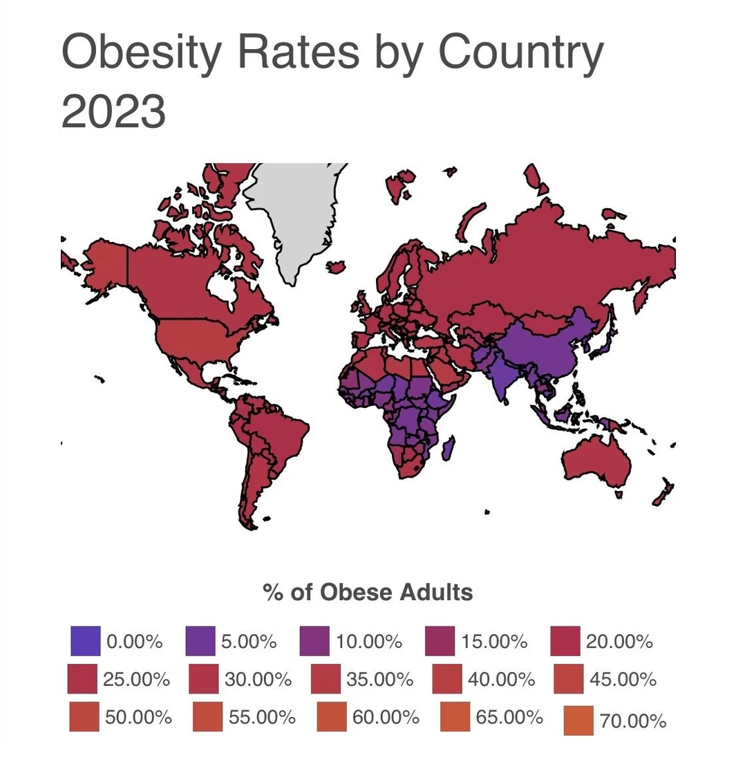
These hues have run together to the point of illegibility. Even with the legend, I couldn't tell you almost any of the values meant to be associated with any given country. Poor color choice has effectively rendered this chart useless. However, carelessly selecting colors that are very different under the impression that it will improve readability can also cause problems. Consider the following map and what it suggests about the United States.

The stark contrast in color, splitting the US neatly down the middle, might lead a viewer to believe there is a significant difference between the east and west. Perhaps the Rocky Mountains have something to do with it, or the Atlantic and Pacific oceans...? However, any such interesting theories would be the product of misleading design. Taking a closer look at the color legend will show that while the values themselves are incrementing smoothly, the colors are not. Dark colors are next to light ones, because whoever made this map was not drawing what they saw. In their mind, dark green and light green, dark blue and light blue, those are natural neighbors. Green is green and blue is blue, right? However, clearly, the difference in value is more significant than that logic would imply. The dark green and light green have a distinct, stark boundary between them, despite the actual numerical difference being no greater than any other two adjacent colors. This map has created the impression of significance from nothing. Much like text, color can send a message you never intended.

When choosing colors, its good to start with a basic palette. If you aren't confident that you can pick colors yourself, Coolors is a generator that will spit out hundreds of solid color selections complete with hex codes for you to use, whether as-is or as a jumping of point. If you have an image you are working off of, you can use Imagecolorpicker will let you upload whatever you like and sample colors from it. This is great for creating dashboards that have consistent color theming with logos, branding, or associated imagery. If you are picking colors yourself but want to be sure that they will be legible, this Contrast Checker from WebAIM will give you an explicit score based on your inputs. WebAIM works to improve accessibility on the web, and their Contrast Checker includes an eyedrop tool so you can pull colors directly from your dashboard. There is also a handy explanation on accessibility guidelines at the bottom.
While there are no right or wrong colors to use, try to keep in mind the connotations of certain colors or combinations. In most Western countries, red reads as "bad", green as "good". For better or worse, pink is "feminine" and blue is "masculine", and so on. Keep track of what meanings you've assigned to certain colors. If profits are in purple in one chart, they should stay purple in another. If you are using colors to depict a range of values, carefully consider if the colors properly match the numbers - that is, drastically different numbers are drastically different in hue and/or value, and similar numbers are similar in hue and/or value. Soliciting opinions from others can be a good way to check if you've gotten your message across.
Ultimately, what looks good is a matter of subjective tastes. Some people love crazy fonts, wild colors, and abstract use of space. And even the most conservative dashboards can benefit from such details in moderation. However, when starting out, it's important to keep the ultimate goal in mind: to make data easier to understand. Design choices that are a step back from that goal should be avoided. And by using the principles that hundreds of graphic artists, data scientists, and typesetters have developed before us, even the most artistically unsure among us can create something that is both pleasing to the eye and informative.
