


One of the most important aspects of being a data consultant is to understand the needs and priorities of your stakeholder and the users of dashboards. Designing dashboards is not just about the right chart for the data or putting as much data as possible on the canvas. It is about building something that matches the priorities and the daily work of your stakeholder.
For example, you are about to build a dashboard that displays different metrics related to Customer Service Calls. You may think that the stakeholder is interested in calls that took too long, e.g. 45 minutes. But in conversations with your stakeholder, you find out that they are actually more concerned with disconnected or abandoned calls as these are usually associated with customer dissatisfaction. This simple example shows why you should always try to understand what numbers are most important to your stakeholder. But how do you do that?
Of course, you could ask directly "What KPIs or Key Metrics are important to you?". But especially if stakeholders are used to Excel Sheets, they may say something like "all columns are important" or "All Call-related data". But these answers don't really help you build dashboards that are useful AND draw out business insights
Instead, you can make use of Sketches, also called "Wire-Framing" or Excalidraws (which is a free-to-use website that makes sketching super easy).
When you have an Update-Meeting with your stakeholder, prepare by sketching out your vision for the dashboard. What numbers would you put on? What columns would you use? What charts would you choose? How would you lay it out? Which chart/data should take up more space than others? What colors are you thinking? What interactivity is possible?
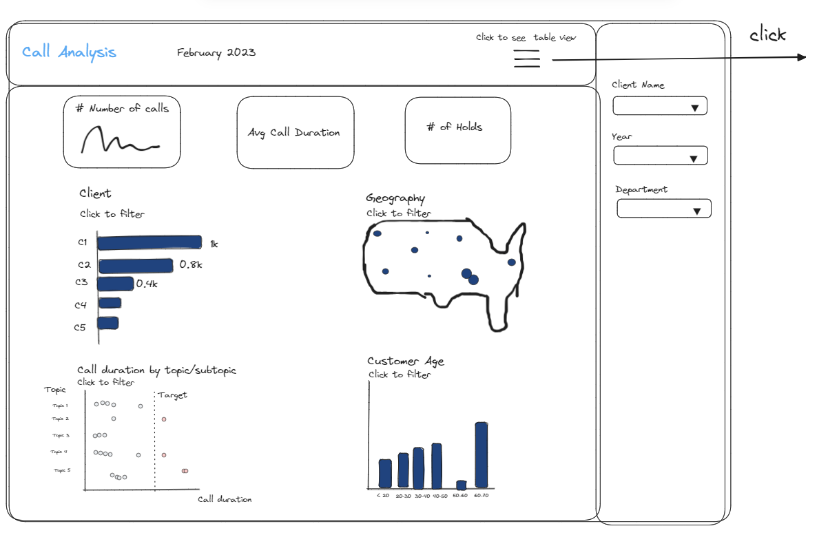
Essentially, you make a draft sketch with the information you have. This could look something like this:
Then, during the update meeting, you will walk through the sketch and ask targeted questions. For example, if a certain KPI is useful, if there are other numbers that should be in the top row, or if they need other filters on the side. You can also ask whether they need to set their own targets or need to see the data in table view as well. The sketch does not have to be perfect and you can certainly explain any roadblocks you have or if there are areas where you are less confident. You can also highlight data issues. For example, you may want to use the topics of the calls in one of your charts but you don't know which column contains this information, or if it is available at all.
I received feedback from my stakeholder who I worked with on a short-term consultancy project (~ 2 weeks) that seeing these sketches is amazing, particularly for stakeholders who may not be so creative or versed in building dashboards. Without having a sketch in front of them, it is difficult to imagine how the final product will look like. But if you give them a sketch, they can immediately tell you what numbers are missing, what information is too much, or what interactivity is needed.
Plus: You can take notes or implement smaller changes right on the call.
In the above example, I workshopped the sketch with my stakeholder and realized:
1) The stakeholder is really interested in abandoned/disconnected calls.
2) A map of the whole US is not as useful as being able to drilldown into individual states.
3) It's important to change the target for the topic charts and the bin size for the age chart.
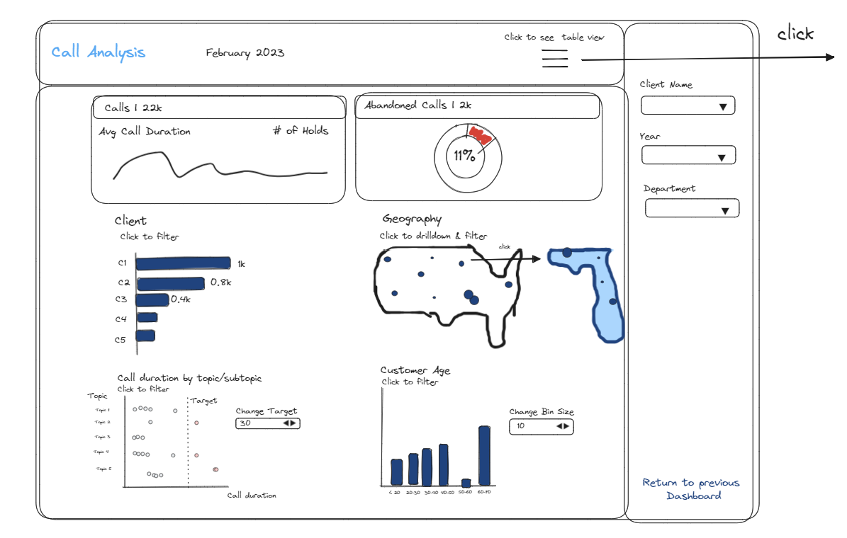
I updated the sketch based on that feedback, but more importantly, I gained a much deeper understanding in how the stakeholder will interact with the dashboard and what metrics are important. My updated sketch looked like this:
These are some of the reasons why I personally always create sketches before building any dashboard (another reason: it makes your actual dashboard building much faster!)
Just a word of caution: Sketching is a great tool, especially for the early update meetings when you are not quite sure what direction to take or you want to get to know the stakeholder/user of the dashboard better. If you keep updating your sketches and keep showing them to the stakeholder, you may risk an infinite loop of updating your sketches and never getting to build your dashboard. Depending on the project length, you may not even show the updated sketch to the stakeholder or you do one more reiteration before you start building the dashboard.
Did this article resonate with you? Have you used sketches before? Send me a message on LinkedIn!
Feature Image by Hal Gatewood / Unsplash
Sketches by Lisa Hitch