


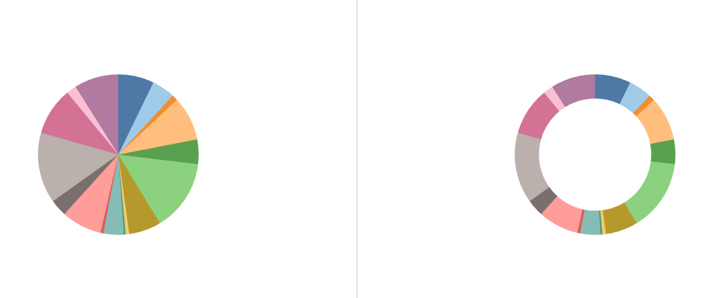
Whole-to-part visualizations of data can sometimes be tricky. Think about a pie chart with many different sections (as shown below). It is hard to distinguish which segment is bigger or smaller compared to others. A donut chart may be a better choice, because the arc of the donut slices are a little easier to interpret for the human mind than pie slices, but it is still difficult if you have a lot of different segments (in a lot of cases, a simple bar chart may be a better option!).
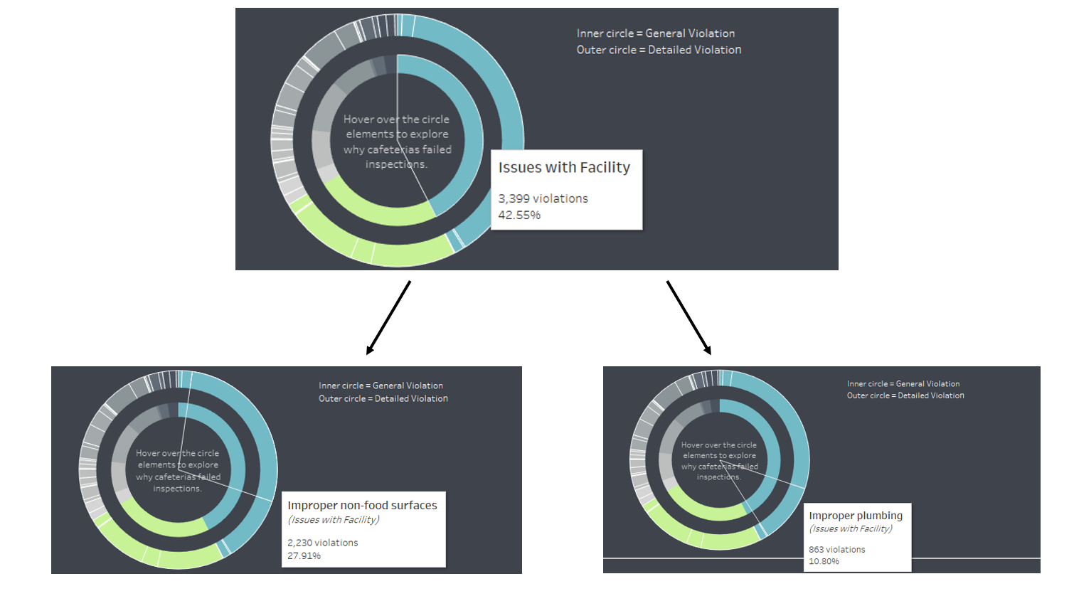
But donut charts have an advantage when it comes to hierarchical data, which then turns our donut chart into a sunburst chart. A sunburst chart has the advantage of displaying how two different dimensions relate to each other in terms of percentages. Take my final application visualization for the Data School on the topic of School Cafeteria Violations. School cafeterias received violations that included an overarching category (the inner ring in the screenshots below) and a more concrete or detailed violation within that category (the outer ring). I wanted to highlight how much the detailed violation reasons make up of the whole (all violations), but also how much they make up of each category. Since each detailed violation is unique to a broader violation category (and cannot appear in multple categories), a sunburst chart is an option is this case.
In case this was confusing, see the pictures below. In the first picture, I hover over the blue part of the inner right, which shows the overarching category (in this case issues with facilities). In the two pictures below, I hover different segments on the outer ring, but both of them are blue meaning they are within the larger category of facility issues (in this case we have the detailed violations of improper non-food surfaces and improper plumbing).
Okay, now that I explained when to potentially use a sunburst chart, let's build it! To do that, I use map layers with a transparent map and layer 4 pie charts on top of each other.
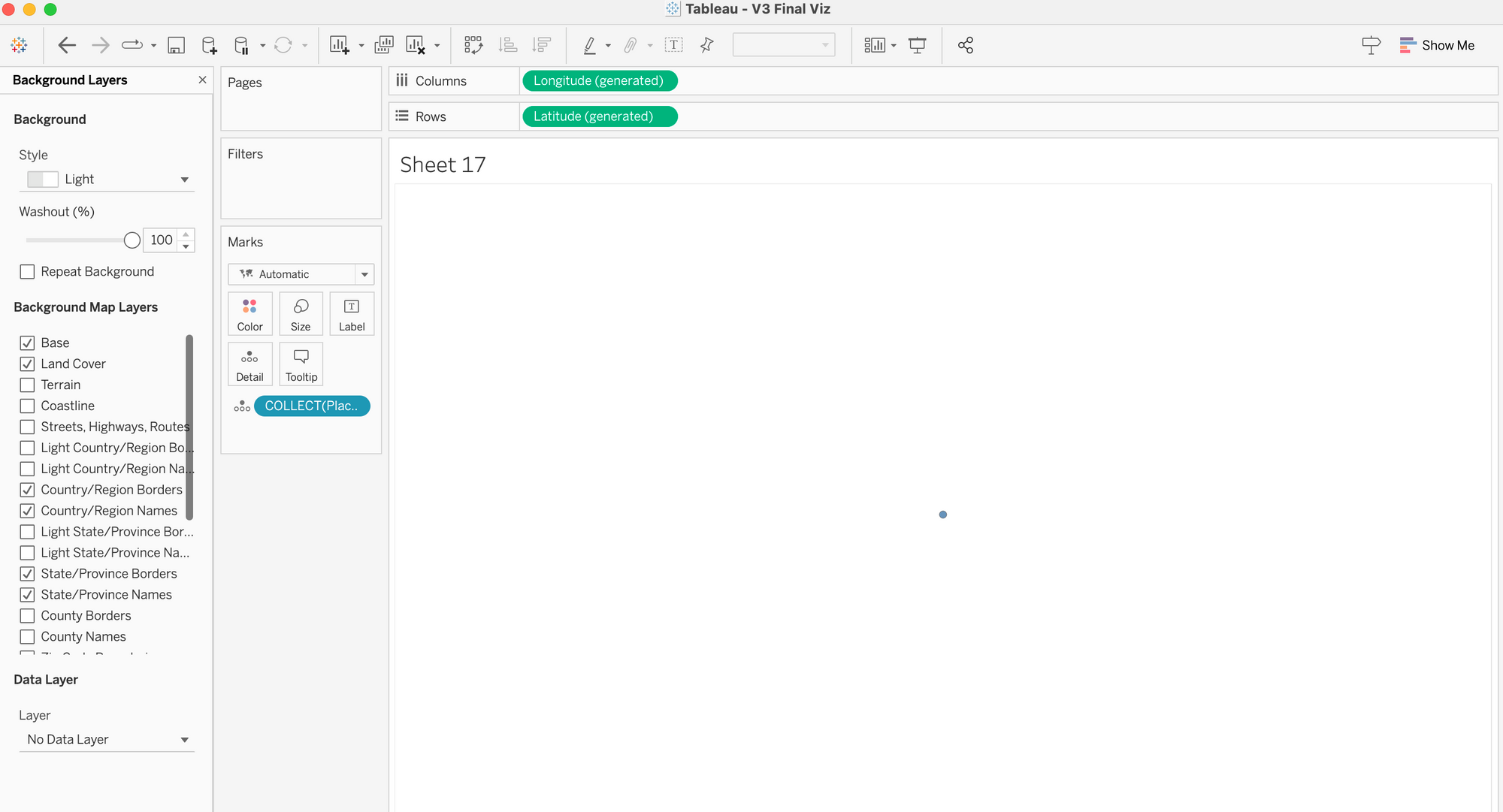
Step 1: Create the map
Create a calculated field called "Placeholder" and type Makepoint(0,0). Drag Longitude to Columns, Latitude to Rows, and drag the newly created Placeholder onto Detail. Next, navigate to Map > Background Layers ... and turn the "Washout" to 100%. You should only see one dot on a white canvas now.
Step 2: Create the first layer (dark circle in the middle)
Turn the marks card to "Pie" and change the color to a dark grey (note: you can use any color you want and you can increase the size a bit). Now you have the inner part of your sunburst chart.
Step 3: Build the first inner ring
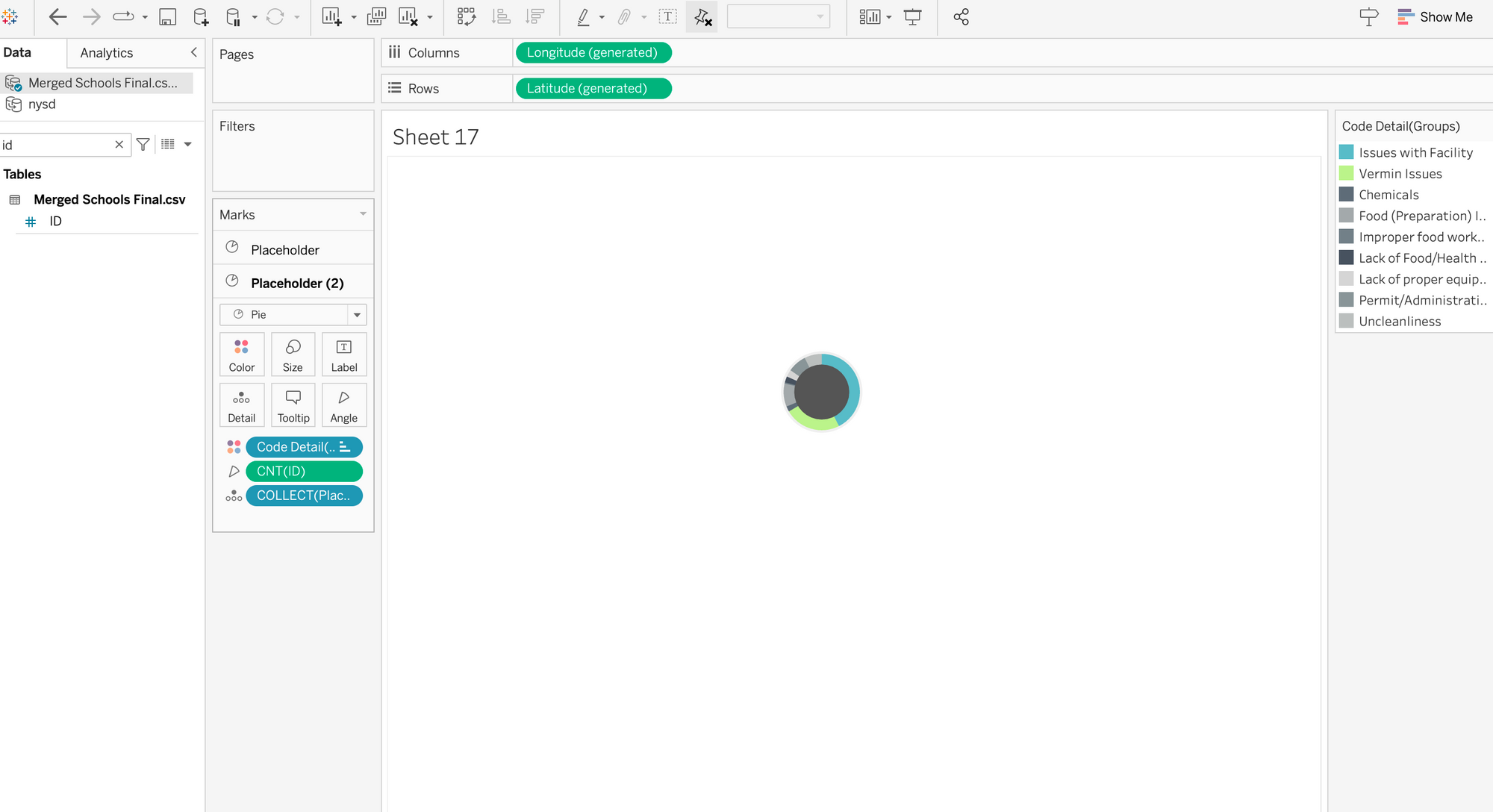
Drag the Placeholder from the data pane on the left towards the canvas without letting go. A little window will appear that says "Add as Marks Layer". Drop the Placeholder onto there. Turn it into a Pie and increase the size. Make sure to re-arrange the two marks layers in your marks card so that the first placeholder is always on top.
Now drag your dimension or category onto color and your measure onto angle. In my example, I used the violation category on color and the count of violations on angle. With this, you created your first ring!
Step 4: Create the second ring (a dark placeholder)
This step is optional, but because I want to separate the different rings, I add a darker ring in between to make the colors stand out more. To do this, I simply drag the Placeholder again onto the "Add Marks Layer", switch it to "Pie", then drag that marks card to the bottom, change the color and increase the size.
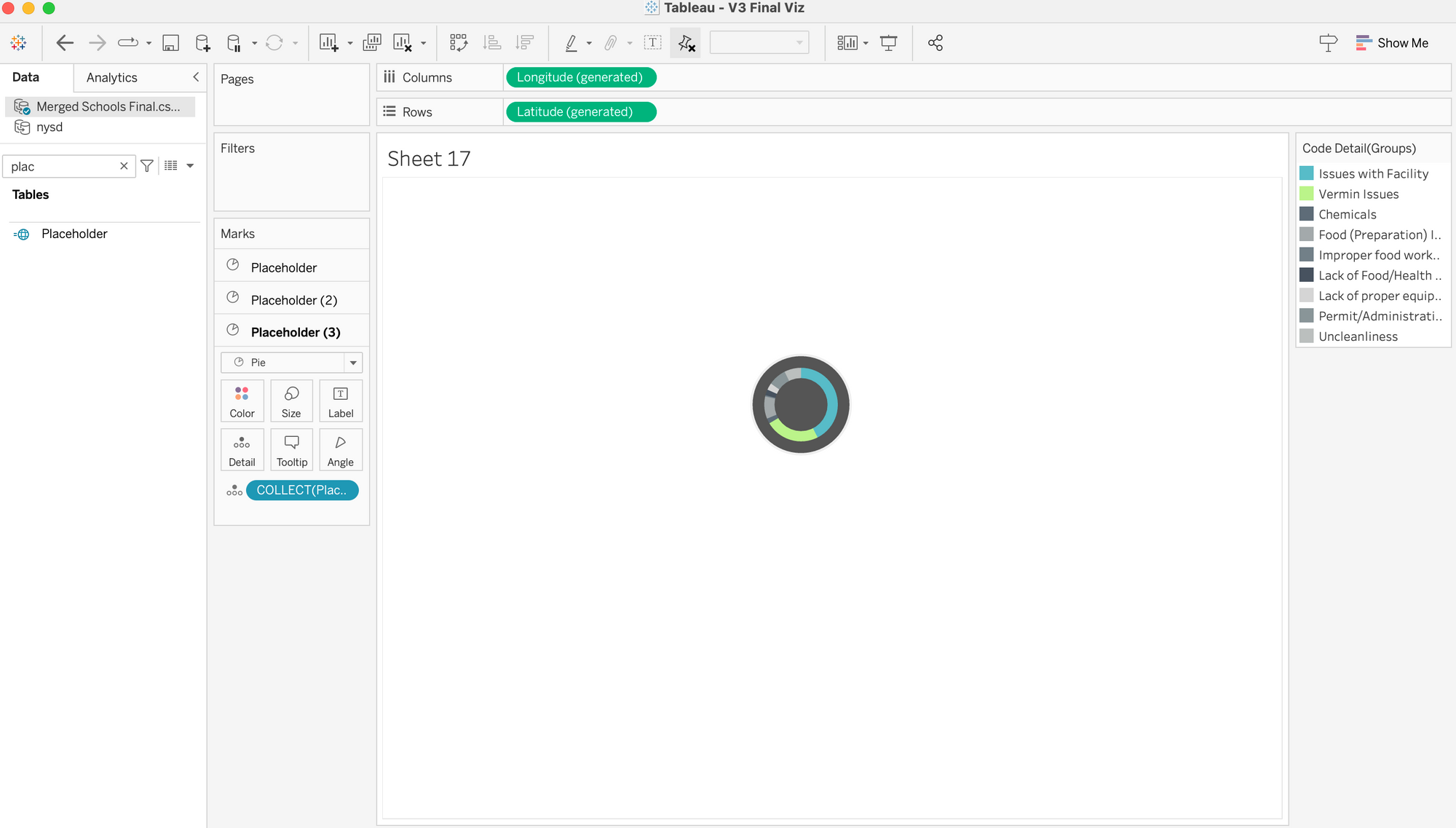
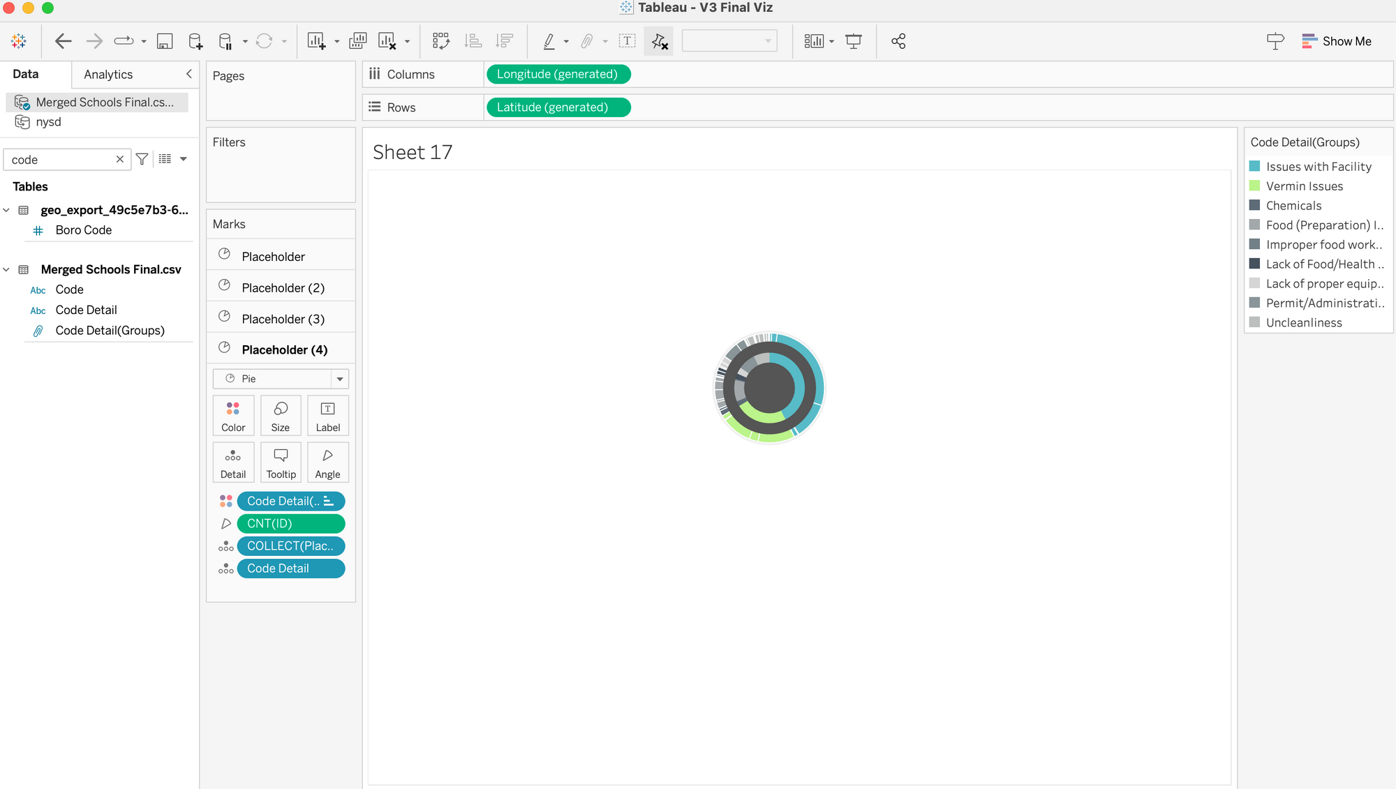
Step 5: Create the last ring!
Same thing as before: Drag the Placeholder onto the "Add Marks Layer" card, then move it to the bottom in your marks card, turn it into a pie, and increase the size. We still want the the same dimension as before onto color and the measure (in my case the count of violations) onto angle. Up to this point, you basically recreated your inner ring. But we want to split it up into the lower hierarchy. In my case, I want to split it up into smaller segments that correspond to the more detailed violation. Therefore, I drag that more detailed field or dimension onto detail in my marks card. Important here: You may still not see a difference until you hover over the outer circle and see that it is broken up. To make the individual segments clearer, you can add a white border on the color card of that last ring. Now you should see the broken up segments quite easily.
And et voila! You just created a sunburst chart!
Screenshots by Lisa Hitch in Tableau 2023.1
Did you like this type of content? Send me a message on Linkedin!