


Imagine this scenario: You built an amazing dashboard with lots of interactivity, filters, and parameters. It looks stunning and you present it to the CEO of the company you are consulting for. Everyone is excited to see what your dashboard can do. But then: Every single click takes 30 seconds to load. The first impression is ruined! No matter how great the dashboard looks, how great the idea behind your visualizations was, or what amazing business insights it could show, if your dashboard lags and takes more than 5 seconds to load, you will lose your audience and in the worst case scenario the trust of your client.
To prevent that, it is important to know about some performance-enhancing tips and tricks when building your dashboard.
Keep in mind that the easiest fixes are usually related to the dashboard design. However, in some cases the server environment or set-up of the data needs to be addressed. The following tips are design-oriented and meant for you to keep in mind while creating your dashboard or in order to change your dashboard for bette performance.
1.) Relationships/Joins over Blends
The new relationship model in Tableau introduced the data model where you can create relationships between datasets. These relationshipsare quite flexible and only run whenever that relationship is needed within your calculations or worksheets. Therefore, these relationships are generally more performant than the older technique of blending. Another advantage is that the datasets are not joined into one large table as it would be the case with joins. Larger datasets can slow down your performance, which is why you may want to use relationships instead.
For example, let's assume you have two datasets connected through a relationship, but one of your worksheets only uses data from one dataset. Tableau will automatically only use the one dataset and process less data for this visualization and hence your dashboard will be faster as a result.
However, if you know that your visualizations always require both datasets, you may opt for joins. Even though these do create one large dataset by combining your two smaller datasets, the join only needs to occur once and not every single time you update a visualization.
So relationships and joins are generally preferred over the older method of blending. Blending uses the data from one dataset as the primary data that is always displayed and then the data from a secondary dataset as supplementary material. Data columns from the secondary dataset are "linked" to the first one. Blends also query your data independently, combine/aggregate the data, and then visualize the results on your visualization, which is why they are less performant than relationships or joins.
2.) Use Data Source Filters
Especially with large datasets with millions or even billions of rows, you ideally want to use a data source filter that filters the data before any other operation is done. But beware that this will filter all your worksheets and visualizations on your dashboard.
Here is an example: Let's say you are working with the Superstore data in Tableau. By default, the data source includes data on both Canada and the United States. Now let's say that you build a dashboard that only looks at American stores. You know that none of your visualizations will include any data on Canadian stores. In this case, you can apply a data source filter and filter to only the United States.
There are 2 ways to apply a Data Source filter:
a.) Data Source Tab:
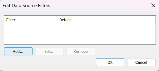
Navigate to the Data Source Tab and then on the top right where it says "Filters" click "edit". A pop-up will appear where you can click "Add...". Here you can choose the column(s) that you want to filter by. Click OK and the familiar filter pop-up will appear where you can choose sub-categories or specify conditions.
b.) Data Menu
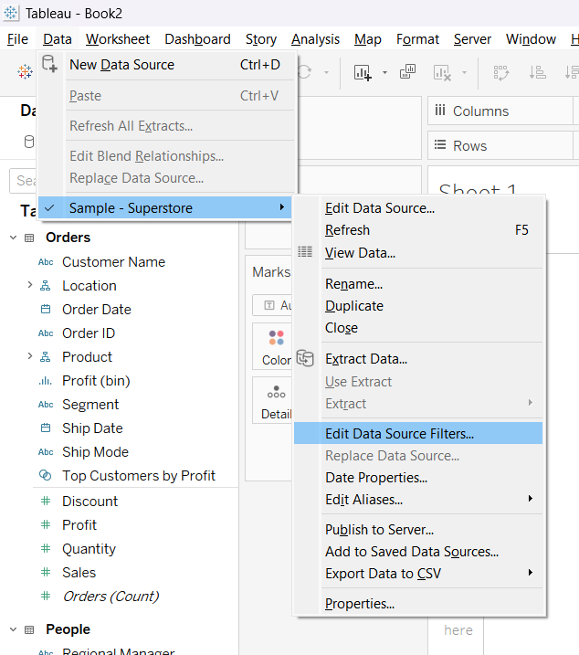
When you click on "Data" in the top menu on a worksheet, you can select the Data source and click "Edit Data Source Filters". The rest of the steps are the same as in the Data Source Tab.
3.) Reduce number of sheets
Reducing sheets has an enormous performance effect on your dashboard. Every time your dashboard has to "access" a different sheet, a new query has to be created. The more queries, the slower the performance. Think about whether you can reduce worksheets by putting KPIs in the title of a worksheet or combining charts with dual axis.
Also ask yourself whether every single chart or graph adds new value to your dashboard. If it does not, you may want to remove that graph.
4.) Reduce elements on your dashboard
Each element on your dashboard will slow down your performance marginally. Do you have unnecessary containers on your dashboard? Blank elements that can be removed? Do you have filters that are not needed? Do you have a phone preview on your dashboard that you don't need?
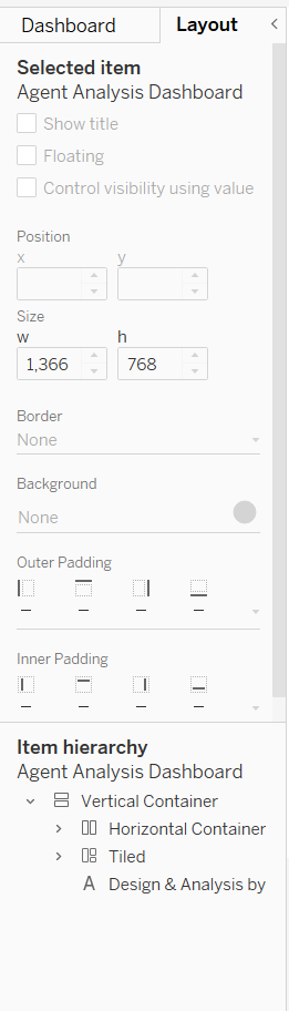
One tip here is to navigate to your dashboard and on the left side click "Layout". At the bottom of that pane you see your item hierarchy including all containers and items on your dashboard. If you click on one of them, it will be highlighted on your dashboard. I would recommend going through them and making sure that each element has a purpose on your dashboard and cannot be removed.
5.) Hide unused fields
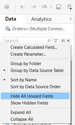
One of the easiest modification is to hide all your unused fields. It is quite likely that your dataset has many more variables and columns than you will use in your dashboard in visualizations. In the data pane you can click on the little black arrow and click "Hide All Unused Fields". Tableau will automatically hide all fields that you have not yet used in any of your worksheets. I would recommend doing this at the very end when you already built your dashboard and you are ready to publish or present it.
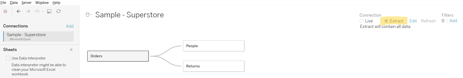
6.) Extract over Live connection
Tableau allows for 2 common connections: live and extracts. Live connection is a connection to your data source that updates as soon as your data source updates. An extract takes a "snapshot" of your data source at the moment when you create your dashboard (There is a way to have an extract being updated in a certain interval, but for the simplicity of this article, we will assume that the extract is mostly static and the live connection updates your data and hence is dynamic).
Since Tableau "looks" for updates in the data and potentially has to update your full dataset, live connections will always slow down your performance compared to extracts. You can create an extract by going to the Data Source Tab and clicking "Extract" on the top right corner. You will have to save the extract to your computer before publishing your workbook.
7.) Filter options
Filters can be quite performance-intensive. If possible, try to use parameters as these only accept a single value as opposed to filters that accept multiple values. However, in some cases you need to use a filter. In these cases you can customize your filter. For example, a multiple-select list with all possible options can slow down your dashboard, whereas a type-in textbox can be more performant.
Click on the container of the filter on your dashboard and on the little white arrow. You then can customize the type of filter. Generally, when you filter contains a lot of different options, a multi-select list is not the most performant. Let's say you have a list of Customer IDs. Instead of having them all listed, you could change the type of filter to be a type-in text box.
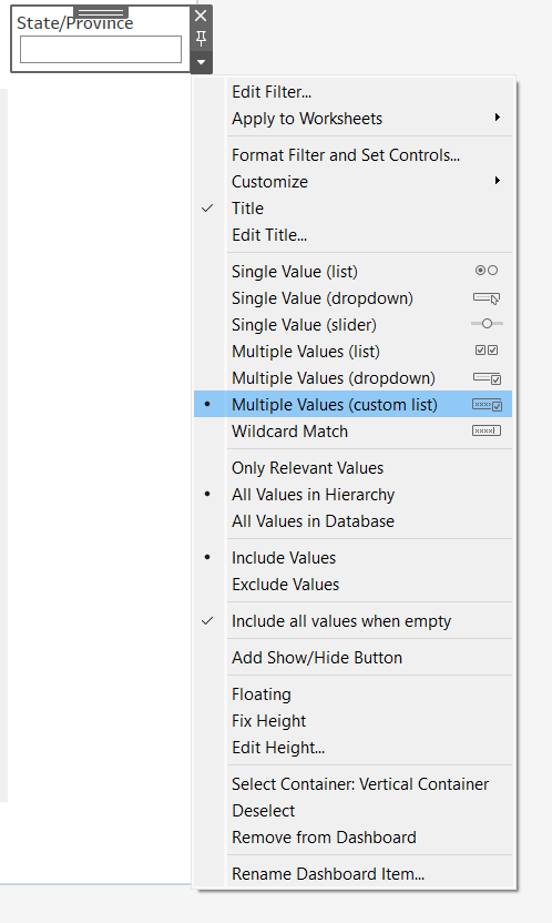
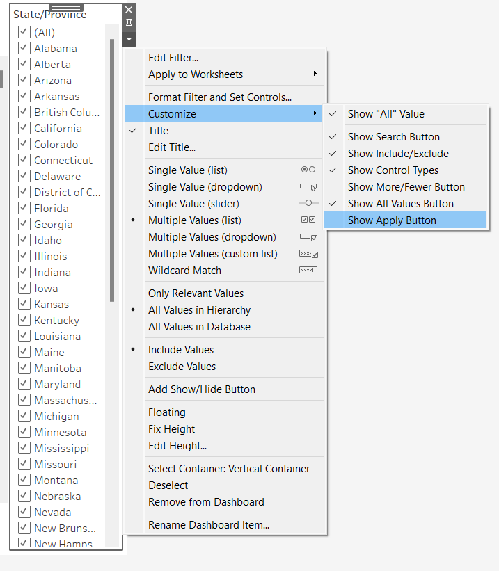
This brings me to another point. In the customization menu, you can also add an "Apply" button. If your user can make multiple selections (e.g. select multiple states), you can tell Tableau to not apply the selection until the user hits "Apply". Again, this will increase the performance of your dashboard, since Tableau won't have to run every single selection, but queries once after the whole selection has been made.
8.) Remove unnecessary fields or filters from worksheets
You may have come across this, but sometimes we are exploring our data and adding fields or filters to our worksheets, but then in the end we decide that we don't need them anymore. One example is that you think you want to add a filter down the road and put a field on the filters card with "All" as selection. Later on you decide against having a filter, but forget to take it off. Similarly, we may add information to the Detail marks card or the Tooltip, but then don't end up using them. When you are done building your dashboard, go back to your worksheets and remove any fields you don't need from the marks and filter cards.
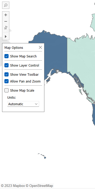
9.) Map options
When working with maps, you can turn off certain map options that would slow down your dashboard. For example, let's say you have a map of the United States to give a broad overview of the country. By default, the user of your dashboard can zoom in and out of the map and move the map around. However, rendering the map always takes some time and is resource-intensive. If you know that the map shouldn't be very interactive but rather act as an overview visualization, you may want to "fix" your map which would also decrease the time it takes to render it.
To do this, you can navigate to your dashboard and click "Map" in the top menu. Go down to "Map Options ...". This will open a pop-up on your map where you can untick "Allow Pan and Zoom". In the same pop-up you can also turn off the tool and search bar for the map.
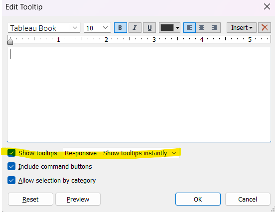
10.) Turn off Tooltips
If you don't need tooltips for your charts, I would recommend turning them off. For example, you often see KPIs on business dashboard where the tooltip just re-iterates what the KPI itself says. To improve performance, you can simply turn off the tooltips by clicking on the tooltip marks card and then deselecting "Show tooltip".
Were these tips helpful? Let me know by reaching out to me on LinkedIn: https://www.linkedin.com/in/lisa-hitch/