


On the last day, we had to build an analyst dashboard that works on multiple devices. The data that we used was on kickstart projects that requested crowdfunding to meet their budget goals.
My user story was:
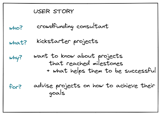
The question I wanted to answer with this project are the followings:
- Are there any countries that have a higher success rate?
- Does the success of a project depend on when people launch it?
- What should be the budget of a project for people to fund it?
- Are people more likely to fund certain category projects?
- Which ones were the most successful ones in the category
of the client?- What are their traits? - Does having more time between the launch and the deadline
increase success rate?
Next, I looked up some inspirations and did research on multiple device layouts. The most important things I wanted to keep in mind are simple charts so they work on both layouts and are easy to interpret and focus on answering the questions I set out.
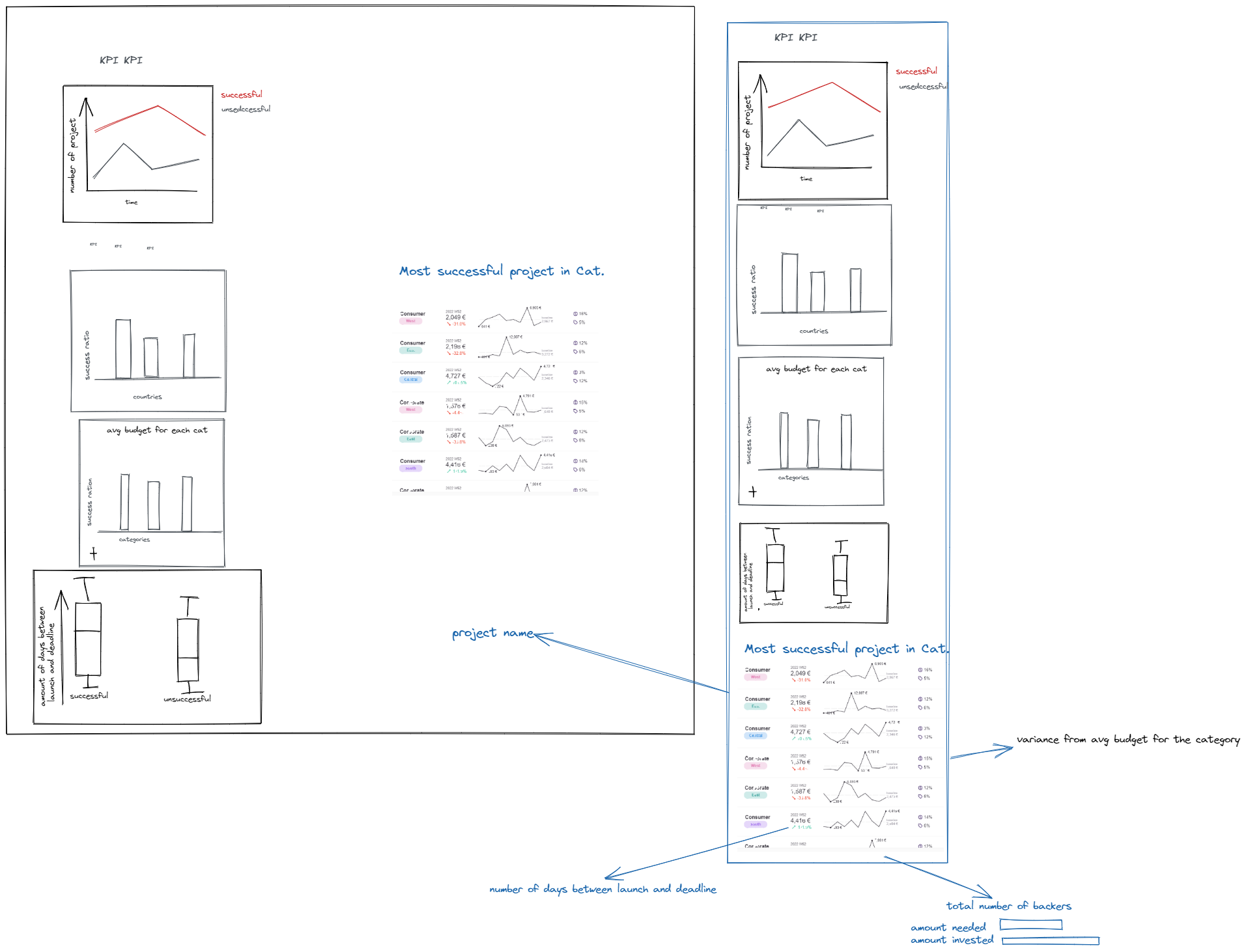
My initial idea was this:
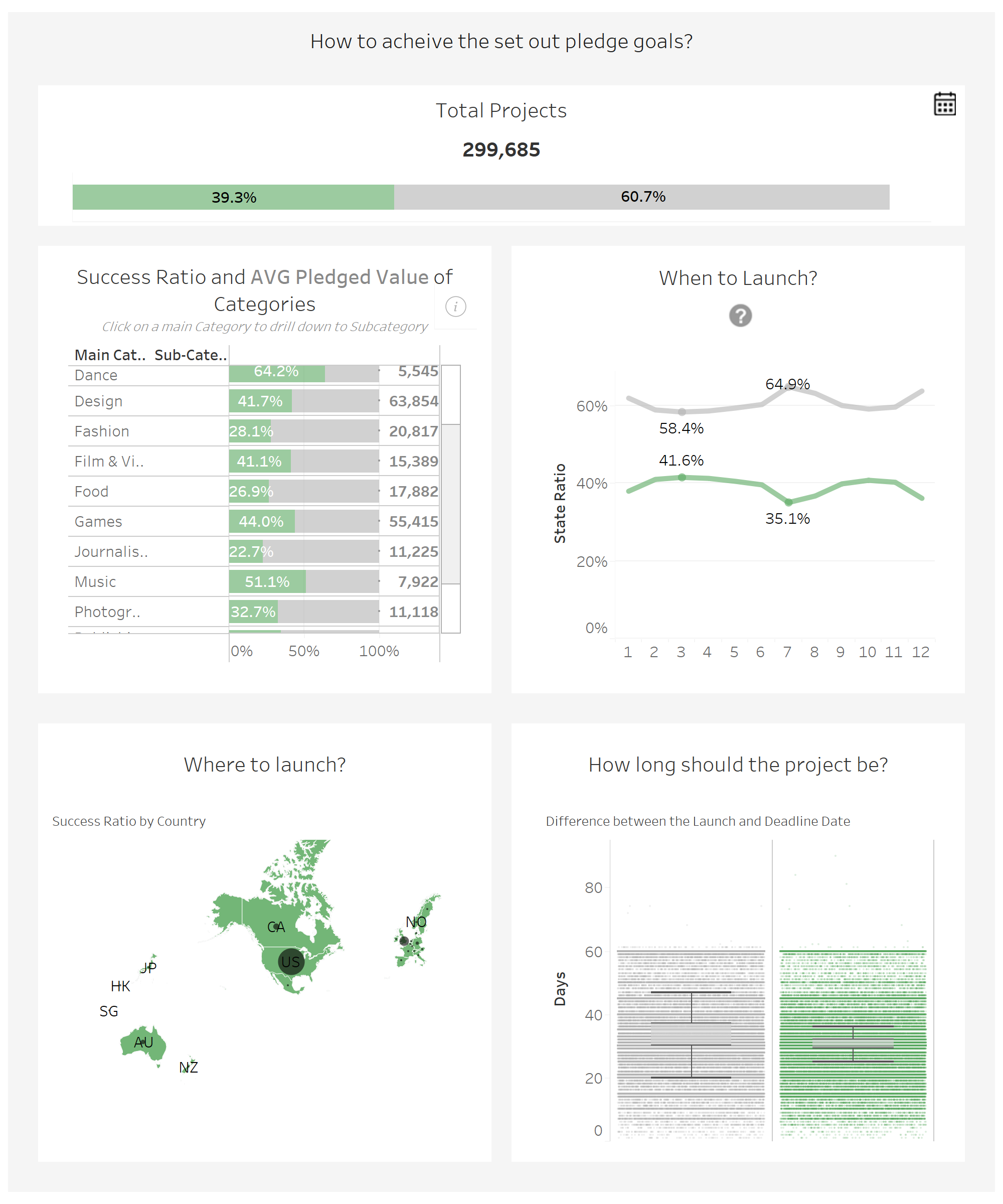
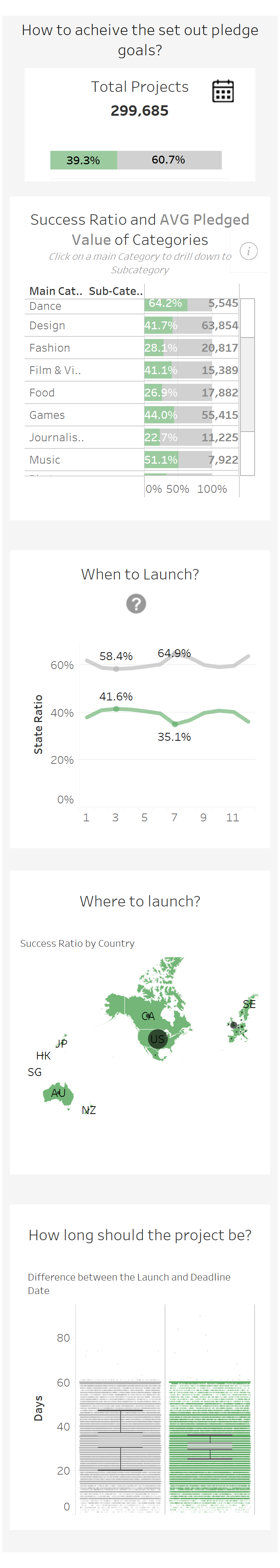
The dashboard I ended up creating:
Reflection
In hindsight I realised my plan was a little too ambitious, I had to leave out the table because I didn't have time for it along with other formatting elements I planned.
The additional feedback that I got is that during the presentation I should've told the story better because I didn't have time to prepare so while presenting I didn't tell a story that answered the 'so what?' question.