


As part of dashboard week, for the third day, we were set the challenge to create an infographic. For this we used the following dataset on Marvel comic Avengers deaths:
https://data.world/fivethirtyeight/avengers
Planning
I started the day with some planning and sketching: I looked for some inspiration and figured out my user story to create a sketch.
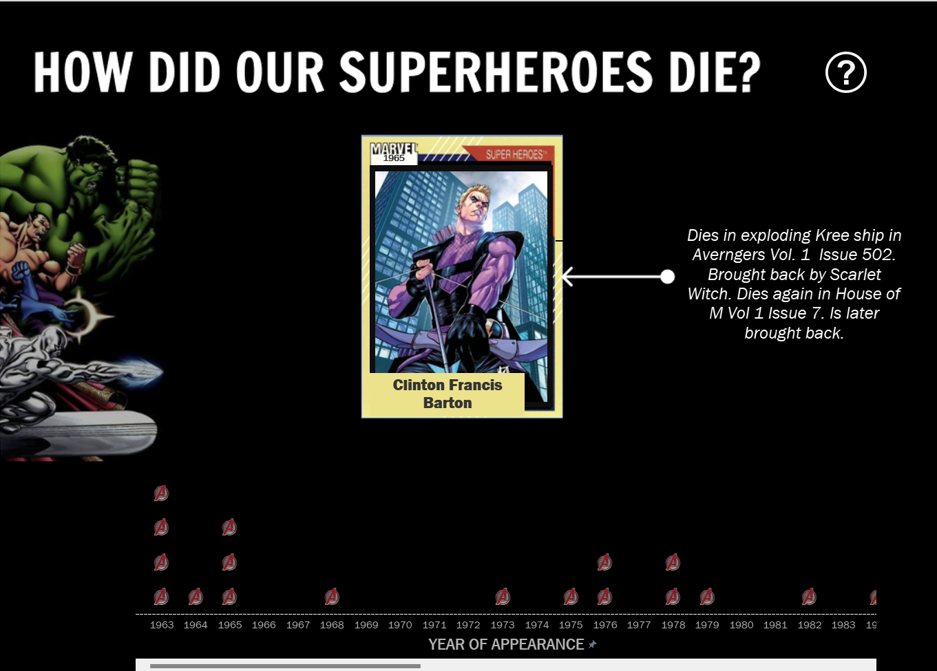
I decided to make a unit chart that shows the number of characters that died each year along with a card that shows the picture of the character that's clicked on the unit chart with some details on how they died.
Data Prepping
In order to do this I had to get the URL for the images, which I did by web scraping the wiki fan page URL in Alteryx.
Dashboarding
The focus today was more on design to create an infographic that's informative.
See what I created below:
Feedback:
I should've made a dashboard that's static since infographics are dashboards that might be printed.