


First day of dashboard week, we had to design a dashboard based on accessibility guidelines. My task was to make a dashboard on UK’s COVID-19 cases that’s accessible to as many people as possible.
These are the factors that I focused on:
- Have a clear title
- Have a summary of the findings in the subtitle
- Clear instructions for the user on how to use the dashboard
- Have straightforward KPIs
- Use Verdana font to avoid ambiguously letters (lowercase ‘L’(l) and capital ‘I’)
- Use high contrast colour for important information
- Use visible font sizes (min 12 for important information)
- Double encoding with colours and shapes
- Highlight significant points in the data and label them
- Include chart captions for users who’d use narration
- Include gridlines to ease estimation
- Use headers to avoid unambiguous axes values
- Alt text for non-text objects
- Bold fonts to draw attention to important information
- Simplicity so the user is not overwhelmed
- Option to download the dashboard as PDF
- Turn off tooltips because they need precise hovering and can’t be read out by the screen reader
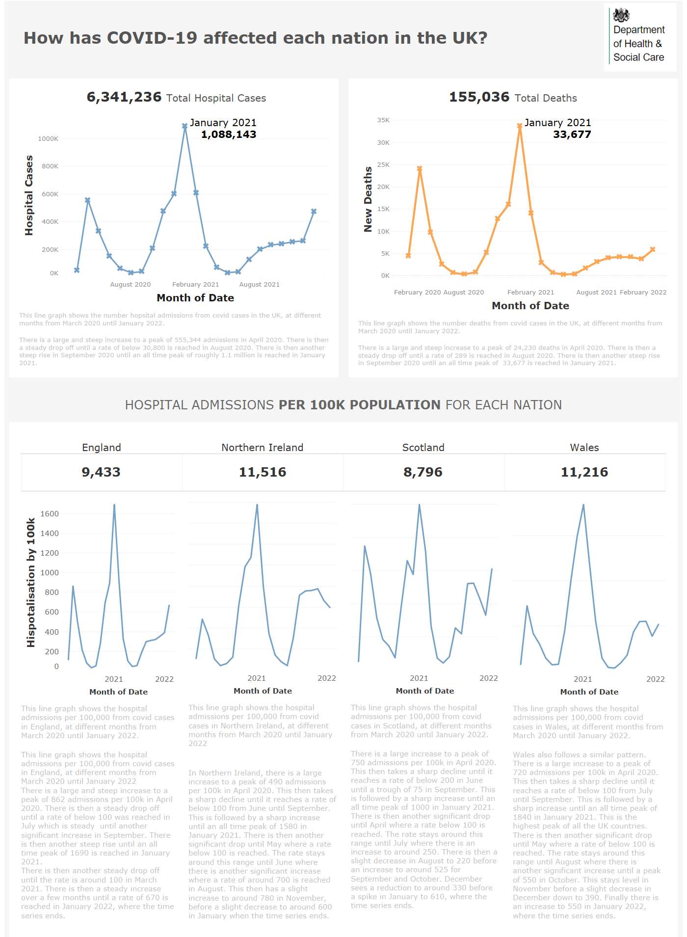
Screenshot of dashboard (cropped):
The feedback that we received for this task:
- We should’ve made the caption darker to increase the contrast
- We should’ve round some of the numbers
Overall, I enjoyed doing this task because we were challenged to think about how to incorporate elements allowing more accessibility while keeping in mind best practices that we’ve learned so far.