


Today's task was to create a report in PowerBI. And unlike Tableau (which I've almost been using for a year!) PowerBI I am not as experienced at.
Our task began with our coach's blog, with us having to design a report to investigate a specific business question.
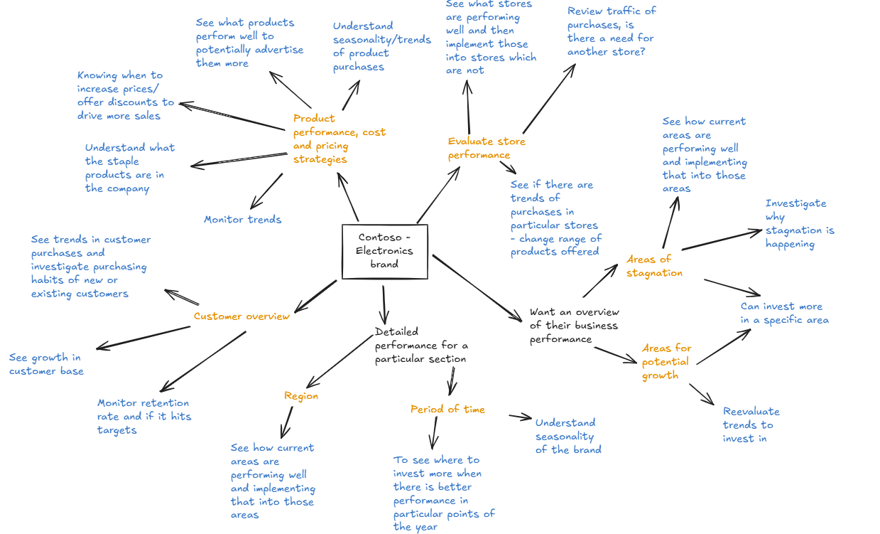
My first step was to mind map everything that I could think of, including the points made in the brief and any additional ones I could think of.
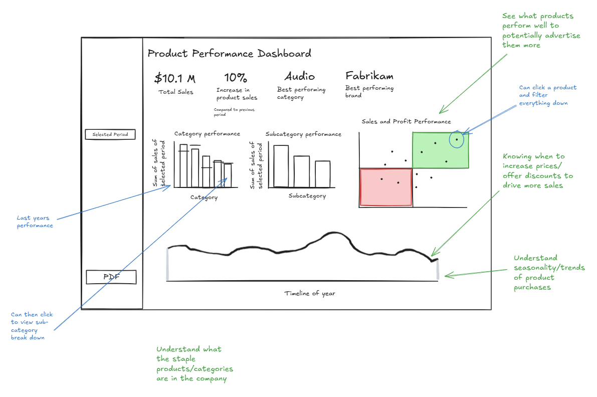
I was most interested in looking at product performance, so using those business decisions I then sketched a dashboard.
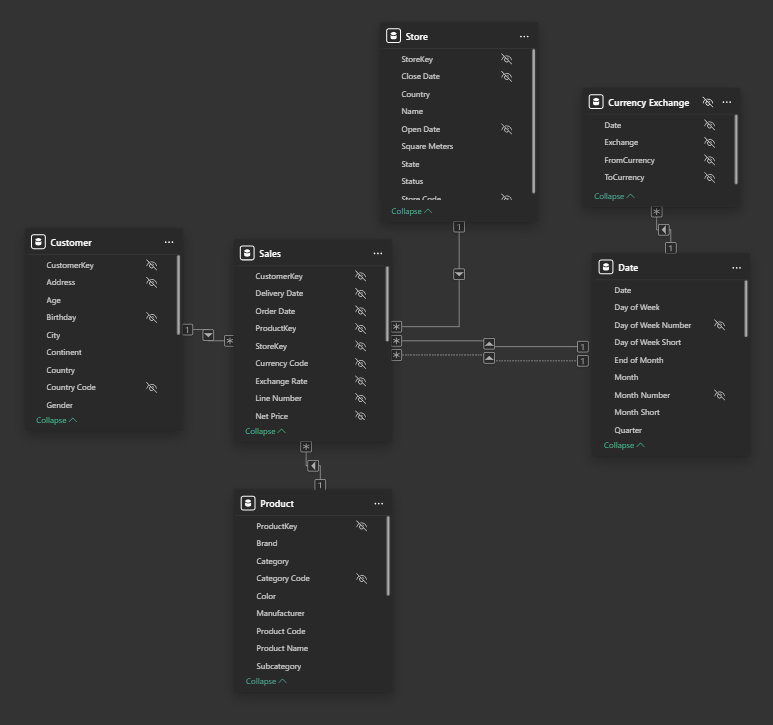
After speaking with the client (our wonderful coach), I then began looking at the dataset and the data model in PowerBI.
A lot of the calculations I used involved a lot of CALCULATE() functions, and repeated multiple times. I've put an example below.
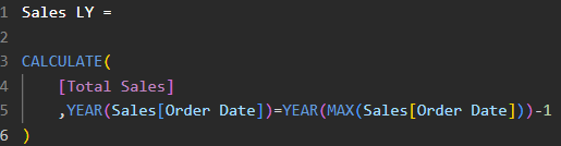
Creating the calculations took a bit of trial and error, and of course a lot of validation./ But when they were made it was a matter of changing whether it was for profit or sales.
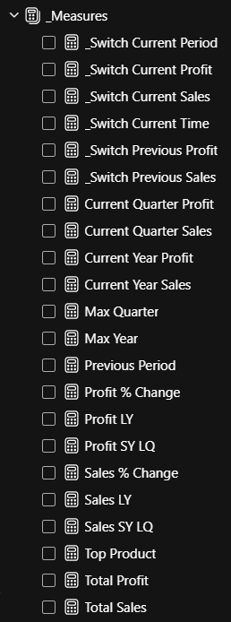
I also added a parameter which would allow the client to change the period that they were looking at.
Something I wish that I did was some data exploration as a I incorrectly assumed that the data was complete. However the dataset only went up to April 2024 leading to soome drastic percentage differences (in hind sight I should have done year to date or only limited it to only full years or quarters).
To not fall behind I moved on to build the rest of the charts and report which was simple, though time consuming. With the way that PowerBI is, unlike with Tableau where you can double click to change an element, you have to find it within menus.
Next steps...
For my next steps I would like to add some more dynamic titles to show what stores are being selected and sign post some more in regards to interactions between the charts. In addition to this I would like to change the calculation to compare the whole report using year to date. And for the scatter plot I want to add some conditional formatting or even add the quartiles for better reference.
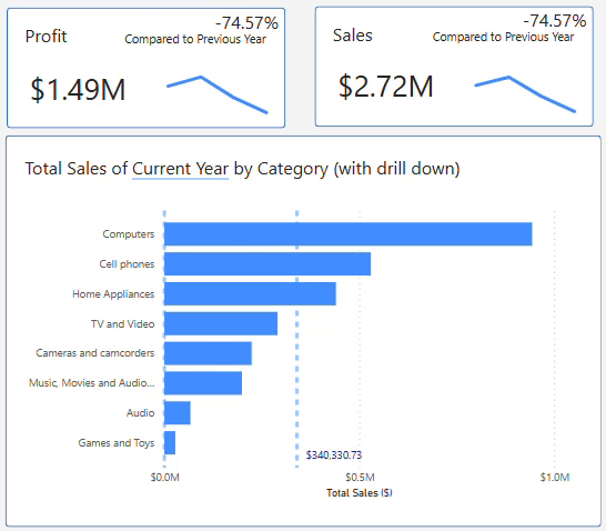
You can view my final report below!