For me, CVs are always challenging to write. With the changing scope of how CVs are processed in the first place, doing something more creative is generally advised against.
However of course with Tableau not only can we be creative, but also introduce another level of interaction.
In this blog, I'm going to be talking about my process and how I went through designing my Tableau CV to date!
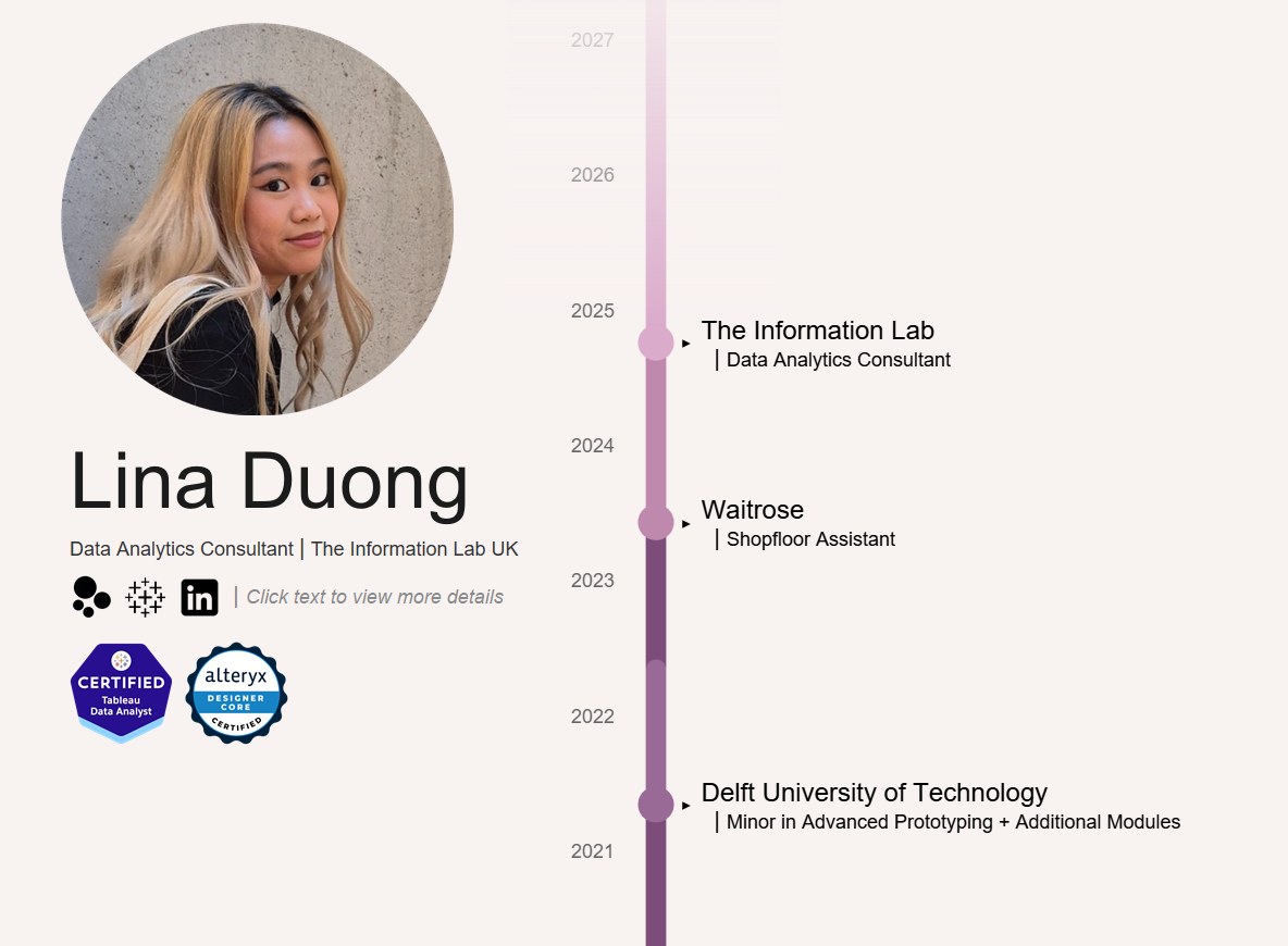
Our task for today was to build a Tableau dashboard as well as a mobile layout, allowing a much larger audience to view the dashboard.
So of course it all begins with research. I looked around Tableau public and saw some nice ways to create an interactive CV that has creativity, interactivity, and still has all the important parts for a CV to have.
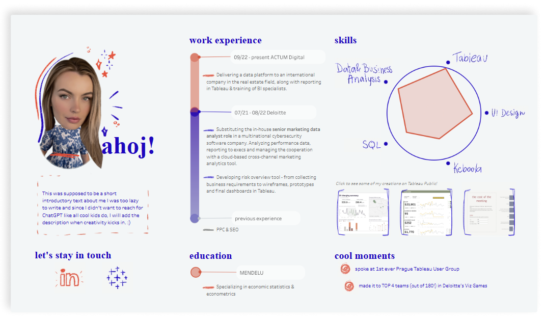
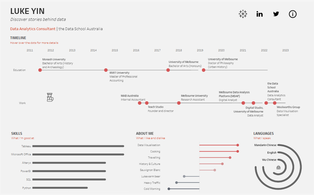
Pata Gogova and Luke Yin's dashboards helped me get some ideas on how to create my own CV.
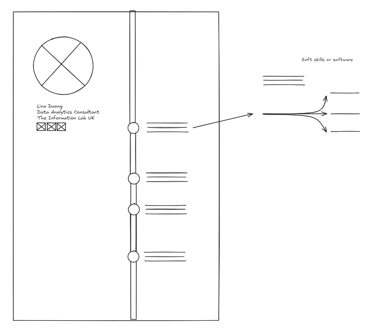
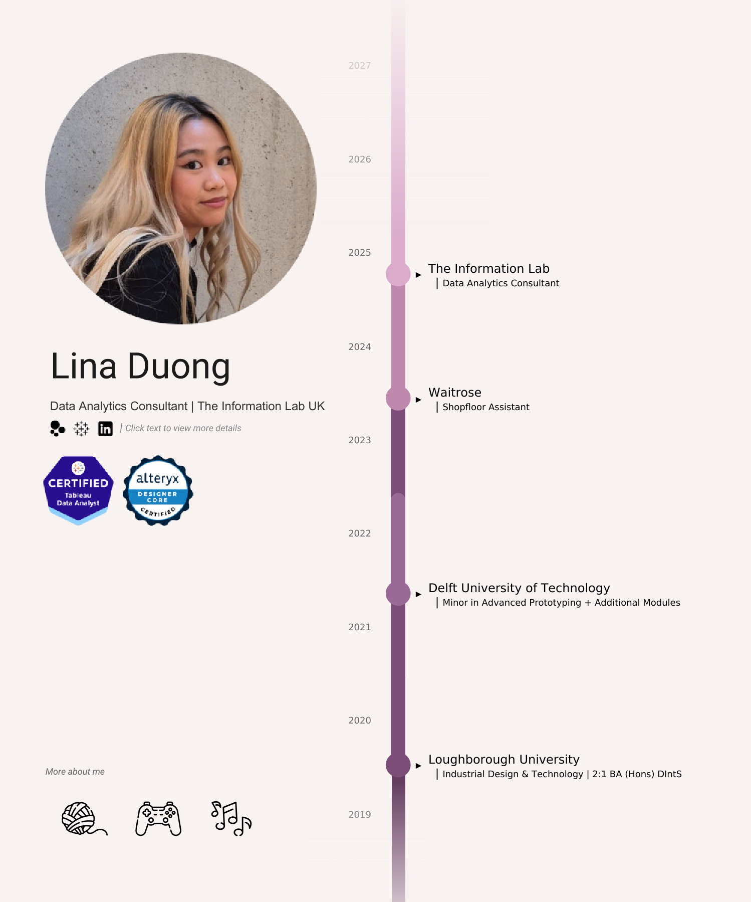
For my CV, I knew I wanted something that flowed vertically like Pata Gogova's. This also meant that I would be able to add text on the main page without having to worry about not having overlapping marks.
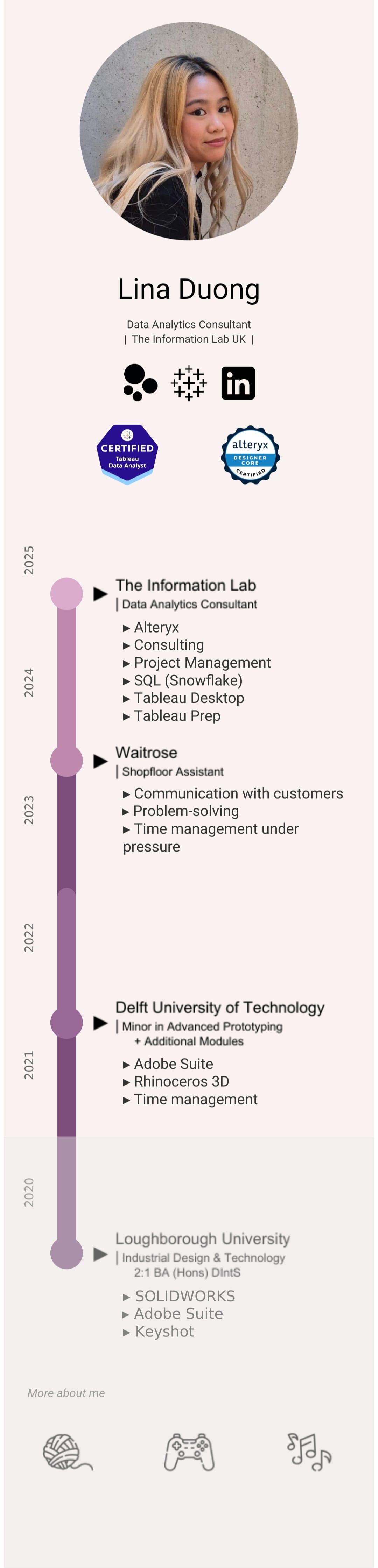
Then another idea I had was inspired by Dom Brady's use of a dendrogram in his viz. So when the milestones are clicked, the dendrogram would pop up and show soft skills as well as software skills.
So at this point I had realised I would need to learn how to make a rounded Gantt chart and also a dendrogram.
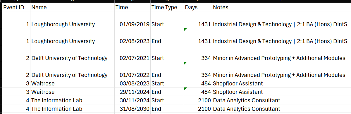
During this time, I reversed engineered multiple workbooks to create my own datasets to use for the CV.
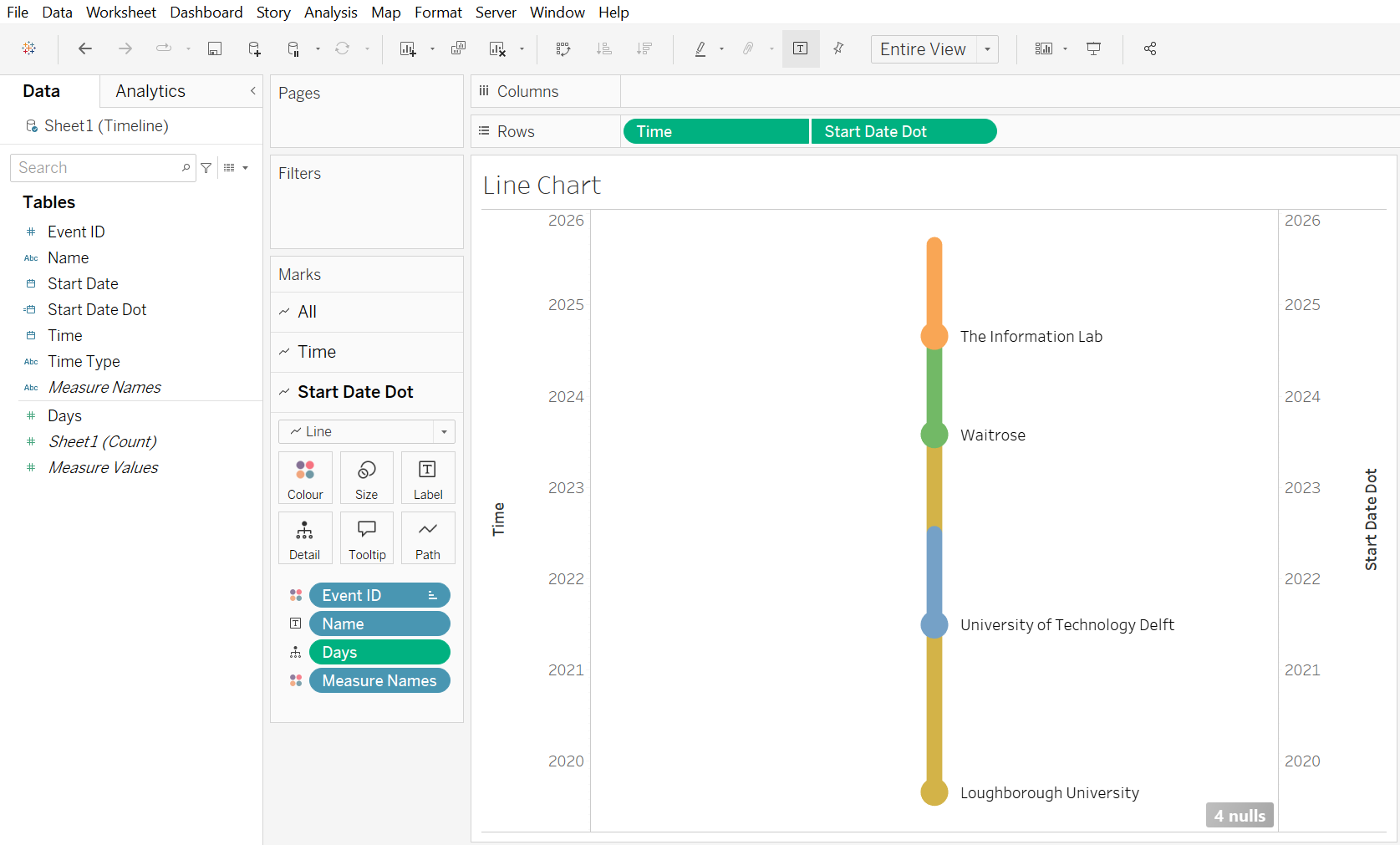
Pretty soon after I realised that I wouldn't be able to have the labels I wanted, I knew that I would need to float the text layer on top of the line chart to get the desired effect.
After getting the Gantt chart to work, I then moved to the dendrogram - which admittedly I struggled a lot more than I expected to.
I watched multiple tutorials and created another dataset to relate to the one I was using for the Gantt chart. I also ended up reverse engineering Dom's dashboard to figure out why mine wasn't working. Admittedly I spent way too long trying to troubleshoot!
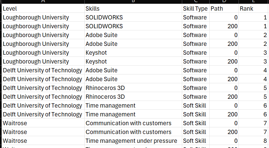
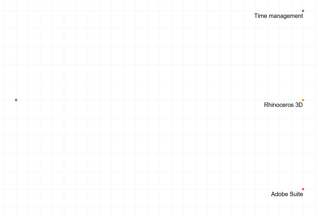
The reason why mine didn't work was because I was missing another window calculation (as I thought I could just use a regular rank)
After I got the two chart elements to work, it was a matter for choosing colours, formatting and getting everything onto the dashboard. This of course involved a lot of tedious nudging of objects, creating a parameter to show the related dendrograms, and the use of Canva for some of the images in the dashboard!
So after getting the majority of the main dashboard done, I then moved onto the phone layout which was more tedious than anything.
If you've ever had to make a phone layout in Tableau, one thing is that charts that are sized for a dashboard won't fit on a mobile screen. This meant that on the main dashboard we had to hide charts and text that we resized for the mobile dashboard.

The mobile layout on Tableau is a lot less forgiving compared to the regular dashboard. Unlike how easy containers are to use on a regular dashboard, on a mobile layout it was incredibly tedious to use.
After receiving feedback on the dashboard, I added a small section at the bottom detailing some of my hobbies.
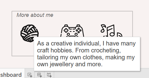
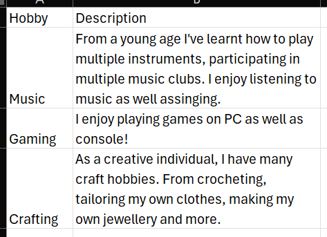
I just made a simple shape table using another dataset which has all the hobbies and descriptions in.
Then of course there was another challenge: uploading it to Tableau public. With a slightly different screen resolution, this meant that the size I was working at on Tableau Desktop didn't match Tableau Public. So I had to spend extra time to resize and rearrange everything.
This was honestly a great challenge and I enjoyed just focusing purely on design.
Next steps...
Of course there are still some things I want to change and add. For example a biography talking about recent experiences, making the dashboard shorter in length, fixing the font sizes (and the strange fuzziness too...) as well as add more skill descriptions.
View the viz here, and view what both views look like as of me posting this blog!