Day one of the infamous dashboard week at the Data School. We’ve all heard about it, read about, had nightmares about it, and so we sat down somewhat apprehensively for the 9am call with Andy to give us the task for the day.
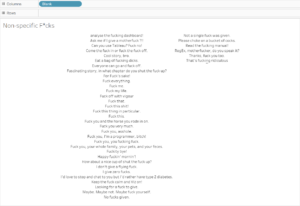
Our mission was to use the FOAAS Api to download some data, then visualise the results in Tableau. I’ll leave you to explore the details of the site in your own time, because it might be NSFW, and likewise with my finished dashboard.
I actually used a technique in my dashboard which I first tried out in my DS application, and given that I had to google it to remind myself how to do it, I thought this would be the perfect subject for today’s blog.
Using a parameter to switch which sheets are displayed
First, build the sheets you want to switch between.
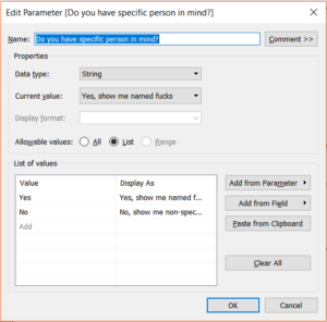
Next, you need a parameter which allows the user to choose between the sheets. In my case, I have two so I only had to make two values. If you had more, of course you’d just have to add more values for the user to switch between.
For every parameter, we need a calculated field, and to switch between sheets the calculated field is joyfully simple. All you need is to drag in the parameter you just created.
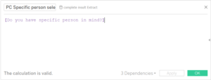
This calculated field then needs adding to both (or all) of the sheets you wish to swap between. You will need to navigate to the first sheet, show the parameter control, and choose the option which relates to that sheet (e.g. “No, show me non-specific insults” will need to be selected on the “Non-Specific F*cks” sheet).
Then, you will be able to add this as a filter; the response which needs to be ticked will depend on the sheet you want to show, so on you “Non-Specific F*cks” sheet, choose “No” and visa versa.
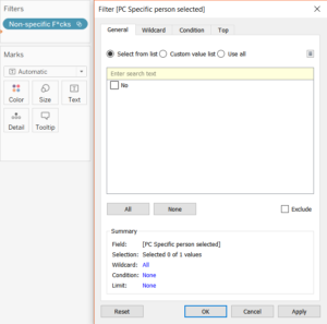
To add the filter to the other sheet(/s), navigate to that sheet, show your parameter control and chose the option relating to your sheet. In this case, it’s “Yes, show me specific insults”, which accompanies the “Named F*cks” sheet. Add the calculated field to your filter in the same way as before, selecting the value which corresponds.
Now, you should be ready to add these sheets to your dashboard! First things first, add a container to your dashboard. It doesn’t really matter if it’s horizontal or vertical, so take your pick. Add both your sheets to the container, and the parameter should show automatically.
You will need to hide the Titles for both sheets for the full effect, but you should find that you can now switch between your two sheets with ease. Don’t panic when one is blank: it’s working!
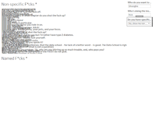
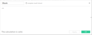
The final issue I encountered was being unable to have the entire view taken up by one sheet. This can happen when there are no pills on either the columns or rows shelf. To get around this, simply create a calculation called blank, and add that to either rows or columns. I found when you added it to columns, it will centrally align your data too. Bonus. Thanks to the Vizible Difference blog for the inspo on the blank calculation!
