


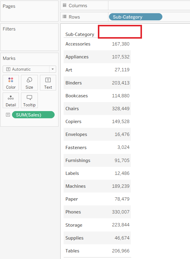
It really annoys me in Tableau when one of two things happen
- The table you make doesn’t label what the measures are (see below)
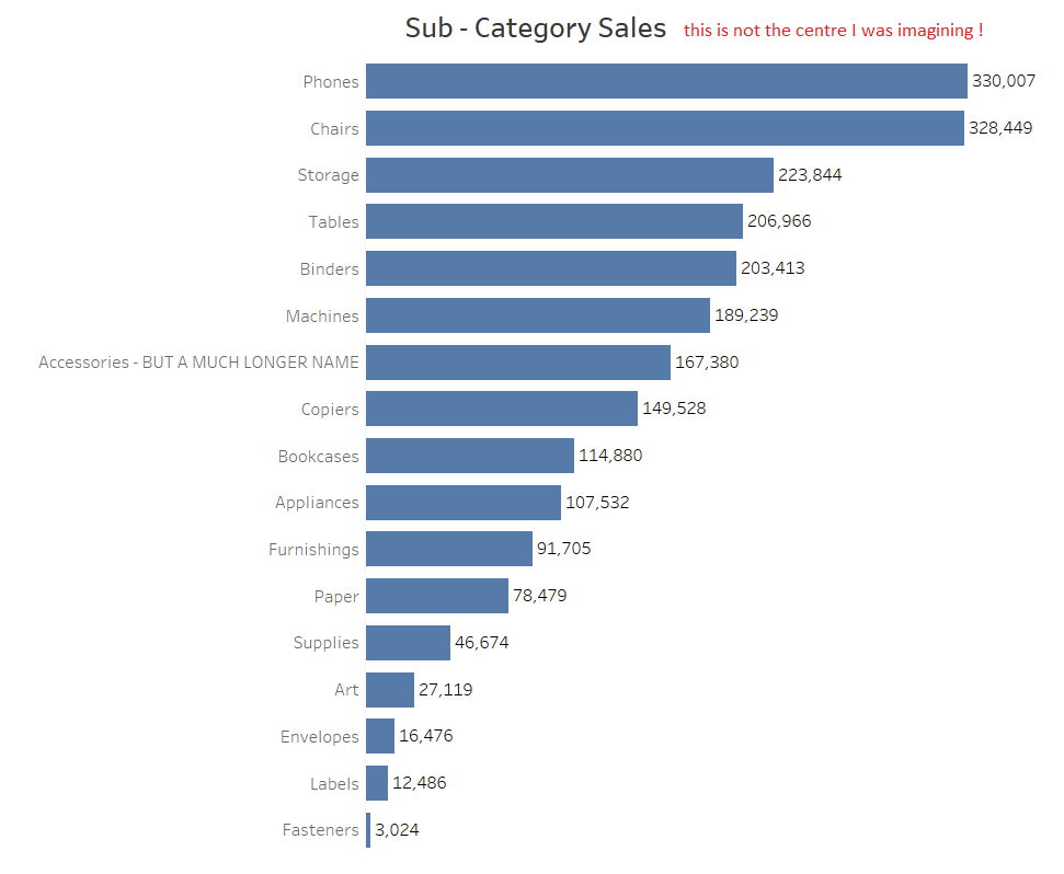
2. Using a chart title doesn’t centre the description to the axis (also see below)
There are two neat tricks to alleviate both of these problems.
METHOD 1 – DRAG MEASURE NAMES INTO THE COLUMNS SHELF
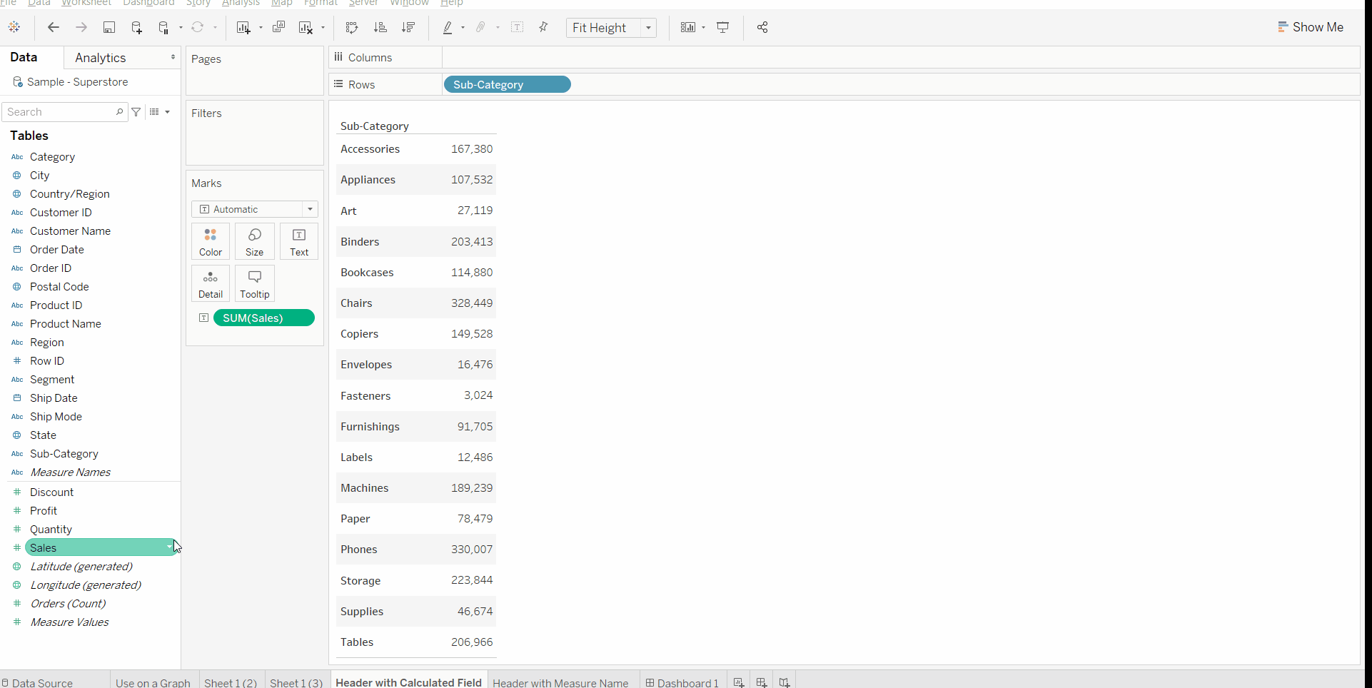
METHOD 2 – CREATE A CALCULATED FIELD (THIS IS FASTER)
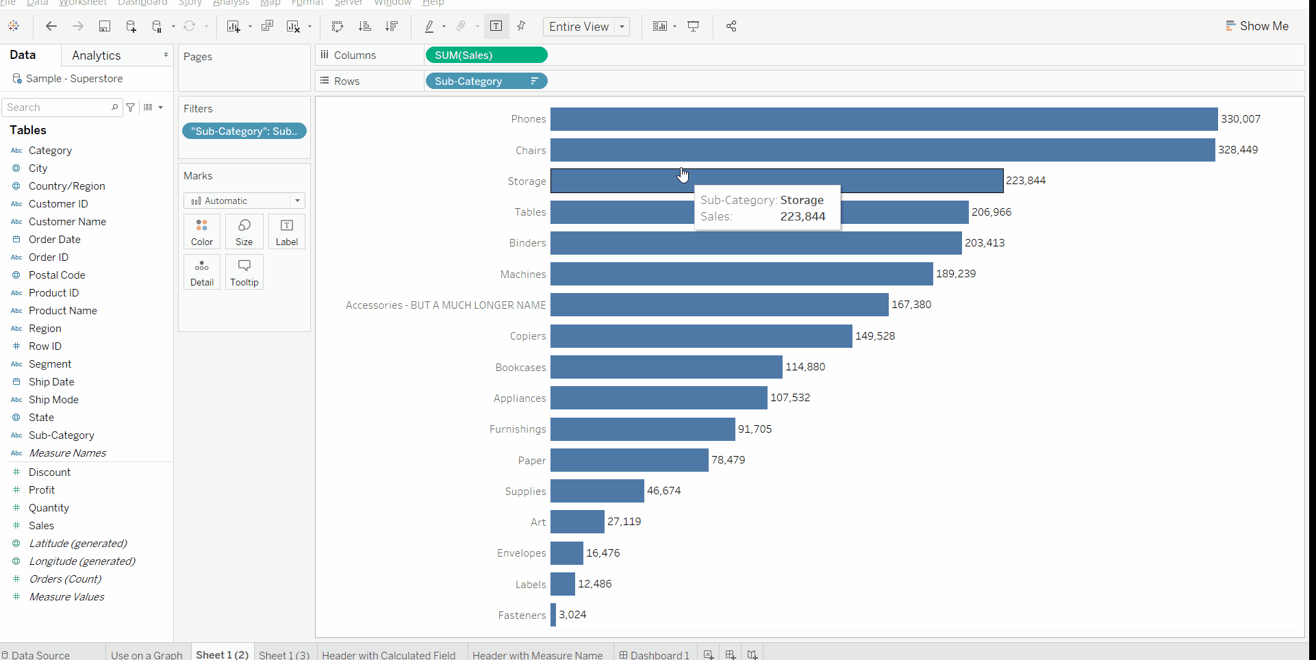
Both methods allow for the same result, however, Method 2 allows you to name the header without then changing the alias.