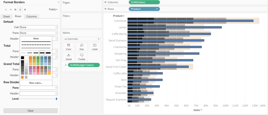
In this tutorial we will learn how to build a bullet chart. For the example below I have created a worksheet where we can see sales of different types of hot drinks in a coffee shop. It would be a good idea to compare the sales to the sales budget to see if the coffee shop has exceeded its expectations. I have dropped the sum of the sales budget in the details marked, this will be needed later on to create a reference line.
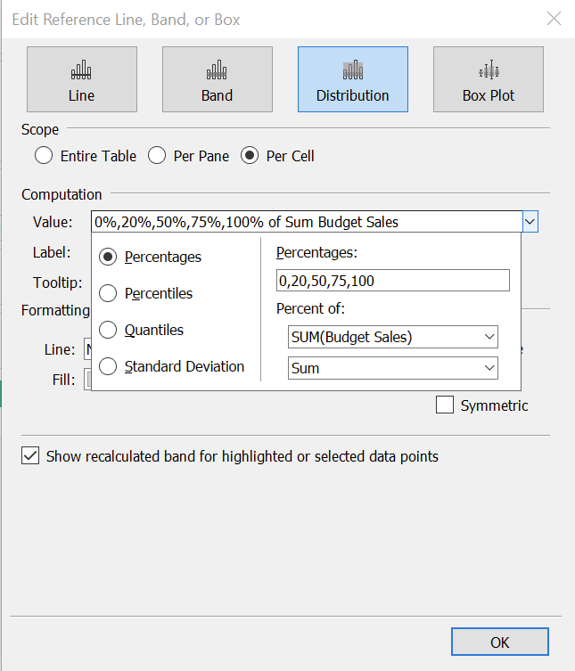
The first thing to do is to pull the reference line from the analytics line into the cell pane and select distribution.
We then want to create the distribution where the different sections are formed by calculating the percentage of the sale budget for eat hot drink, as seen below.
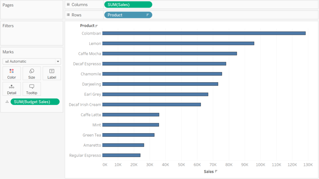
If we remove the label from the reference line we get a view like the one below.
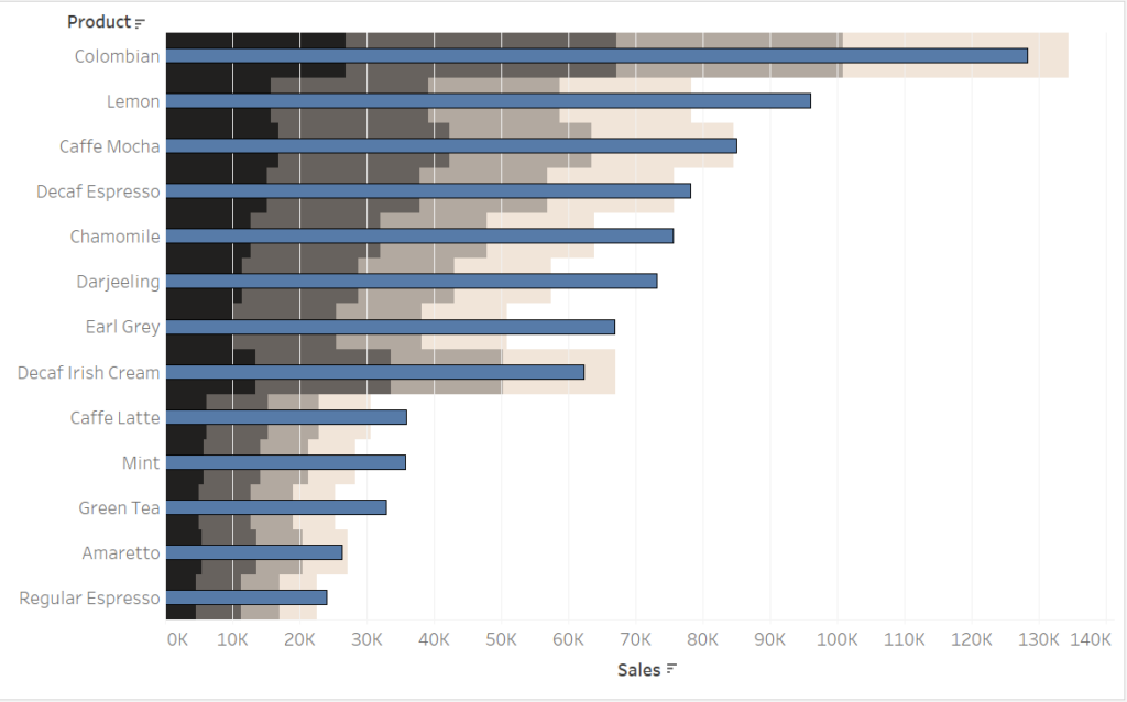
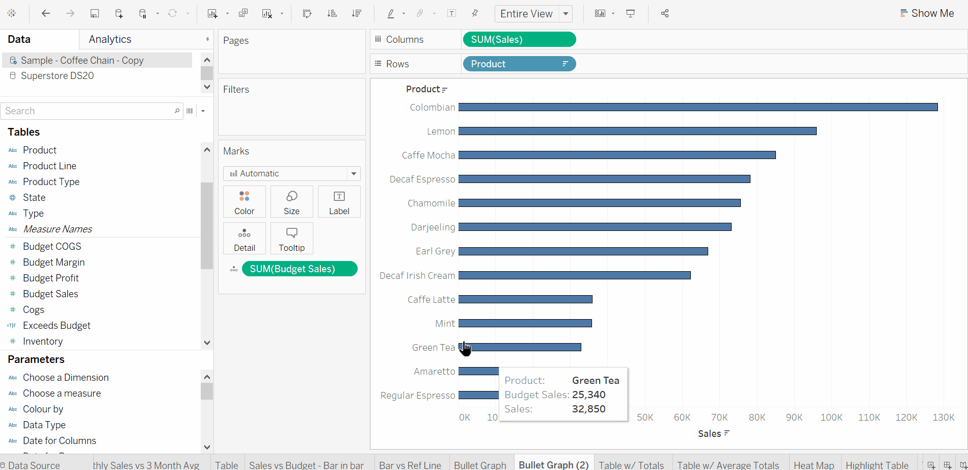
To get the bullet chart more readable, we can do some simple formatting. First we add some white border lines to distinguish between the reference lines.
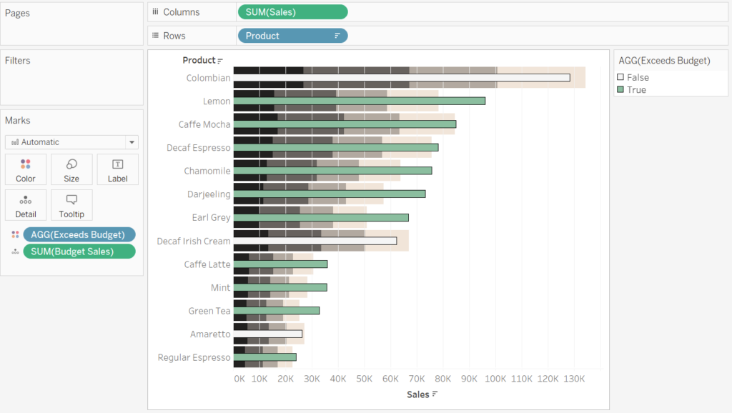
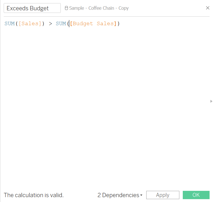
Finally, we can add a calculated boolean field that determines if we the sales have exceeded the sales budget or not. We can then place this field on the colours mark.
By dragging this on the colours mark and choosing a ‘positive’ colour for the TRUE values we get our final bullet chart. Done!