


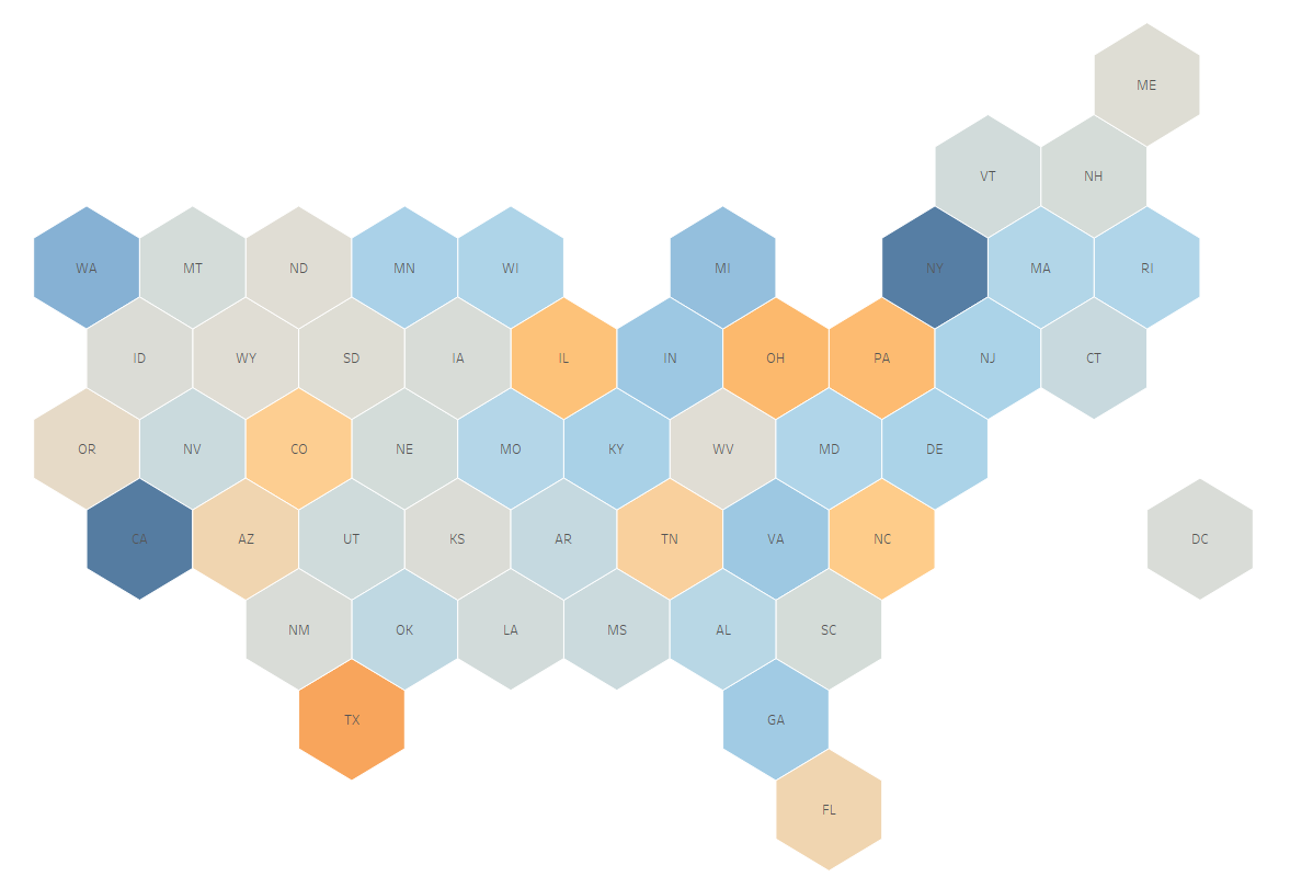
Tile maps are absolutely wonderful. They can be helpful for alleviating the primary weakness of a filled map, namely that each geographic area's size can either overemphasize or deemphasize the values you're showing that pertain to it. A hex map equalizes the size of each region, allowing you to visualize each clearly. You can find other data school blogs about how to make them here and here.
But we're not here to learn how to make a hex map of the U.S.! This blog instead covers how to harness the power of the hex map format to visualize the whole globe. The steps are relatively straightforward, but not at all intuitive.
Step 1: Obtain Tile Coordinates
Firstly we need a set of "coordinates" for each country so that Tableau knows where to place them. Various ways of mapping where exactly each country should be have been discussed in detail here. One example:
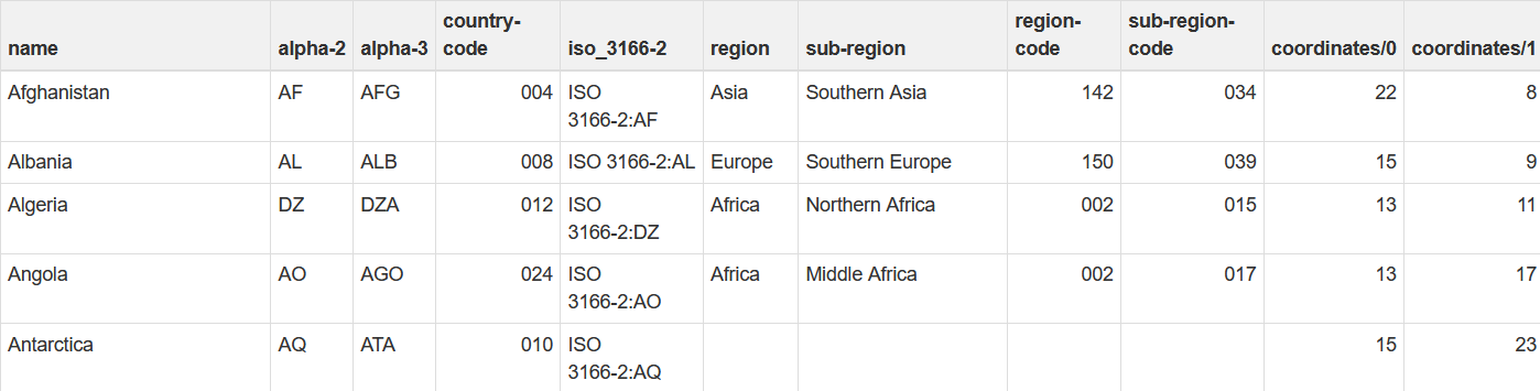
The coordinates we need will have to come from their own dataset. This github repository from Mustafa Saifee has just what we need in json format.
Step 2: Convert to CSV
We'll need to convert said json file into a csv so Tableau can read it properly, and so we can easily join it onto whatever global dataset we want to map. I made use of this online json to csv converter to do so.
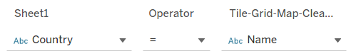
Step 3: Join Datasets
Simply join or relationship this new coordinates csv dataset onto the one whose data you're interested in mapping. The field name for countries is "name" here.
Step 4: Visualize
Throw Coordinates/0 onto columns and Coordinates/1 onto rows. Make sure to also go to Analysis -> Aggregate Measures and uncheck it. This should give you the following chart:
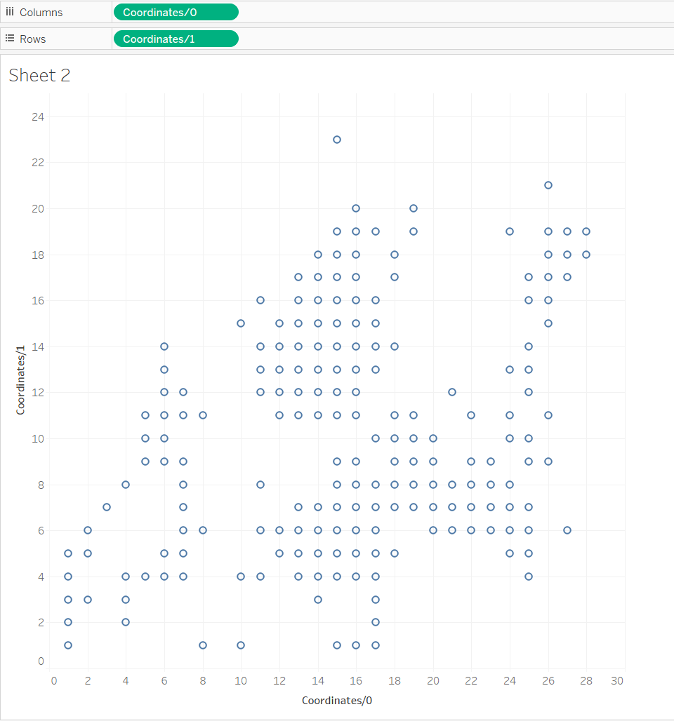
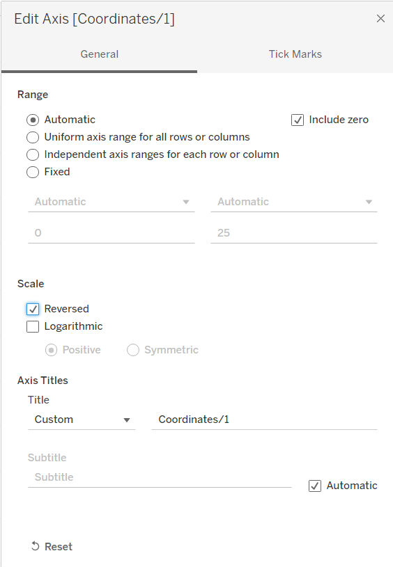
From here you'll need to reverse the vertical axis (Coordinates/1) for the map coordinates to show up right-side-up as intended.
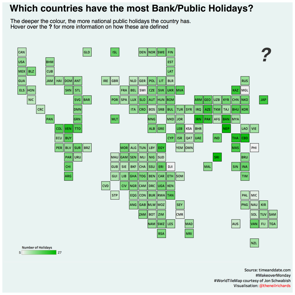
From there you're good to go. Drag the country name onto detail and chart your data to your heart's content. Here's my example, and here's a better example from Raisa Hannus, both using the most recent Makeover Monday dataset.
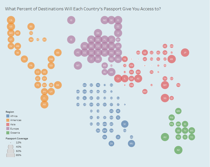
A shortcoming of this global hex map is the inverse of that of filled maps. Of course in equalizing the relative sizes of all countries, you're also making it potentially harder to navigate. Where on this map exactly is Russia? Where's the U.S.? It could definitely be argued that this is just a disruption of our usual instinct to look at the "main" countries and should be seen as a welcome one given most of us never think, for instance, "where is Lesotho?" or "where is Papua New Guinea?" Nonetheless if your aim is simplicity and/or if your audience's geography game isn't all that strong, you may want to opt for a different style of map.