Formatting tooltips in Tableau can be troublesome and tedious. By default, Tableau will include in the tooltip all relevant measures and dimensions in the view, but often in rather boring and occasionally distracting ways. What if you want something more specific, colorful or thoughtful in your tooltip, and what if you want it to display in a particular format?
As you're sure to find, taking on the task of tweaking tooltips can quickly evolve into a cacophony of cryptic calculations. However, any top Tableau technician is bound to tell you that tooltips are an essential part of your overall dashboard formatting, so let's check out a two things you can try.
#1: Adding a Dollar Sign
Recently I was working with a dashboard where I needed to turn a number into a number with a dollar sign in front of it. Not a big deal, but the kicker is that it needed to only have the dollar sign there sometimes. I was using measure switching, a fun thing you can do using parameters. Sometimes this value represented dollars, sometimes it represented raw units. I wanted it to look appropriate in both cases. Here's how I handled that.
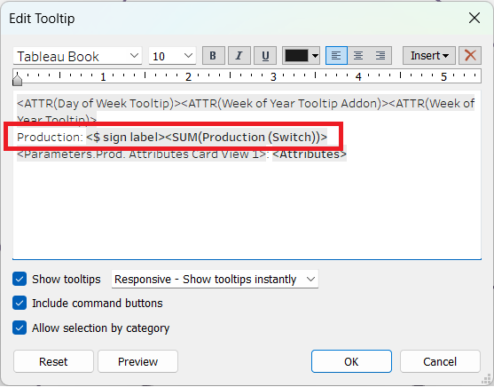
My measure switch revolved around what I called the "Units vs. Dollars Parameter." It was very simple to build, just a string parameter with two possible values: "Units" or "Dollars."
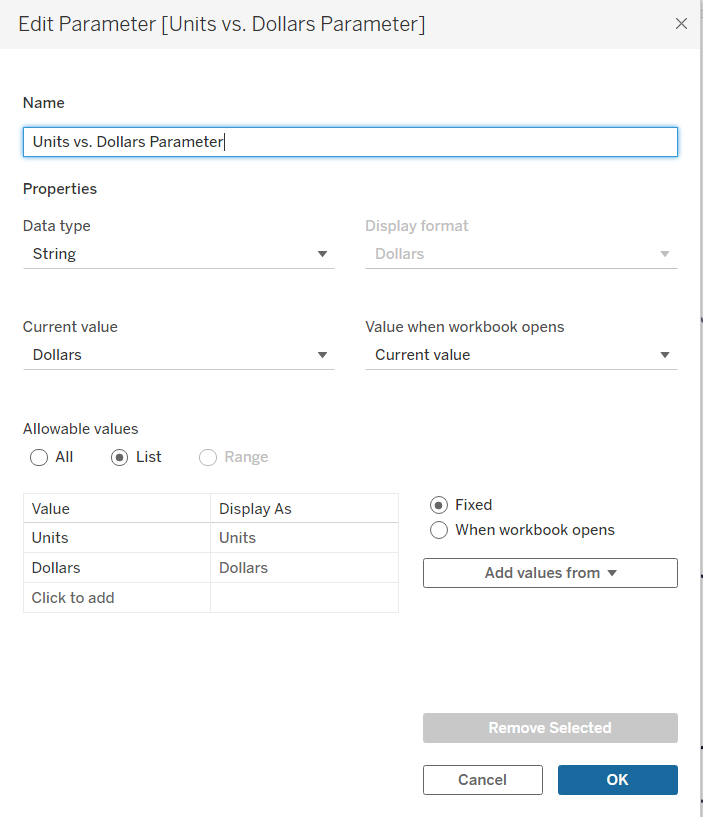
Using this parameter, I created a calculated field. Simply put, if the parameter is "Dollars," then the field will print a dollar sign. If the parameter is set to "Units," it will output a blank, indicated by two quotation marks with nothing inside.
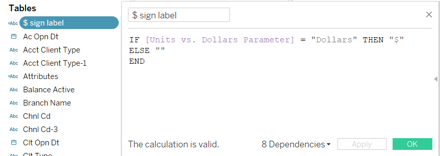
The resulting tooltips appeared as follows:


#2: Changing Date Format
Another aspect of this tooltip you may have noticed is the date at the top. This is another great example of conditionality. My dashboard made use of measure switching not just for the production values, but also for the date. Using a "Day vs. Week" parameter I was able to switch between the timeline being formatted in days versus weeks, hence the name.
Because date formatting can be a bit tricky in Tableau, I had to make use of three different calculated fields, all in tandem with the parameter, to make the date appear as intended.
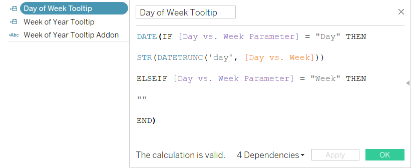
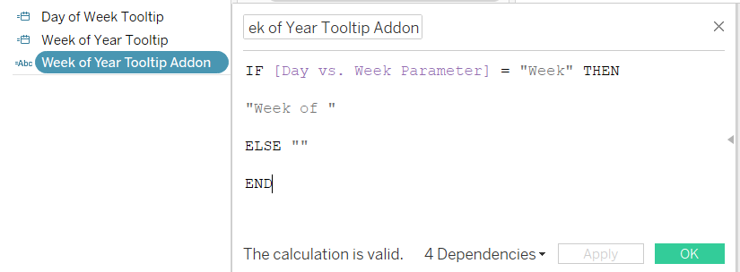
The "Week of Year Tooltip Addon" was a simple text string, something I used to ensure the words "Week of" appeared in the tooltip when appropriate:
For clarity, here's a screenshot of the tooltip format again:
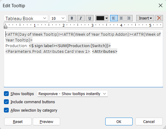
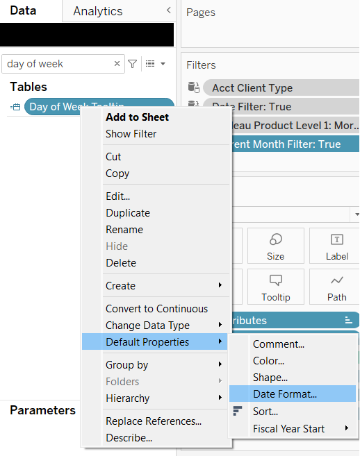
See those how the calculated fields we just discussed are at the top, each enclosed by ATTR()? For reasons unbeknownst to me, Tableau greatly delights in aggregating values at times when, to us humans, it seems utterly arbitrary to do so. As such, those had to be formatted via Default Properties -> Number Format in the Data Pane.
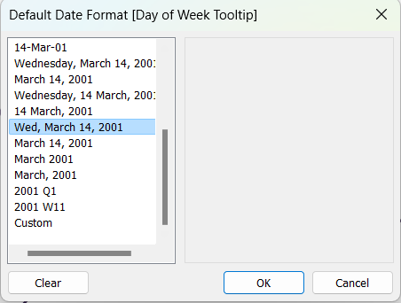
Now, when my Day vs. Week parameter was set to "Day," the tooltip would look something like this:

I hope this has been a helpful foray into figuring out tooltip formatting, which can be frequently frustrating at first, but freshly fascinating further on.
