


One survey question is scarcely enough to tell someone's personality trait, especially one that's simply on a scale of 1-5. Are three? Probably also not, but maybe patterns will begin to emerge through the use of statistics.
It's Dashboard Week here at the Data School, where in our final week of training we soon-to-be-graduates are given a topic or dataset and tasked with putting together a whole dashboard - every day. That includes the start to finish process of data prep, wireframing, dashboard creation, presentation, and writing up a blog like this one.
Looking through the FSEV UK Young People Survey data from 2013, I began to notice some similarities between certain personality questions. For instance, if a person answered positively to both "I try to give as much as I can to other people at Christmas" and "If I find something the doesn't belong to me I will hand it in," maybe we could conclude they're more generous.
I wanted to get some practice with an old friend of mine, k-means clustering, to find out which respondents to this survey could be called more or less of a particular trait, based on three or more questions per cluster. I believe this will paint a more accurate picture than simply filtering to respondents who answered "5" for multiple questions. Again, this is merely survey data, but the idea here is to practice using statistical analysis for a reasonably sufficient purpose.
K-means clustering
Normally if you want to find a relationship between two variables, you may gravitate toward creating a scatterplot and perhaps a trend line. If your software can handle creating a 3D plot, you can even add a third variable! Something I find amazing about k-means however is that you can plug in as many variables as you want, thus going beyond the realm of visualization (fourth, fifth, sixth dimensions!!!) while maintaining the ability to derive information about the relationships between the variables.
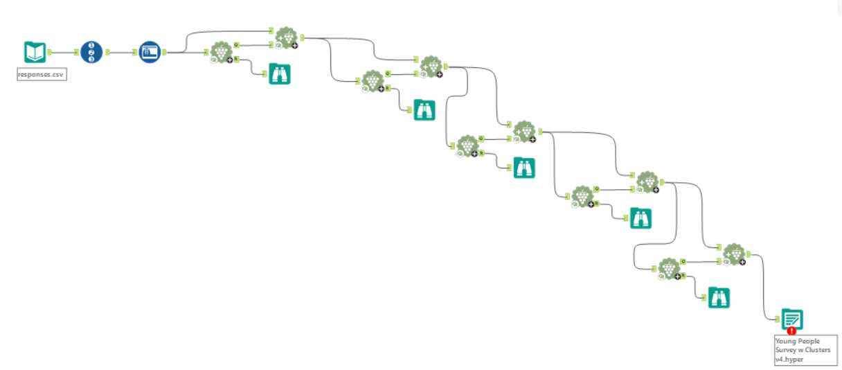
For this, Alteryx can truly do it all. By using the K-Centroids Cluster Analysis tool paired with the Append Cluster tool as shown above, I plugged in a handful of variables (survey question responses) and found the four best-fitting clusters for each. Each respondent then was "assigned" to one of these clusters.
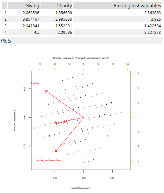
From there, whichever k-mean had the greatest sum of all the variables (representing highest collective average response to the questions on the 1-5 scale) was considered to contain those respondents with the "highest" amount of the relevant trait. The hope was to compare these respondents against the many other questions in the survey, like music preferences, demographics, and health habits.
Wireframing
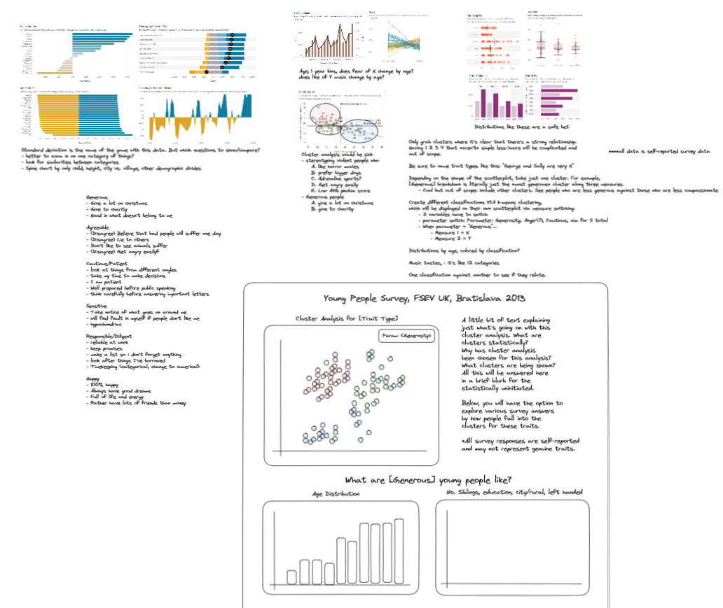
I wanted to proceed with a dashboard that would display the distribution of the clusters as well as the comparison analysis I described. My hope was to show standard deviation across responses and changes in tastes by age and other demographics like number of siblings and whether the respondent grew up in a rural vs. urban environment.
Given the task was, as every other day this week, to get all this done in one day, I didn't quite get to the point of including all that. However I did make something very cool.
The Dashboard
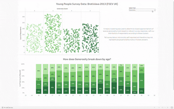
To display the clusters, I opted for what I like to call Jitter Bars. Each is a jitter plot, but the amount of dots also corresponds to the height of the "bar." It's a neat way to show each respondent as their own dot while making the distribution explicit. I did have to manually sort the cluster numbers, given they didn't come numbered in the appropriate order. The bars are now ordered from left to right as least to greatest degree of the selected trait.
The bottom displays the breakdown by age for each cluster. The color convention carries over - those with the most of the selected trait are on the bottom. If you'd like to explore this breakdown for yourself, feel free to check out my work on tableau public here. If I have time after training, I'll definitely come back to this dashboard to include that which I wasn't able to previously.