


In the vast world of data visualization possibilities it is only natural to wonder what exactly makes a visualization "good." Such a question mirrors the perennial philosophical matters of life and living. While there are certainly helpful dashboard design guidelines and competitions like Tableau's Iron Viz, there are simply no definitive rules as to what makes one data visualization better than another.
But perhaps there are at least a few values we can use to guide us toward more helpful, appealing visualizations. Let's consider the following viz by Ahmed Seyam:
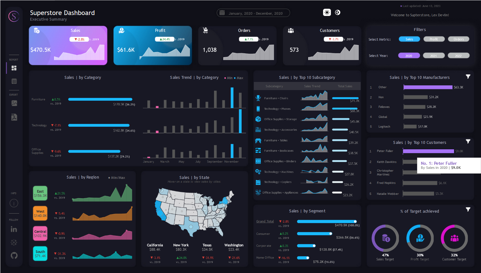
It's very colorful and eye catching, and displays a ton of information. The layout is certainly beautiful and the content is complex. But is it easy to understand? Where are you supposed to look first? What story is being told?
Here's another example:
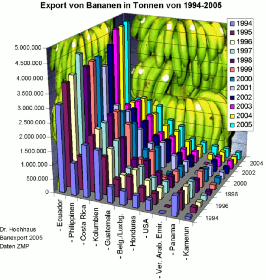
This one also contains a lot of information, and it's at least possible to get its gist. The visual design however is a bit overripe.
One more:
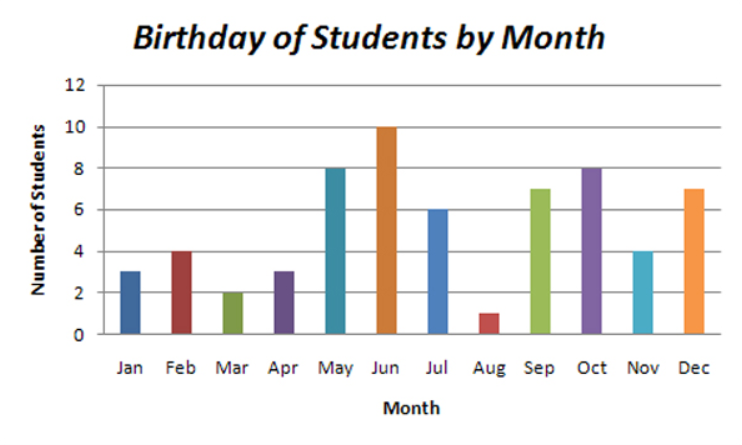
Just one look and you've got it, right? It makes sense immediately. But is it interesting? How much is there to really think about here?
I threw together this ternary chart to advance one possible way of thinking about "good" visualizations.
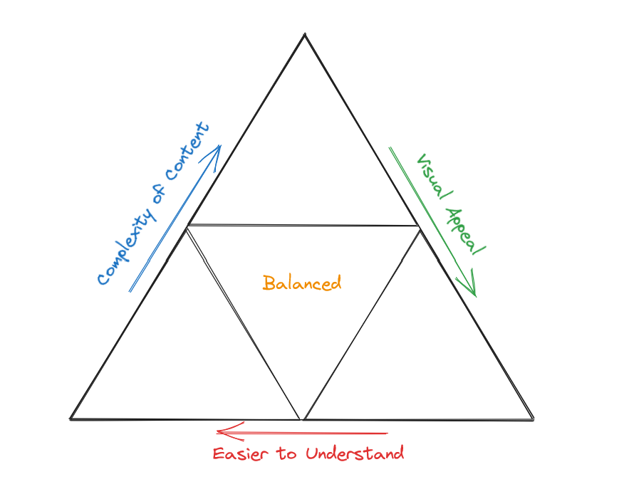
Consider the creation of your viz as a give and take between three ideals:
- Visual appeal
- Complexity of the content
- Ease of audience's understanding of the content
To elaborate, we may imagine a given viz as a point on this chart. Our first, flashy example would land somewhere in the bottom right triangle, because although it is very visually appealing, it's not immediately easy to understand. The banana export chart would land somewhere in the upper triangle given it's cluttered yet not too hard to grasp. Birthday of Students by Month might land in the bottom left triangle due to its nature as an unoffensive, uninteresting chart.
Of course, we want to create visualizations that balance these three ideals and land somewhere in the middle. What might be an example of that?
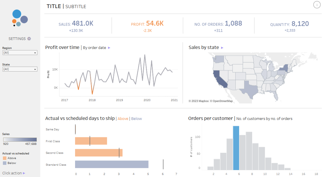
This viz by Ellen Blackburn (@ellenblackburnn) is attractive, interesting, and doesn't sacrifice any complexity in its pursuit of simplicity. It would land squarely (triangularly) in the middle.
With very few clear guidelines as to how to perfect the communication of business intelligence, it's totally fine to rely on your own tastes. Some people love black backgrounds, others find them distracting and garish. Ultimately this is a skill to be built and it will benefit any aspiring data analyst to treat every visualization as a learning experience. Good luck to you!