


This is a tutorial for when you want to have one "chart" that swaps between different measures while maintaining a unique color for each measure.
If you don't know, measure switching is when you want to show many measures against a dimension (or set of dimensions), while only having one measure visible at a time. It's a great tool to keep a dashboard clean and simple, adding an element of interactivity along the way.
Here's how you can set this up:
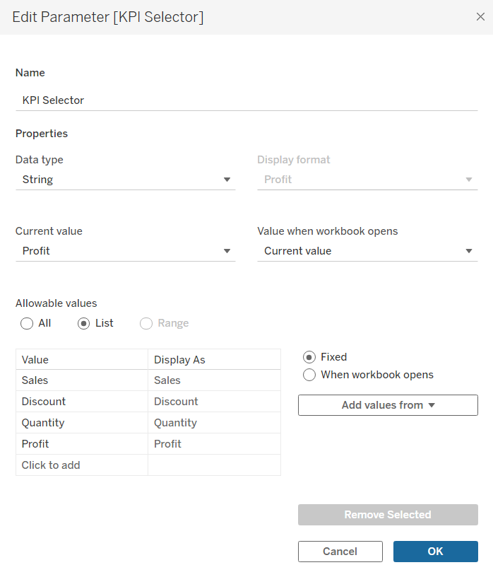
- Create a parameter with a number of values equal to the number of measures you want to switch between.
For example: if we want to switch between the four measures of [Sales], [Profit], [Quantity], [Discounts], our parameter (named "KPI Selector") may read like this:
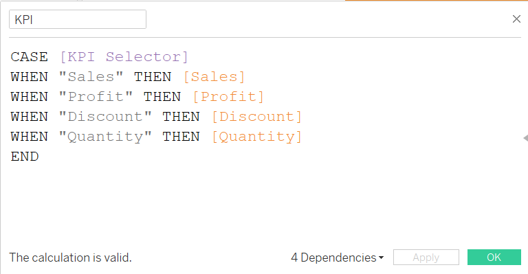
2. Create a calculated field that represents whichever measure that is selected in the parameter:
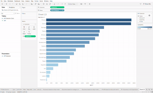
3. Right click the parameter, click "Show Parameter" and try out switching between the measures.
Normally when you measure swap using a parameter, the color will be fixed for the "KPI" measure. It's just one measure after all - one which happens to be assigned values from other measures.
You can't just assign the parameter to the color card. Parameters can't do that. Thankfully there's a very easy way around this:
Step 4: Create an additional calculated field with JUST with the parameter in it and drag it onto the Color card.
For this example, you'll create a new calculated field named something like "KPI Color" whose formula is only the [KPI Selector] parameter inside. You should notice a color legend appear on the right with one color assigned to whatever measure you have selected.
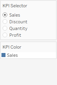
Step 5: Switch through each measure and manually assign each value the color of your choice.
Change the color of Sales to whatever you like, then change the KPI Selector parameter to Discount and you'll see the one value under KPI Color switch to Discount. Go ahead and change that color to whatever you like, and repeat for each of your measure values.
Hey, nice job if you got it to work.