


My fellow Tableau wizard, I am thankful to have found you here, with your eyes keenly fixed upon the words of my blog. Tonight we will perform a powerful spell ... we will summon a Box & Whisker plot. This spell will require several components, including Tableau, and the Superstore dataset. The time is now ... set your mind firmly on your prior statistical training ...
Step 1: The Distribution
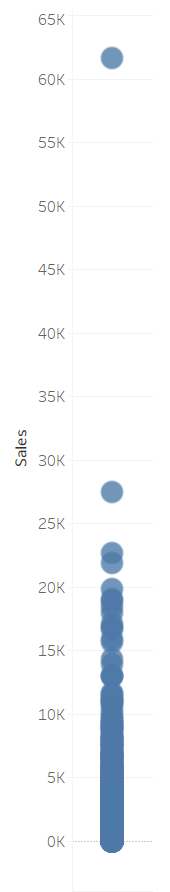
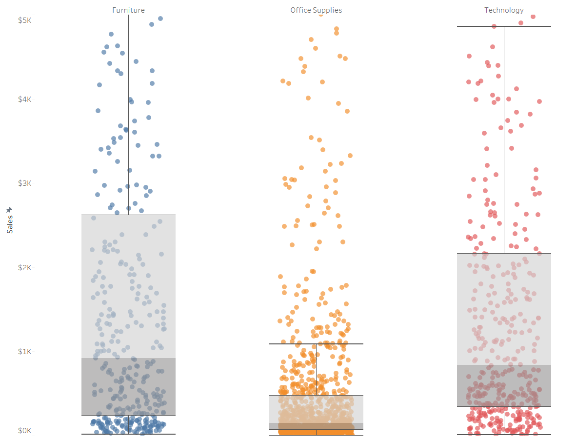
Firstly we'll create a simple distribution of the values we want to visualize - in our case, Sales. Drag Sales to Rows, and Product Name to Detail. Change the chart type to Circle. For the sake of visual clarity, consider shrinking the circles via Size and decreasing the opacity via Color. This should create the following:
Step 2: The Jitter
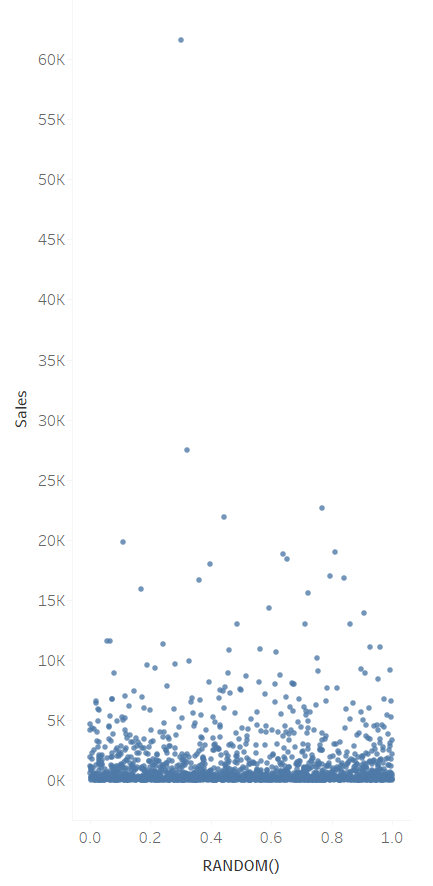
Although we could apply the box plot immediately, it would be barely readable and hardly useful. We'll fix that by "jittering" the distribution.
In Columns, double-click to manually input a formula. Type in "RANDOM()". Doing so will assign each data point a random value between 0 and 1. Now that they're spread out, it's much easier to see each unique value as well as their overall distribution.
Step 3: The Box and Whisker
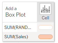
At last, we add the final ingredient to our concoction. Navigate to the Analytics pane at the top left. Under the "Summarize" section, you will find what you need: Box Plot. Drag this onto the cell section for SUM(Sales).
It has been done...!
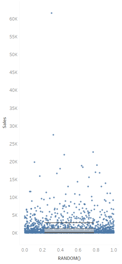
Alas... this box plot looks like a pair of ill-fitting shorts. While it does help illustrate just how far the outliers in the Sales field stray from the interquartile range, it is not very beautiful, and also still difficult to read.
For the purpose of creating a beautiful, easy to read chart, let's make an adjustment. Right click the y axis where Sales is located, select the Fixed option for the Range, and make the range from 0 to 5000. This will exclude most of the outliers from our view - while this is not statistically sound, it will help us understand how a box plot could look, were the data different.
Step 4: Beautification
Right now our dots are a bit too spread out. As we just did with the y axis, let's edit the X axis where our RANDOM() field is located. Fix the axis range from -0.8 to 1.8. Afterward, right click the axis again and uncheck "Show Header."
Likewise, perhaps we could look at products within each category. Drag Category onto Columns as well as Color.
If you would like, you may opt to remove some grid lines and dividers, and change the number format of the Sales field so it appears as currency. The result of our grand spell should have returned something like this:
Yes... the spell is complete... it pleases me to know that you too have mastered this ancient sorcery. Forever remember the significance of the interquartile range, lest you lose your soul to the dark abyss of misguided analytics... box and whisker plots are not for novice wizards, after all...