


In this project, I helped the London Fire Brigade create a dashboard to analyse their data. My main task was to provide insights into their Call Centre performance.
Background:
Emergency calls are handled by trained Call Handlers in an Emergency Call Centre. The goal is to process calls and dispatch resources to incidents as quickly as possible. Incidents are categorized based on their severity, which in our data are:
Critical Incidents: Potential loss of life or property, and
Other Emergency Incidents: Examples include flooding or rural fires.
Each incident type has a Key Performance Indicator (KPI) attached:
Critical Incidents: Standard time (SLA) is 60 seconds.
Other Emergencies: SLA is 90 seconds.
(These values might change in the future.)
The Call Centre Manager wanted to know:
What’s the overall average time for handling calls for different types of incidents?
Is the call centre meeting the SLA standards overall (this month, this year)?
Are the performance figures improving or getting worse compared to last week or month?
Here is my initial Sketch:
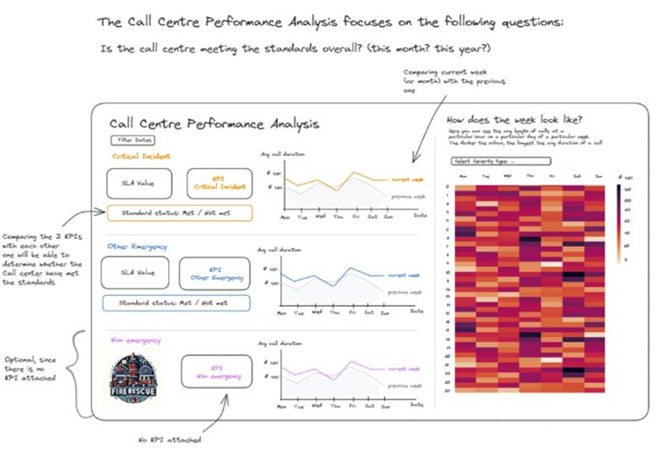
After some modifications to improve clarity and better answer the questions, here is the first version of the dashboard I created:
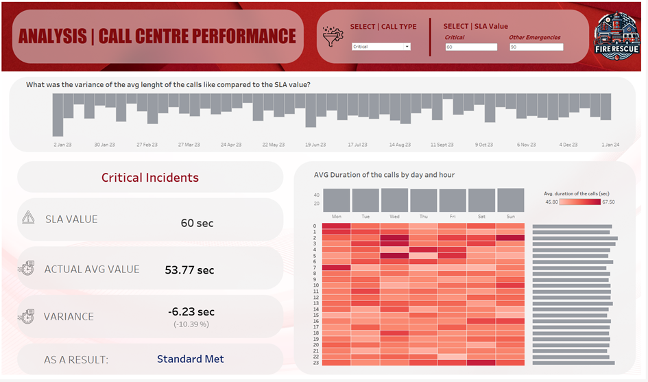
Here, the Manager can first select the call type using the filter at the top of the dashboard (critical/other). If the SLA values change in the future, they can easily be adjusted as needed.
The long bar chart shows the weekly variance of the average call length compared to the respective SLA value. The manager can choose to display data from yearly to daily intervals and compare different time periods. Selecting a particular bar will automatically update the information below to describe that specific time period.
Once the call type is set to either critical or other, the corresponding SLA value, along with the actual value and the variance, will be displayed on the left side of the dashboard. The calculations will be done, and the user will see whether the standard was met or not.
On the other side, the "Marginal Histogram" displays the hours of the day and the days of the week. The heatmap makes it easy to see the busiest times on average. The longer the call, the darker the red. Using colour to represent density or frequency of data points makes it easier to identify clusters and patterns.
The bars on the right and above show the distribution of data along the axes within a particular range. In this case, they show the average duration of calls at a particular hour of the day (y-axis) and the average duration of calls on a particular day of the week (x-axis).
As of now, it seems that the call centre’s performance is complying with the standard. Is it overperforming? Perhaps it's time to adjust the standards and see what happens. So, go ahead! Give it a try yourself. 😉