Today, I embarked on an exciting project: creating my CV as a dashboard. It was a fun and personal endeavor, quite different from the usual "corporate" CVs.
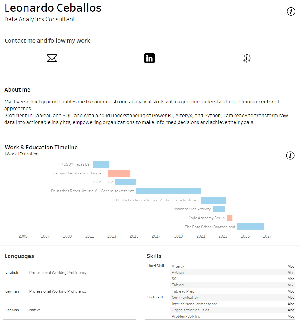
The dashboard begins with my name and current job position, accompanied by social media icons. These icons are interactive:
- Envelope: Clicking this allows users to send me an email.
- LinkedIn: A link to my LinkedIn profile.
- Tableau: A link to my Tableau profile.
Next to the social media icons, there's a show/hide info button. When clicked, it displays brief instructions on how to navigate the dashboard.
I included a small "About Me" section with some text to give a brief introduction. Following this is the Work & Education Timeline, visualized using a Gantt Chart. This chart shows the periods I spent working at various companies and pursuing education. The tooltips provide additional details such as the job/ student title, the company/education institution, start date, duration, and a brief description of my duties. An information button explains how to interpret the Gantt chart.
The last two sections of the dashboard are dedicated to the languages I speak and my skills, both soft and hard (Viz still in development).
Creating this dashboard was a rewarding experience. It allowed me to present my professional journey in a visually engaging and interactive way. I consider this a living document, and I plan to update it regularly to reflect my ongoing growth and experiences.
Stay tuned for updates and new developments!
Below, a screenshot of the dashboard: