First and foremost, what exactly is a sparkline chart? A sparkline chart is a series of small line graphs that show the general trend in a dataset. They are often useful for comparing trends within groups.
Now, how do we create one?
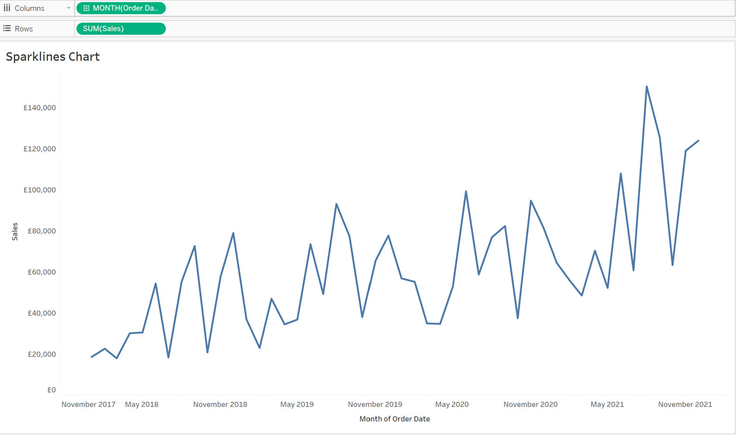
To begin with, create a simple line graph. In order to create a line graph, you’ll need two continuous variables. For this example I will be using the Sample Superstore dataset and the variables I have chosen are ‘Order Date’ and ‘Sales’.
Ps: If your date in tableau is in a date format and therefore a discrete variable simply right click, and drag it to the columns shelf and you’ll see this window pop up:
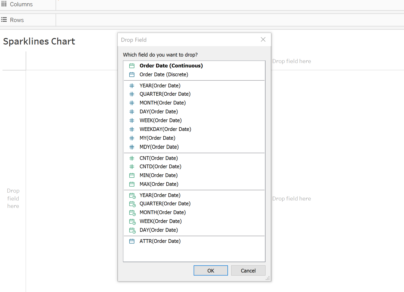
From this you can see the date options in the colour green are continuous and the ones in blue are discrete. Hence, choosing one of the green options will convert the date into a continuous format.
The line graph should look like this once you've completed it:
Now, in order to compare trends, this must be split into various categories. To do so, choose a dimension and drop it onto the rows shelf. After that, your chart should look something like this:
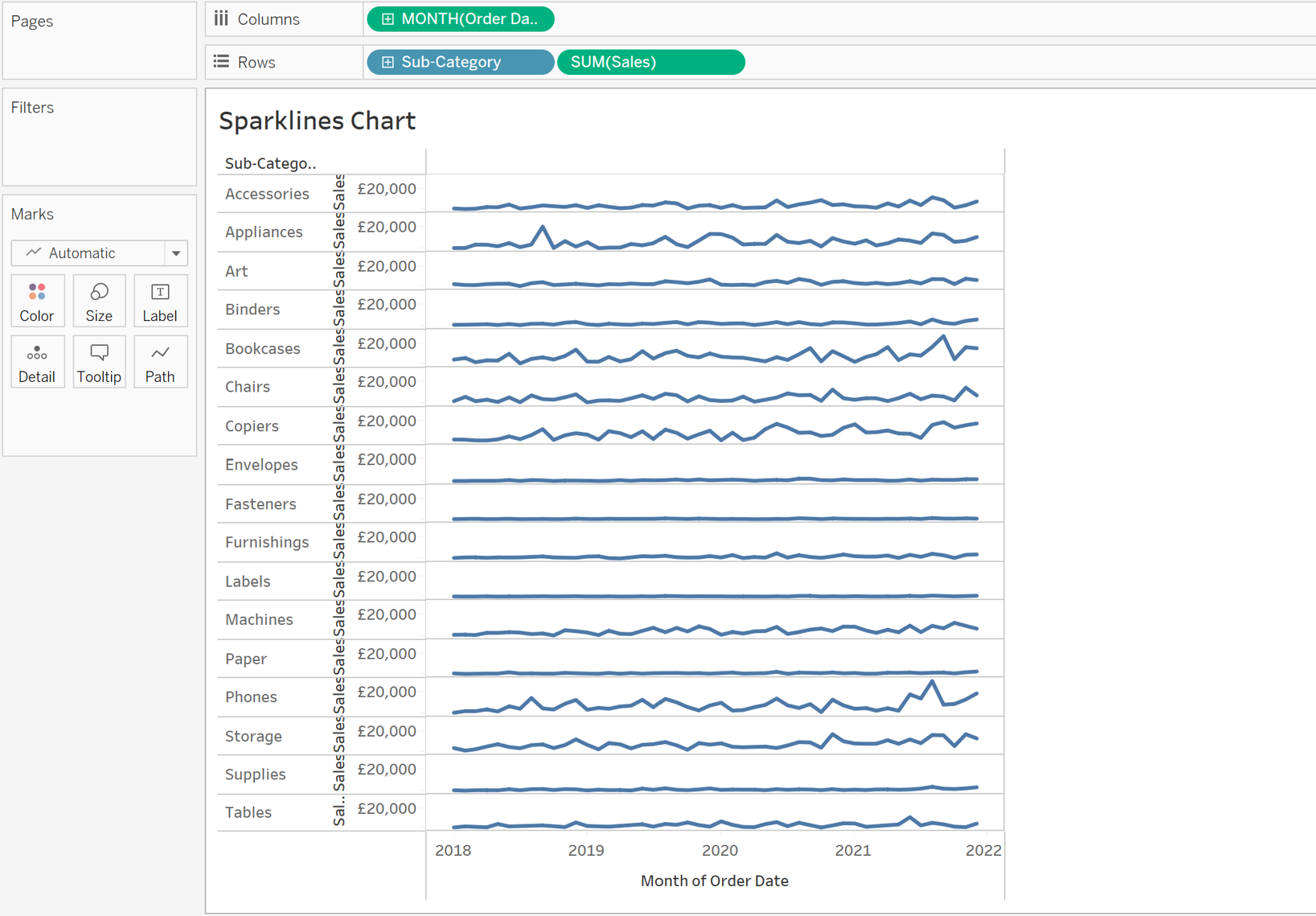
As you can see, although certain categories show a clear trend, others appear to be relatively flat. This is because tableau uses the same axis for all categories, making it difficult to identify trends in some categories such as Envelopes and Fasteners.
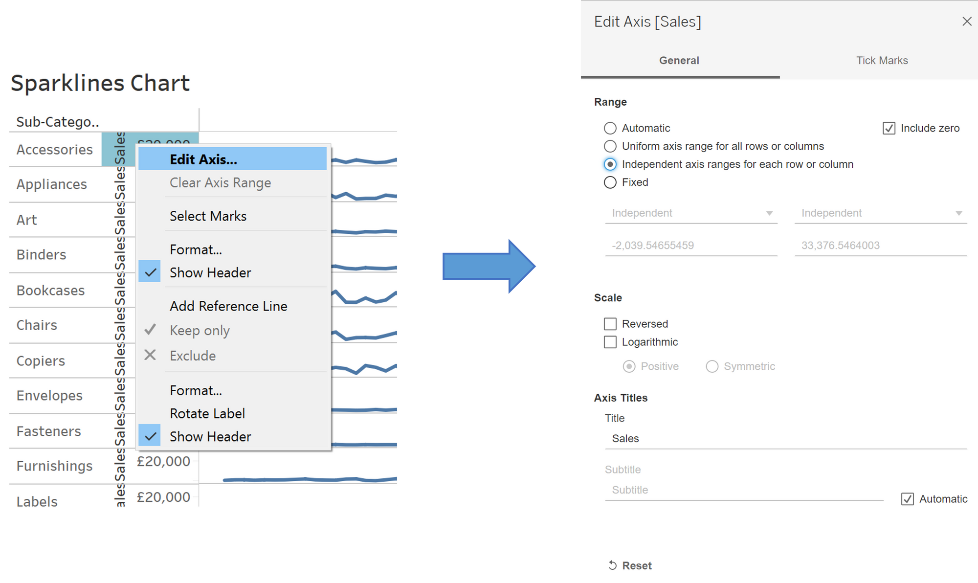
To fix this, right-click on the axis and select Edit Axis from the drop-down menu. As shown below, change the axis option from "automatic" to "Independent axis ranges for each row and column". The axis for each individual category will now be scaled depending on its minimum and maximum values.
The chart should now something like this:
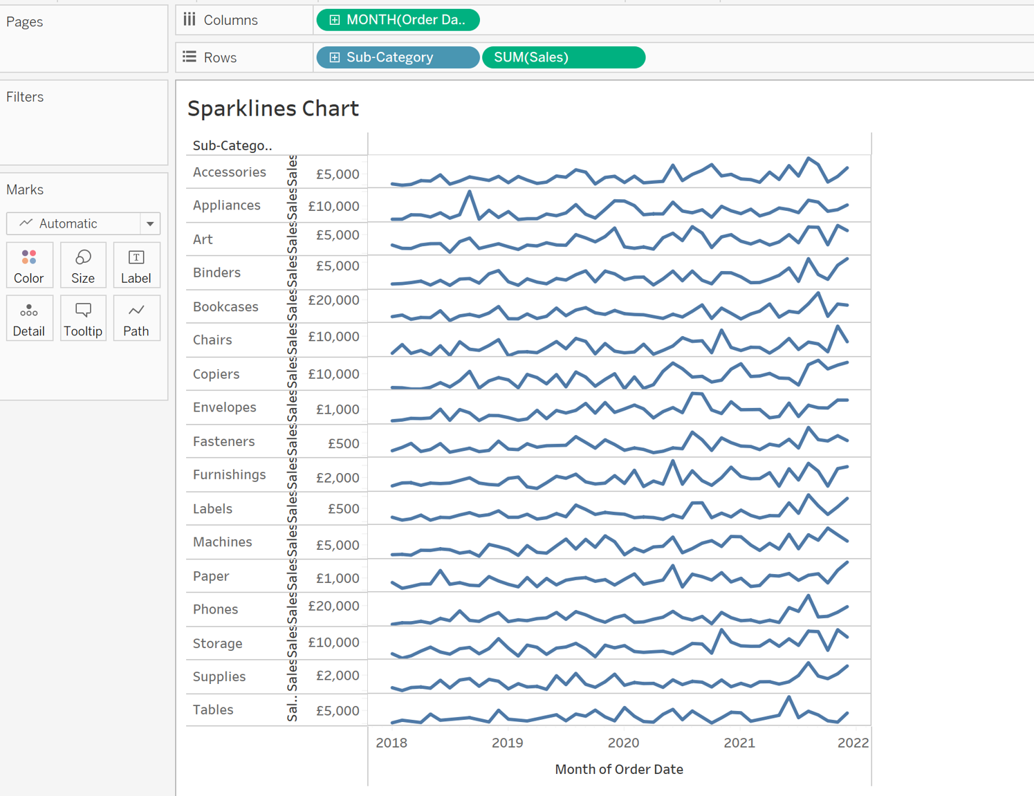
All that is left to do now is format the chart such that it looks neat and easy to understand. As a result, start by removing the header, as it adds little value to the chart. To do so, simply right-click and untick the display header box. Although it is optional, I will also hide the field labels for the rows because they add no value to this particular chart.

The finished version should look something like this:
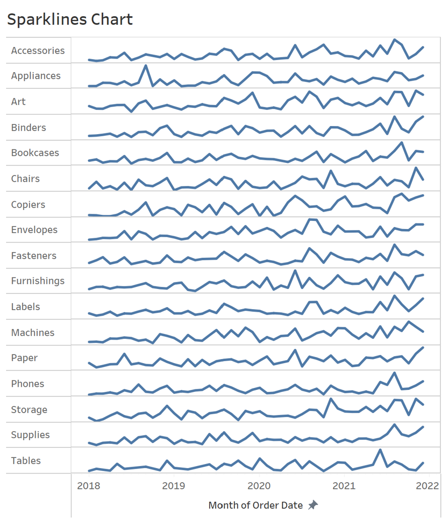
This is how you make a basic sparkline chart. You may also add more features to your sparkline chart, but that will be the focus of another blog post.
