Line graphs are among of the easiest graphs to interpret, but you can make them even easier to understand by adding some of the elements described below.
Dots
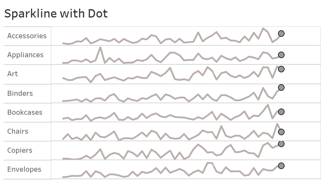
The effect of the most recent value can be improved by adding a dot to the end of your line chart. To do this, simply follow these steps:
Start by creating a calculated field, which reads as follows:
IF LAST() = 0
THEN SUM([Sales])
END
In Tableau, the LAST function returns the number of rows remaining from the current row, hence if we set LAST() = 0, it means there are no rows left till the last value, which means the current value = last value. As a result, this calculation isolates the last value.
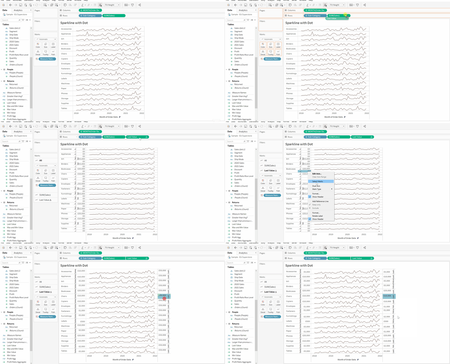
Drag and drop the calculated field onto the rows shelf. Then right-click on the calculated field's axis and choose "Dual Axis" from the drop-down menu. Right-click the axis once more, this time choose "Synchronize Axis", as displayed below:
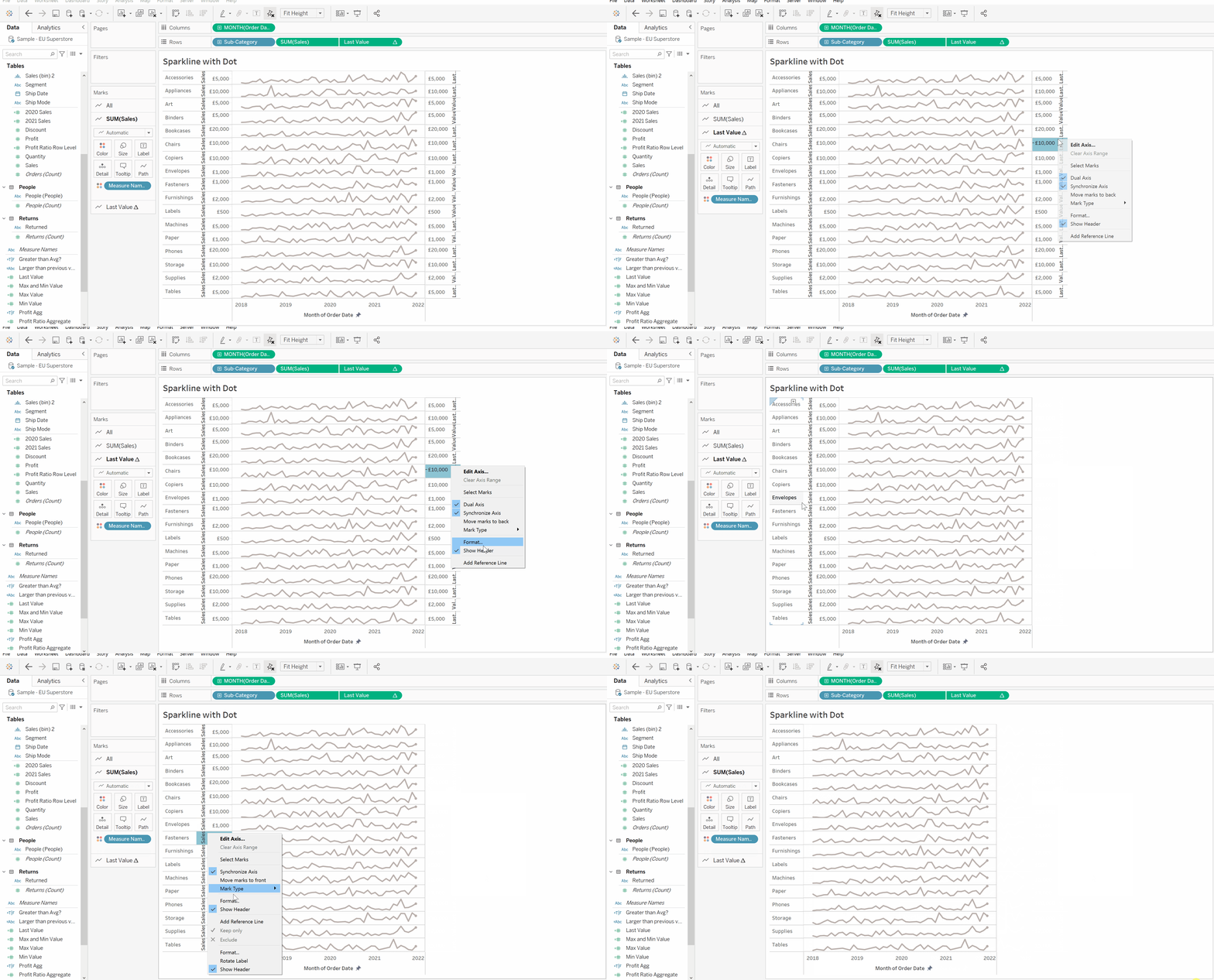
We can now remove both axes because they add little value to the sparkline chart, but this is an optional step.
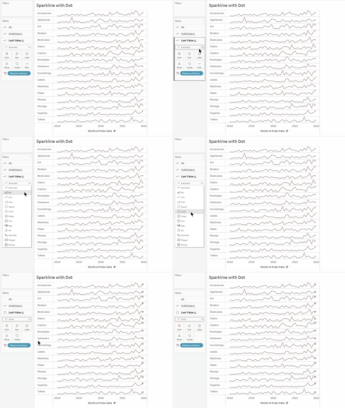
now change the mark type on the last value from "Automatic" to "Circle"
We can also create a border around the dots to make them stand out a little more. To do so, go to colour on the Last Value marks card and choose a colour for the border, as seen below.
Dots as a Indicator
We can create dots which indicate whether there is a year on year increase or decrease like the graph shown below.
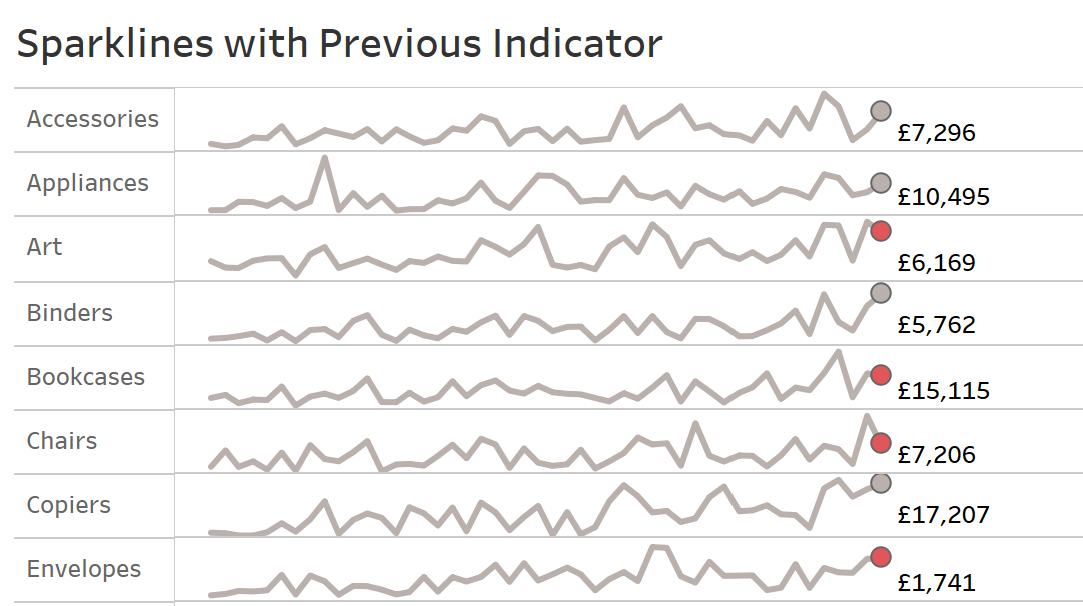
In order to do this, we need to create a calculated field like the following:
IF ZN(SUM([Sales])) > LOOKUP(ZN(SUM([Sales])),-1)
THEN
'Higher' else 'Lower'
END
The ZN function simply returns a zero for any nulls within that expression. E.g. if the there was no sales made in one February and hence the sum of sales February was a null, then the ZN function will set the sum of sales for February to a zero.
The LOOKUP function returns the value of the given expression in target row. E.g. LOOKUP (SUM([Sales]),-1) translates to the Sum of sales for 1 row prior to current row.
Therefore, this IF statement translates to:
If the sum of sales is greater than the sum of sales for one row before the current row then 'Higher' otherwise 'Lower'.
Now drag the calculation and drop it on top of the colour mark for the last value.
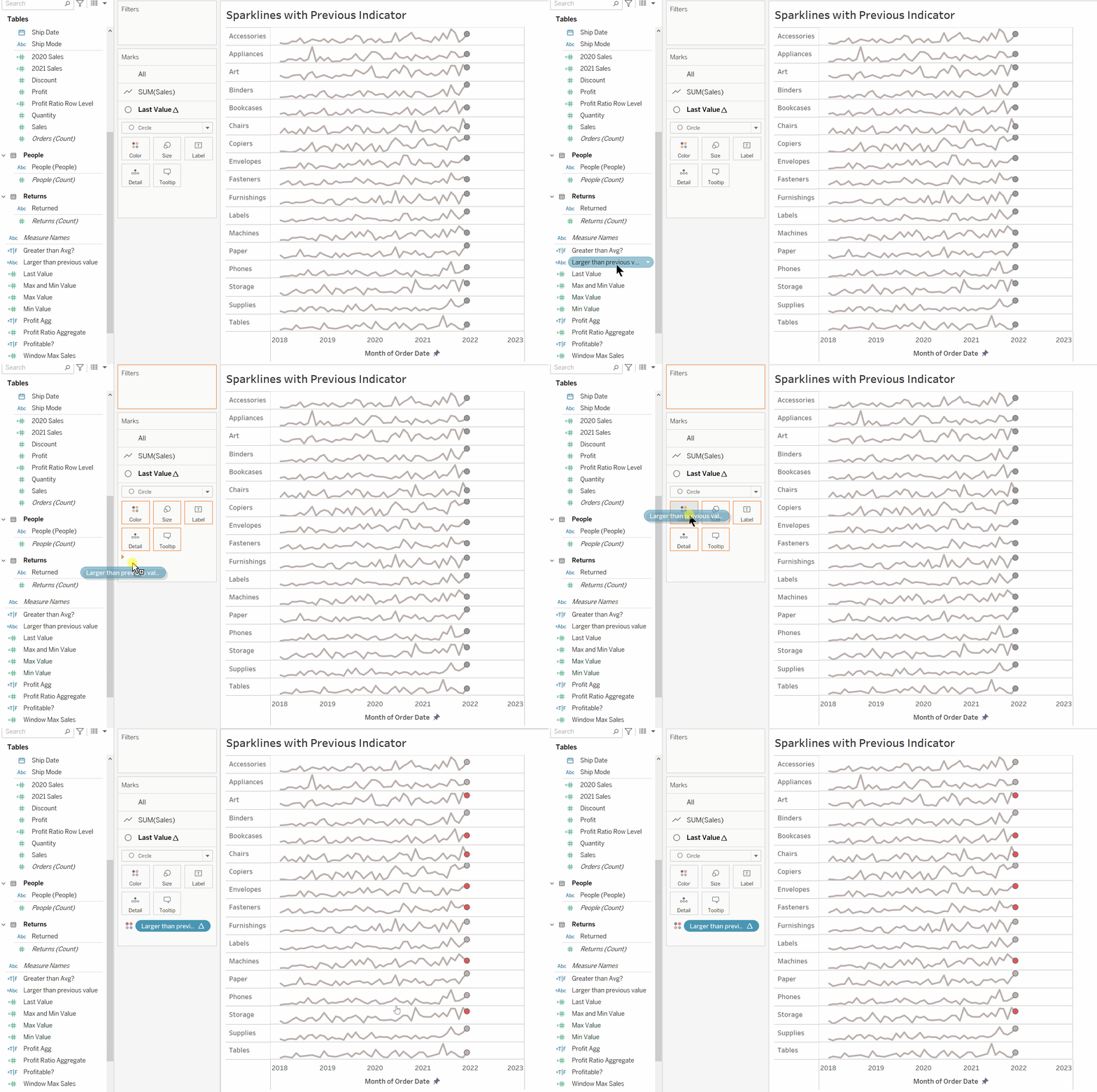
The Lookup function is a table calculation so check if the calculation is computed using the table across, like shown below:
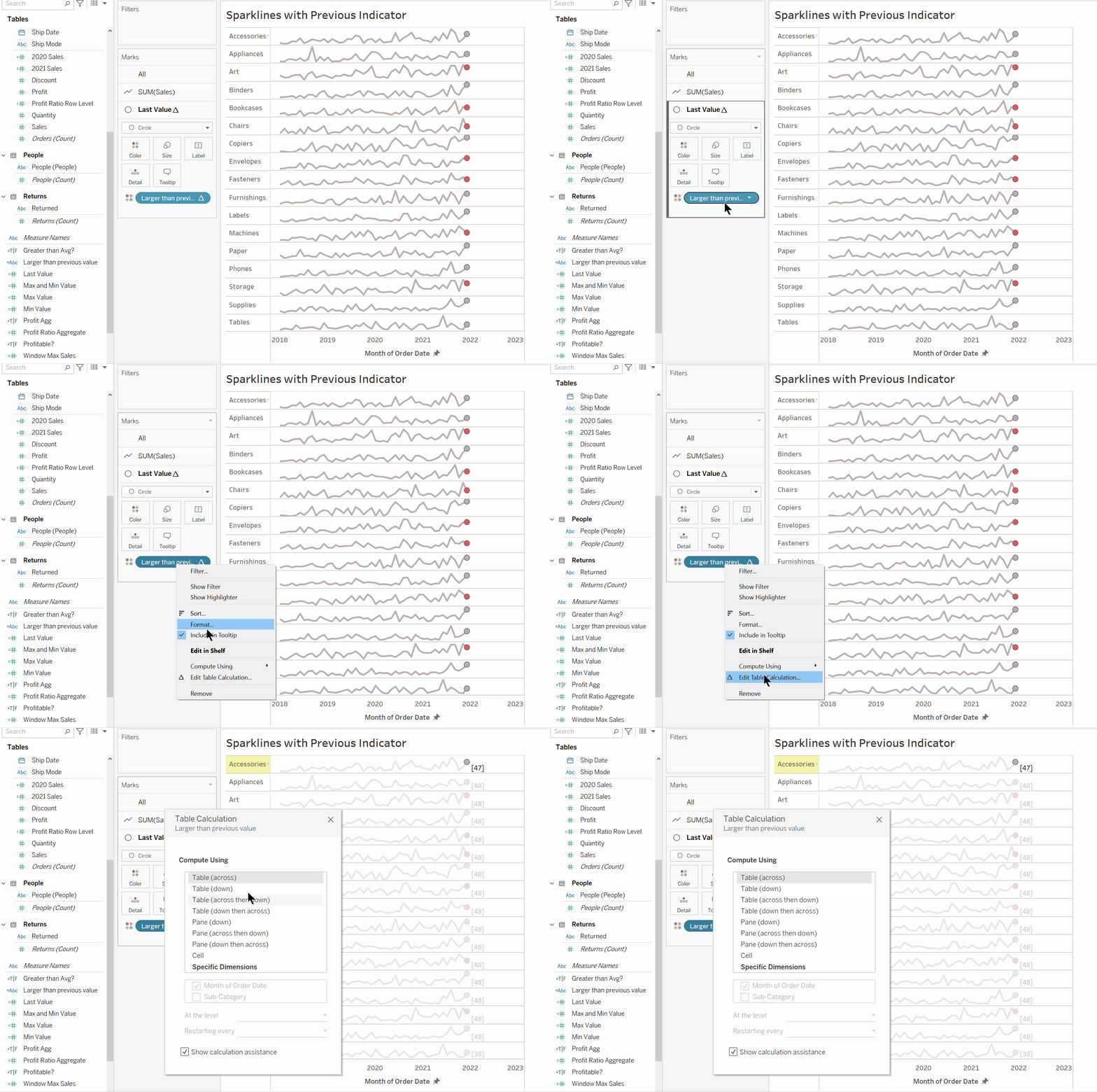
Now you can see the colour of the dots change based on whether there has been a year on year increase or decrease.
We can also add labels to the dots by following the steps below:
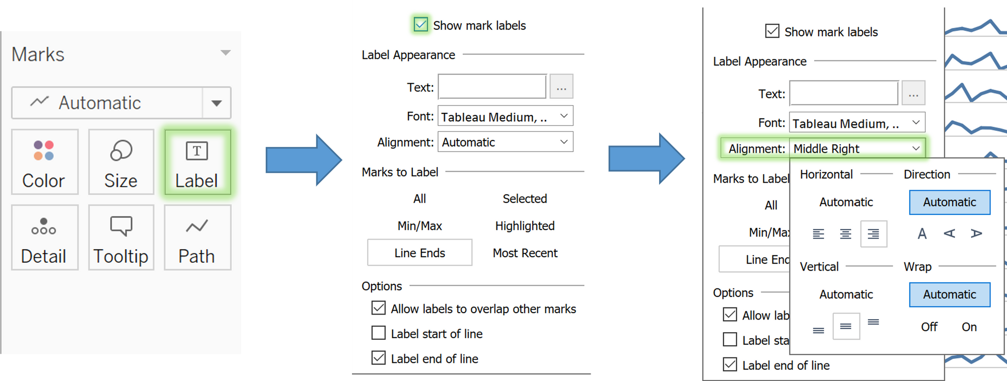
And that is how you can enhance the appearance of your line charts with dots.
