I will be showing you how to wireframe a Tableau dashboard. This will assist you in creating a well organized dashboard. So let’s jump right into it and get started.
Wireframing acts as the foundational plan for your visualization, outlining the layout before diving into the intricate specifics of your Tableau dashboard. It empowers you to refine ideas, consider user interactions, and make informed decisions for a more effective and impactful dashboard.
When creating a dashboard, you will see a pane labelled ‘Objects’.
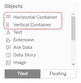
In this pane there are two main containers. The ‘Horizontal’ container and the ‘Vertical’ containers. These are the base in structuring your dashboard.
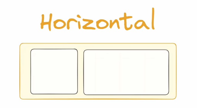
‘Horizontal’ containers are used when you need to place objects beside one another.
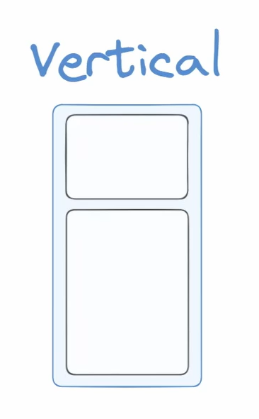
‘Vertical’ containers are used when placing objects on top of or below one another.
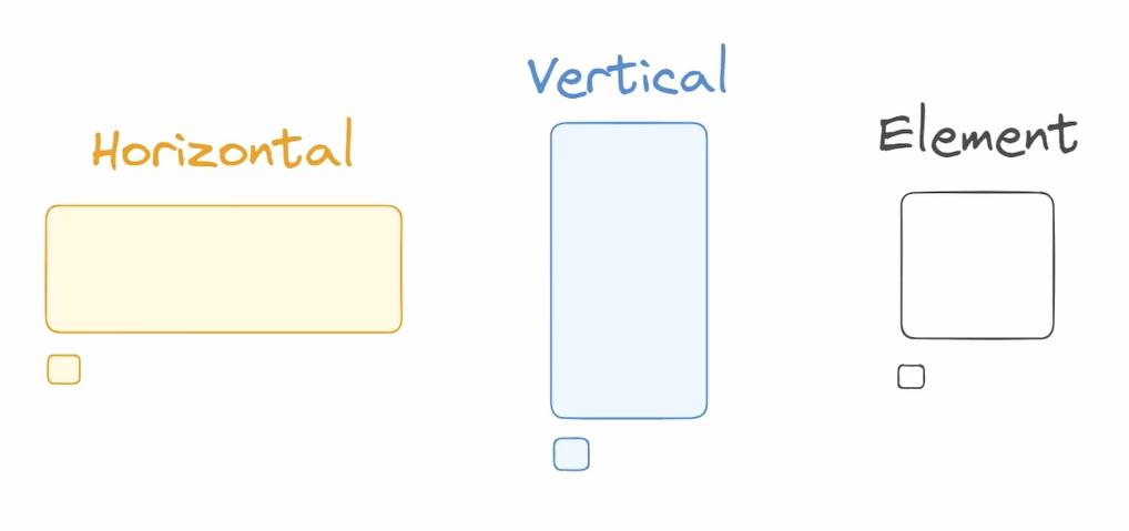
I have color coded and labelled containers according to the elements we will be using in our example.
The program that we will be creating this layout in is called Excalidraw. You can go to Excalidraw.com so that you may follow along with the tutorial.
The image I have below is the dashboard we will be creating a plan for to recreate in Tableau. The dashboard was created as a Workout Wednesday on workout-wednesday.com by me which you can find on my Tableau Public.
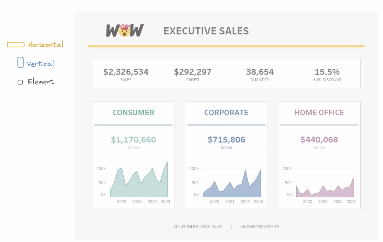
Now that we have our tools, let’s begin creating the wireframe.
We will work our way from the most outer container to the most inner elements. This is because it helps establish a clear hierarchy of visual elements, ensuring that primary containers and sections are defined before addressing finer details.
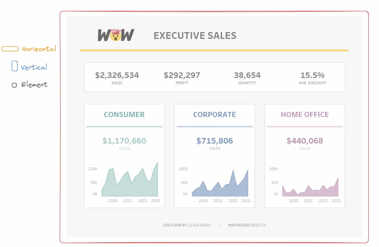
Let’s start with the main container, but to decide on the shape, we must look at the elements next in the hierarchy. In most cases, we will have header, body and footer containers within the main container.
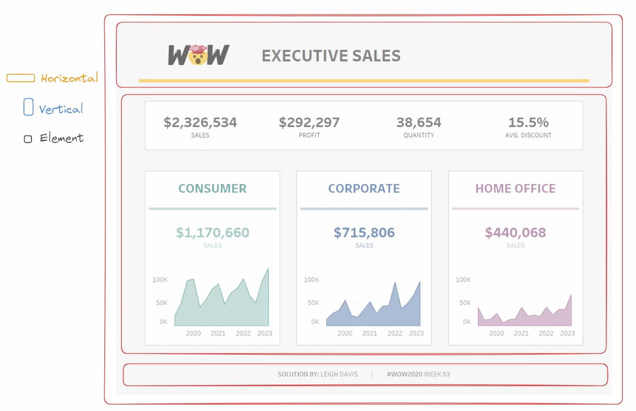
The header, body and footer containers are stacked vertically on top of one another in this example. Therefore, we will place the largest and most outer container as a vertical container.
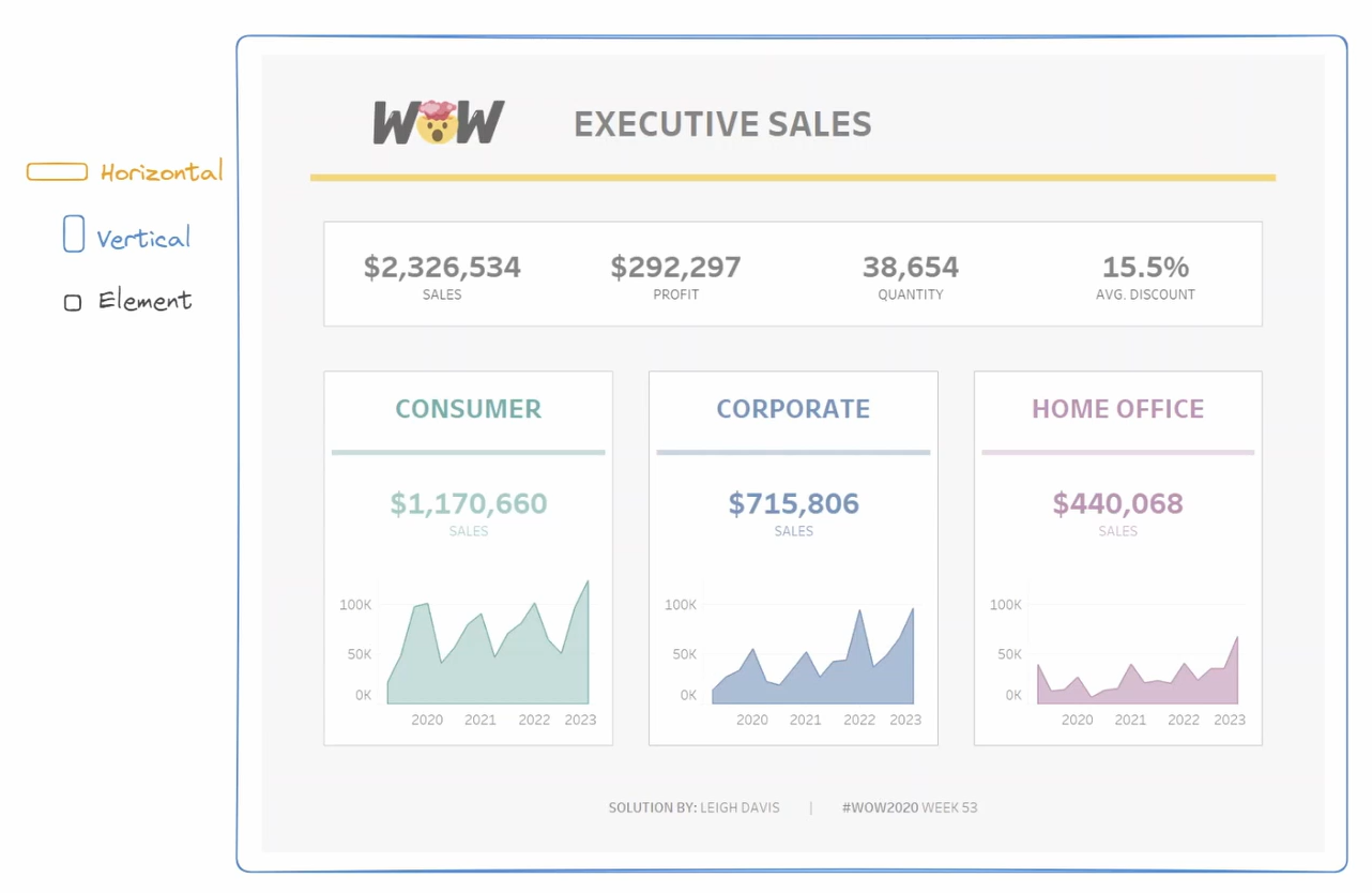
We will then follow with the header container. This may look like a vertical container because the inner elements appear next to each other, but there is a blank element to create a yellow line as a design choice.
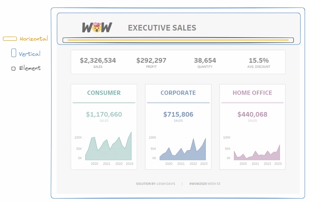
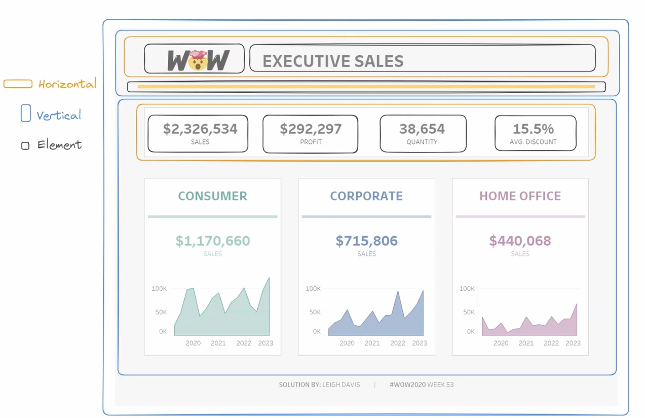
Therefore this header will be a vertical container that contains that horizontal stack and blank element. The horizontal container then contains the logo and heading.

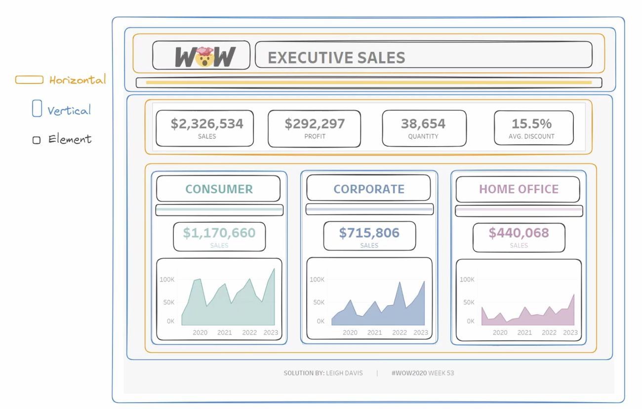
Next is the body. The body contains two major containers. The KPIs are visibly outlined with borders in the dashboard. This gives us the hint of a horizontal container. There are 4 KPIs as 4 elements.
The body also contains a large horizontal element that stacks the ‘consumer’, ‘corporate’, and ‘ ‘home office’ charts together. Each chart is made up of several elements that are stacked on top of each other. This means each has a vertical container.
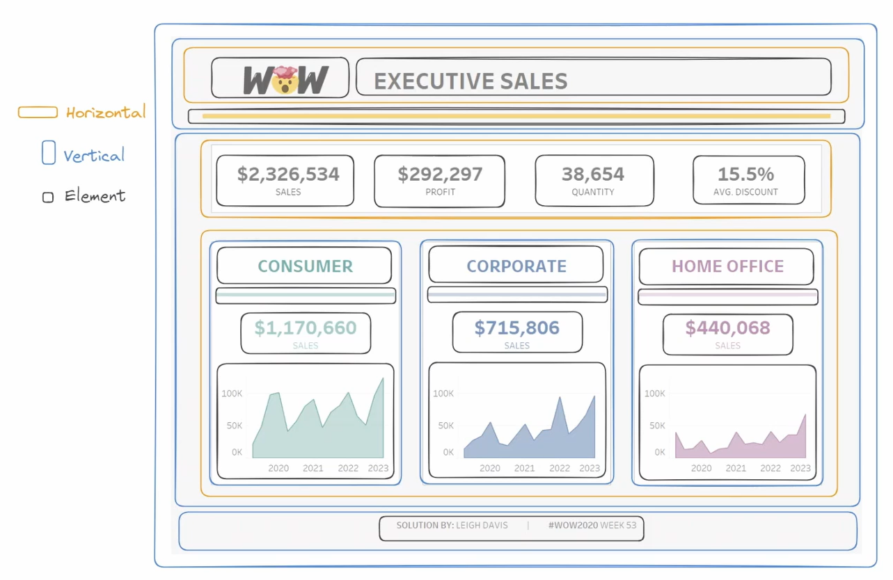
Finally is my footer. Now, although this container only contains one element, I will still place it in a vertical container with the single element inside. This is because utilizing a container ensures consistent alignment throughout the dashboard and allows for potential future additions or adjustments to the footer's content without disrupting the overall layout and design of the dashboard.
Thank you for reading, I hope you now feel more confident in Wireframing for a Tableau Dashboard.
