


Today marked the first day of DS6 Alteryx week (well, four days) and so introductions were in order. First impressions when opening this data cleansing software is a seemingly innocent looking dashboard that charms with its draggable tool icons. Its sample workflow tutorials slowly facilitate familiarisation with a few of these tools – snapping together connections to map the flow of information. These samples provide a taste of the potential power that a capable user can channel to profound effect.
Upon exiting the tutorial safe haven and moving on to working with external data sources, a sense of being overwhelmed can quickly take over. Before you know it, the workflow is packed with tool icons – half of which are unsuitable or unnecessary, and a string of error messages have appeared.
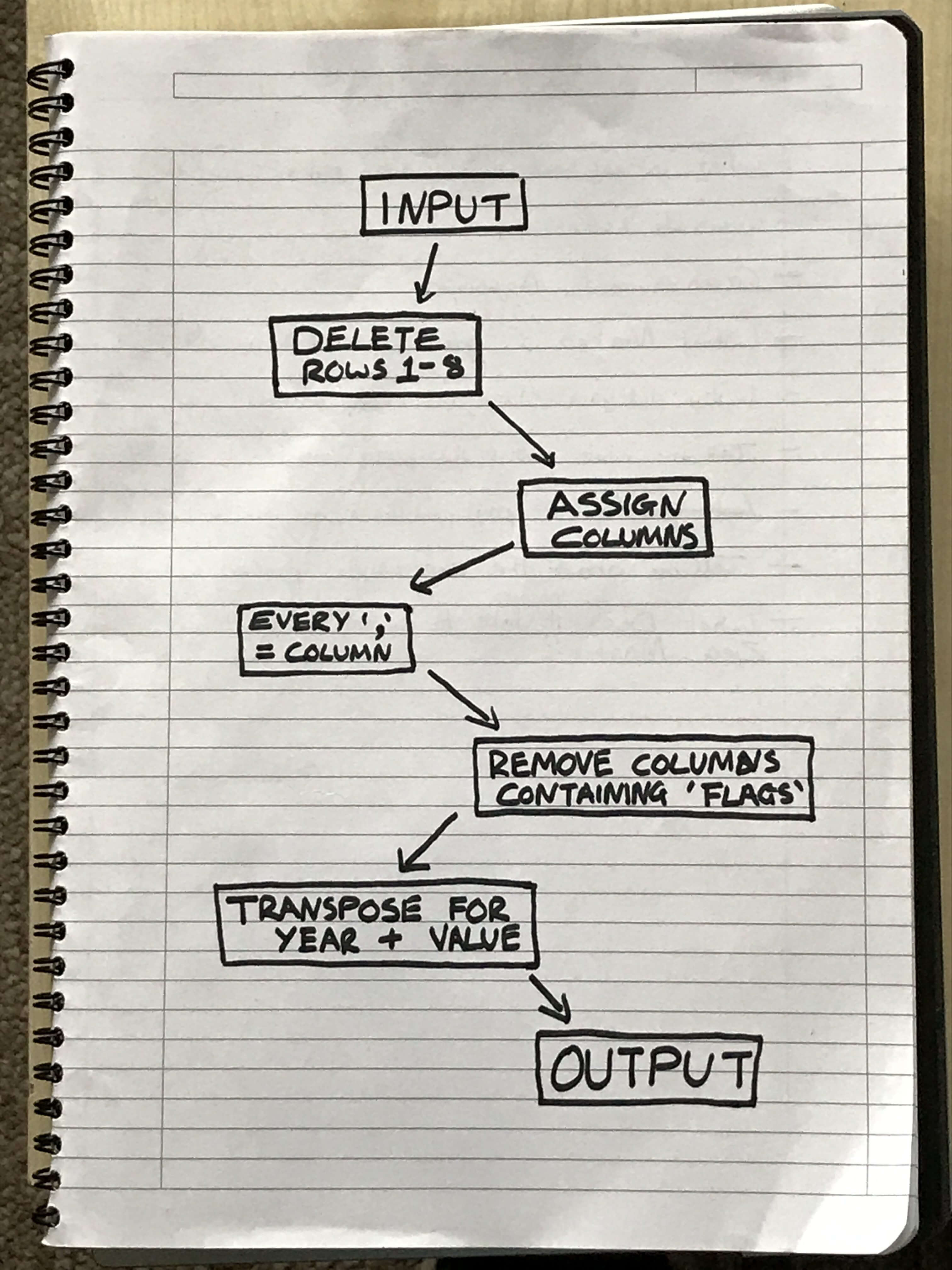
At this stage, it’s best to stop and take a step back – instead of throwing your device out the window. Go back to looking at the data source that you are trying to clean and map out in plain, simple terms on paper. What you need to do, and in what order does it need to happen?
These tasks could be as simple as deleting the blank rows present at the top of the source or transposing columns to rows. Whatever it is, identify them, then build a flow chart on paper starting with input and ending with an output. Next, consider which of the Alteryx tools there are available that could perform these tasks.
From this point, you have a ‘blueprint’ to follow, guiding your work in Alteryx. It is possible that some tweaks to the process will be necessary as it’s applied. But at least the central skeleton will be constructed.
Finally, if you’re ever unsure about any particular aspect of a tool icon, or what exactly it does altogether. Just hit F1 and Alteryx will link you to a helpful information page.