


Roll forward to Thursday of Week 1…
So, over the course of last week, I had learnt more about Tableau’s functionalities than I had in the period since I first discovered the software. Specifically, some new methods of arranging and visualising data via Andy’s coaching and exercises. Additionally, I had gained some insight into how to approach the design aspect of a visualisation – such as considering the aim, audience and data; thanks to Caroline Beaven’s insightful workshop.
Amongst this – presentations from the likes of James Eiloart helped us truly understand what differentiates tableau from other BI software. In addition, listening to the likes of David Krupp (a regular Tableau blogger) has proved invaluable.
Following an action-packed three days, I was eager to see what would come next. Then the bombshell was dropped, we were tasked with remaking our original application and presenting it back to the group the following day. This seemingly mammoth task played out in the following fashion:
Firstly, I had to review the application storyboard on my Tableau public (view here) and consider what I thought worked and what didn’t.
The below table summarises my thoughts:
|
What works? |
What Doesn’t? |
| – Highlighting | – Colours (lack context) |
| – Narrative | – Layout (Too compact) |
| – Language | – Pictures/ Icons (some not so effective) |
| – Story | – Chart types |
| – Key points | – Scroll bars |
| – Icons/pictures (some effective) | – Title (doesn’t stand out) |
| – User journey |
I then reconsidered the aim. Originally, I wanted to use the data to help the user find a new game to play based on popularity; however, my resulting application ended up as an overview of trends. Consequently, this is the approach I took with the remake – a user-friendly, single dashboard tool that yields a selection of popular games under the selected criteria. The basic premise being to present back to the user, based on their choices, some similar games that they might like to play.
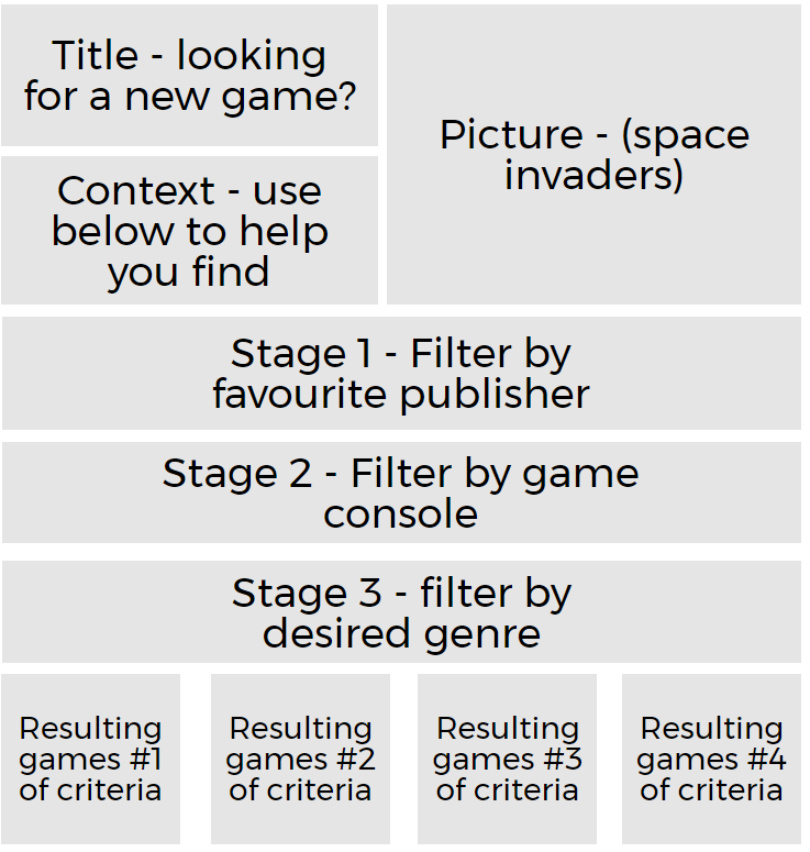
Following advice on the functionality – making use of dashboard actions and filter context – I considered more than usual the layout of my new viz using an approach that Caroline taught us. This involves writing key points (sheets, text, title, pictures, etc.) on post-it notes – then moving them around a piece of paper so that you can get a feel for how the dashboard would look and therefore work.
Here is a computerised version of my mock-up:
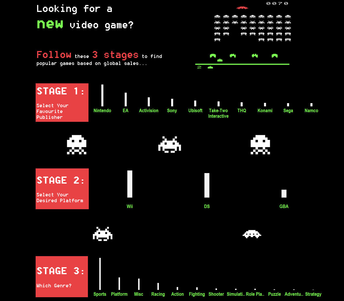
On to the result – I chose to stick to a retro, ‘Space Invaders’ theme by employing recognised colours, icons and chart types. Both the language and layout I feel facilitated a user guided journey that was clear and simplistic. A screenshot of this can be seen below or here on my Tableau public account.
Given additional time, I would like to explore the implementation of parameters, perhaps, to allow the user to view by sales in their region. By doing so, I feel this would aid as an additional way to filter.