


For the last day of the dashboard week, Michael assigned a task that each DSNY 5 members re-build the initial application to The Data School. The requirement is using the original data (raw data). This task is so interesting. It reminds me all good memories at that time when I worked on that initial application.
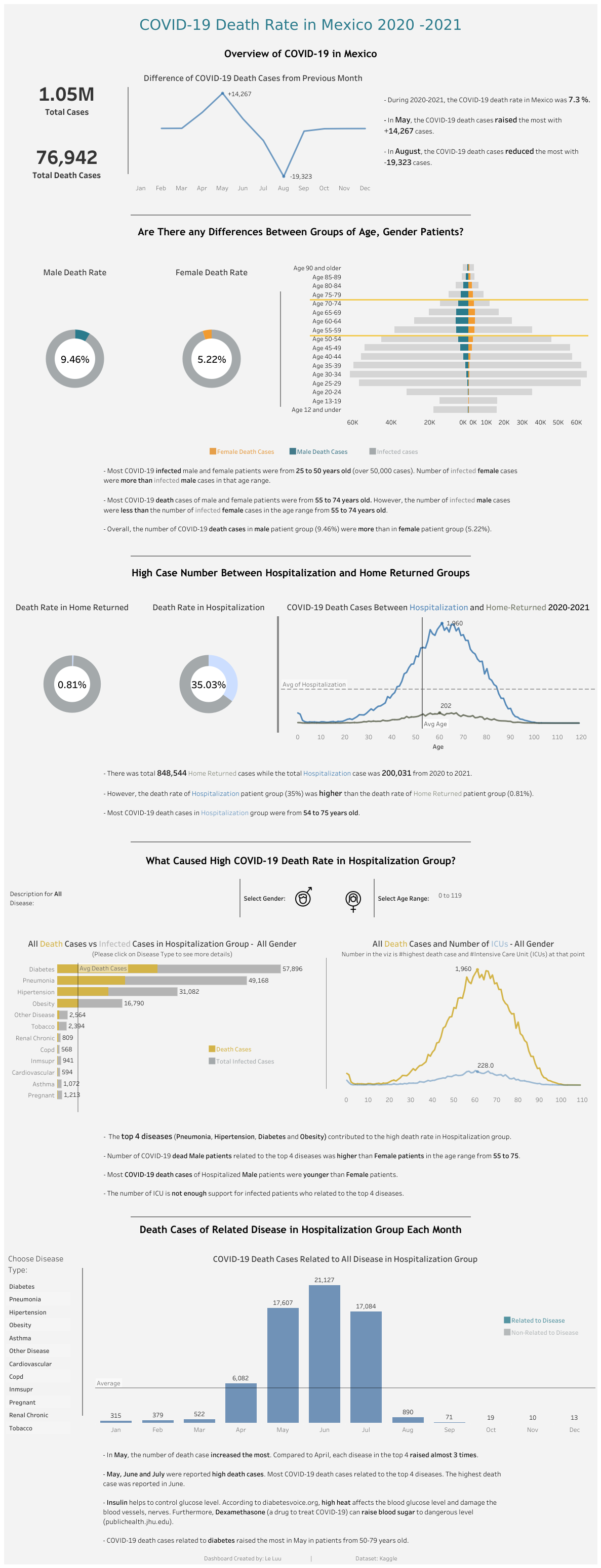
To have that final initial application (Image 1), I revised my dashboard 4 or 5 times. Thanks to the feedback from Samuel Shurmer, Collin Smith and Michael McFadden, I learned and improved my Tableau skills then applied it into the dashboard. I chose the COVID-19 topic because it was a hot topic at that time and many relative were affected by COVID-19. In some countries, the condition of COVID-19 was still being very complicated and terrible. Therefore, I would like to know what factors caused high COVID-19 death rate. It would be great for everyone to know and defend.
My initial application dashboard on Tableau Public: https://public.tableau.com/views/ProjectCOVID19inMexico2020-2021/Revised_COVID_Dashboard?:language=en-US&:display_count=n&:origin=viz_share_link
This project is a challenge for me because I need to make it better in a short time (5 hours). The process is quite similar to the previous dashboard week day. It includes:
1/ Review the data dictionary
2/ Clean/ Prepare data in Alteryx
3/ Sketch a draft on Excalidraw
4/ Build visualization on Tableau Desktop
5/ Test and Publish on Tableau Public
Now, are you ready to go back to the past with me? Let's get started!
1/ Review the data dictionary
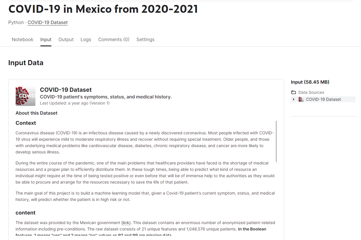
I searched the COVID-19 in Mexico on Kaggle page. I chose that dataset because there are many diseases which could affect to the COVID-19 death rate. I can explore which diseases could easily lead to the COVID death. Also, at that time, I used Python with pandas library to clean, prepare and explore the data. So I wrote a blog to explore the data on Kaggle and prepare the data for visualization in Tableau.
My Kaggle blog: https://www.kaggle.com/code/leluudev/covid-19-in-mexico-from-2020-2021
If you click on the Input menu on the top, it will show the data dictionary of the dataset (Image 2). There are over 1 million rows and 21 fields in the dataset. Some fields have values 97, 98 or 99. It means missing data. In some Boolean fields, 1 for yes and 2 for no.
2/ Clean/ Prepare data in Alteryx
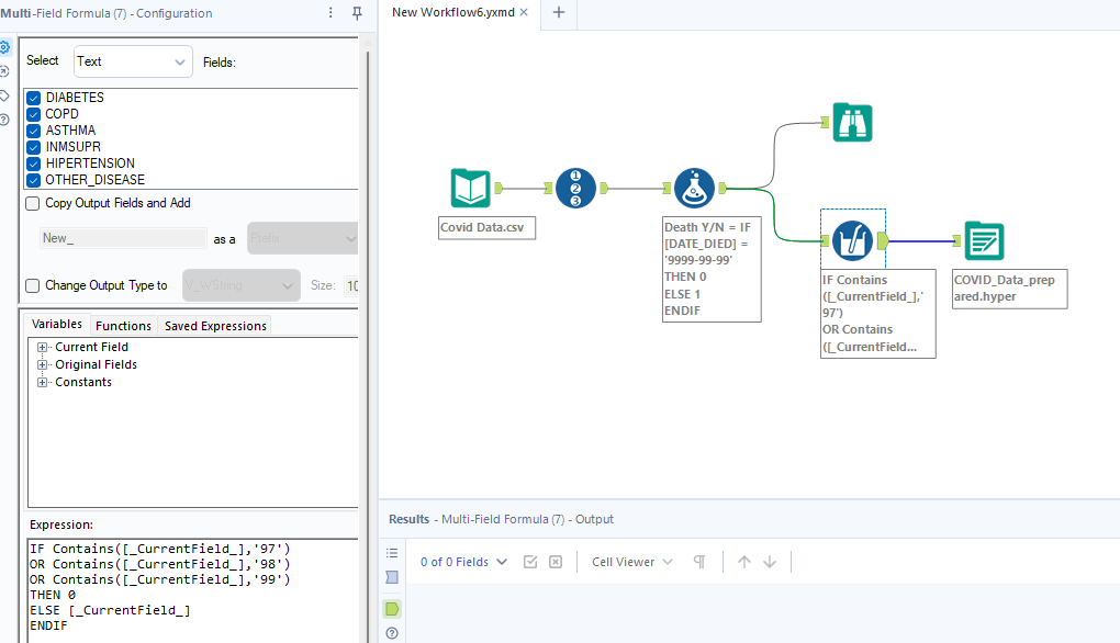
After understanding the data, I will clean and prepare the data in Alteryx. If you scroll down the Kaggle page, you can see how I cleaned and prepared the data with Python. However, Alteryx will make everything better. In Alteryx, I created a new field to decide the case is death or not based on the Date Died. Some fields contain the value 97, 98 or 99; I replaced those values by 0. Then, the last step is outputting the data.
On my Kaggle's blog, I used Pearson to find the correlation between each field (Image 4). For the values between 0 and 1, it means positive correlation. When a variable changes, the other variable is also change the same direction. For value equals 0, it means that no correlation between 2 variables. For values from 0 to -1, it means negative correlation. When a variable changes, the other variable change in the opposite direction.
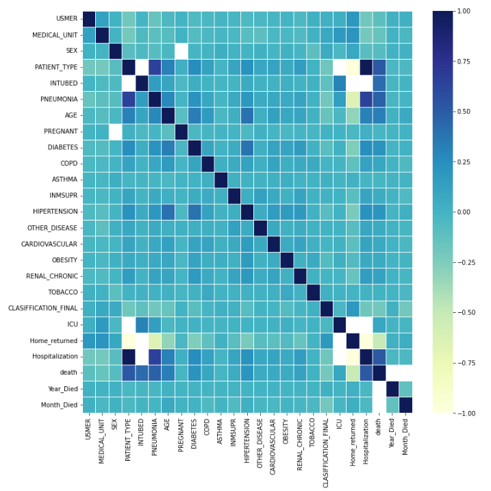
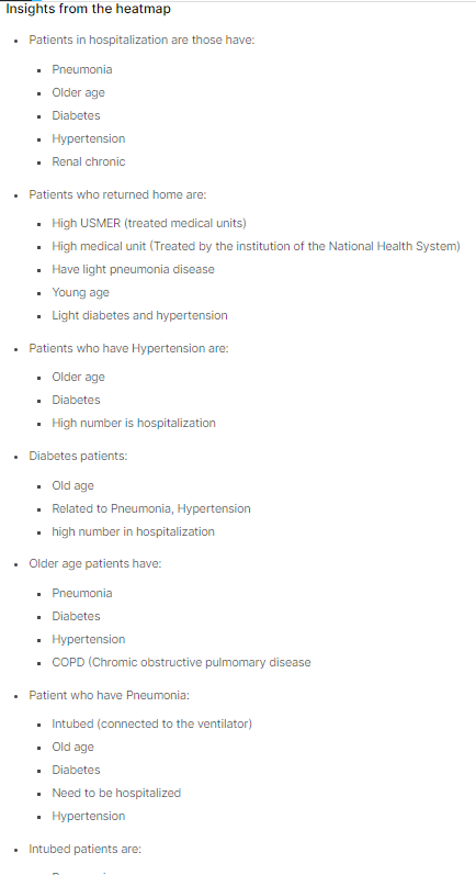
Based on that heat map, I can give some insights for myself (Image 5). It was very helpful to me when I deciding the topic that I will focus on and explore more.
Back to the current task, I got the output data from Alteryx. In the next step, I will think about the topic and tells the story to the audience based on the insights that I have.
3/ Sketch a draft on Excalidraw
The challenge of this task is how to make a dashboard better than the initial application. What I could change in this revised dashboard is telling another story. Therefore, I was planning to compare the death cases between patients who were treated in hospital and home-returned.
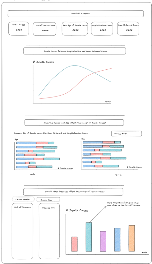
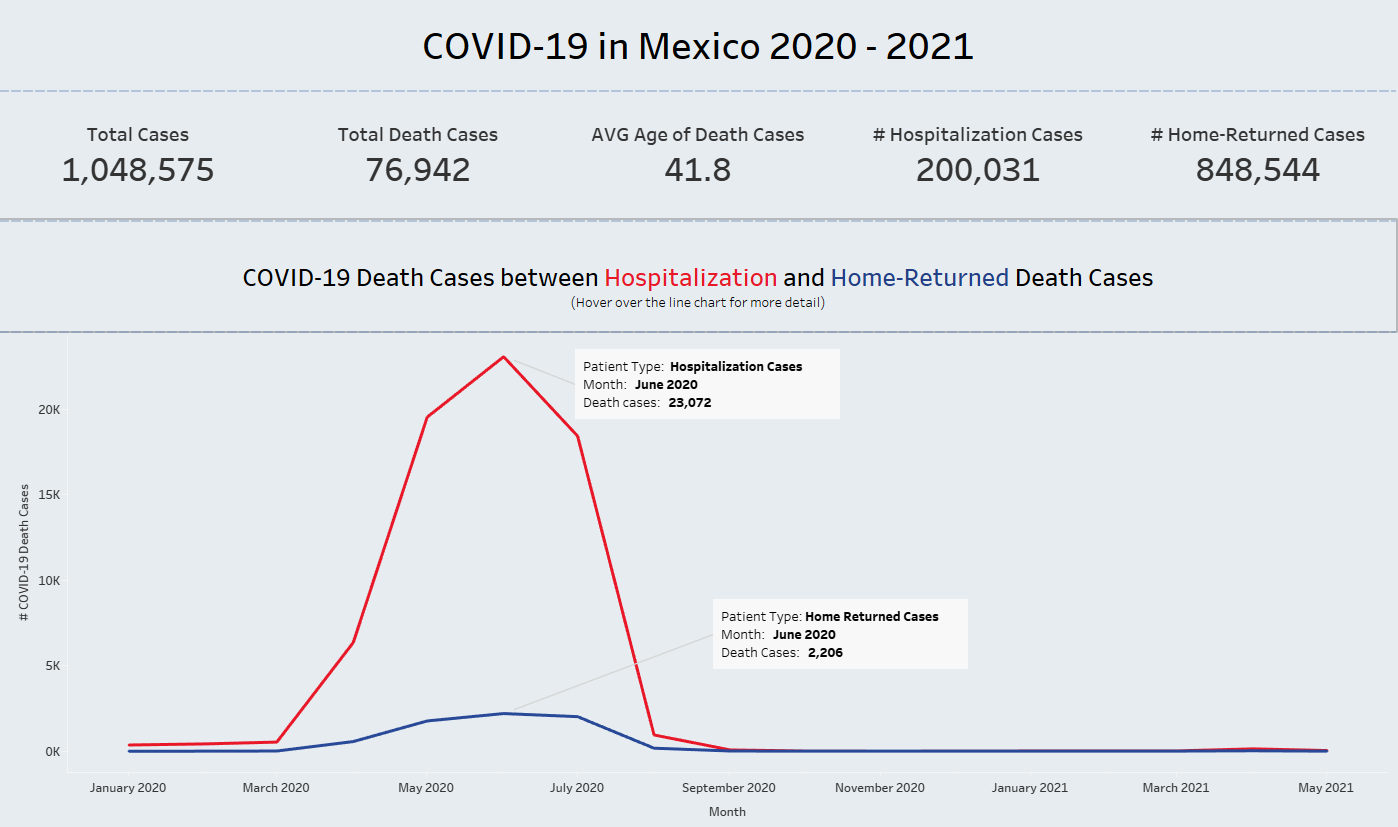
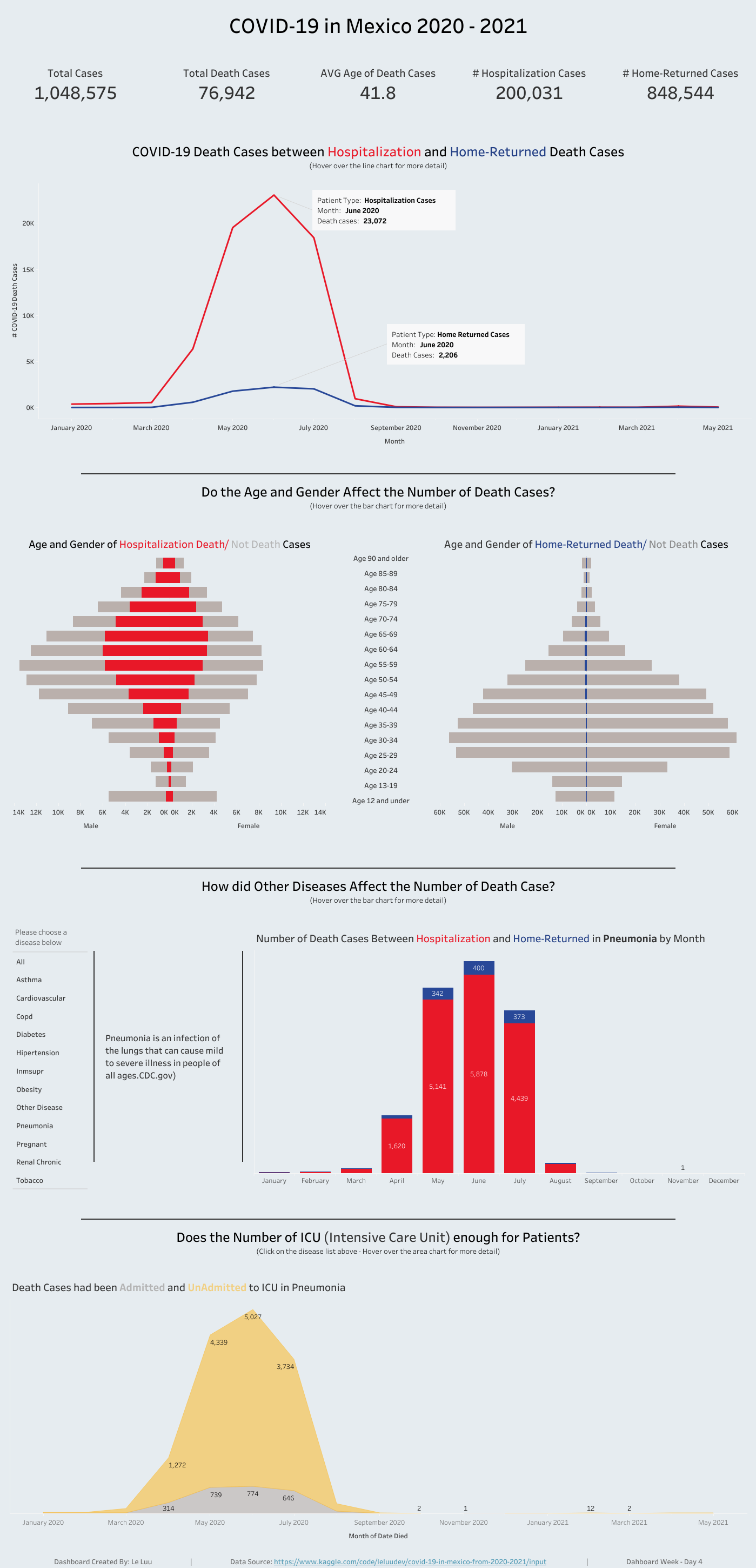
From the top, I have BANs to show an overview of total cases, total death cases, average age of death cases, hospitalization cases, home-returned cases. Then, the line chart compares the number of death cases between those 2 types. In the next section, I would like to know if the age and gender affect the number of death cases. For the final section, the user can explore which diseases caused high COVID-19 death rate. I also have a container to show the description of each disease if the user clicks on the name of the disease.
4/ Build visualization on Tableau Desktop
After getting the ideas to build, I started building visualization on Tableau Desktop. I kept the BANs same as the sketch on Excalidraw. For the line chart, I compared the Hospitalization and Home-Returned Death Cases by the time from Jan 2020 to May 2021. Most COVID-19 death cases were recorded in June 2020 and from Hospitalization cases (Image 7).
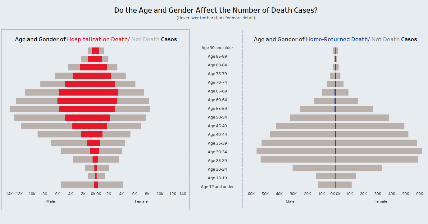
In the next section, I compared the Hospitalization and Home-Returned death cases by the age and gender (Image 8). Based on the butterfly chart, most Hospitalization cases were infected by COVID-19 from 45 to 69 years old while Home-Returned Cases were infected from 25 to 49 years old. The number of death cases in Hospitalization were more than Home-Returned very much (over thousands cases). The number of death cases in males more than female in Hospitalization type. I would say thank you to Valerija for helping me to edit the axis range by the reference line. It'd hard to compare if the axis range in the same chart is not the same.
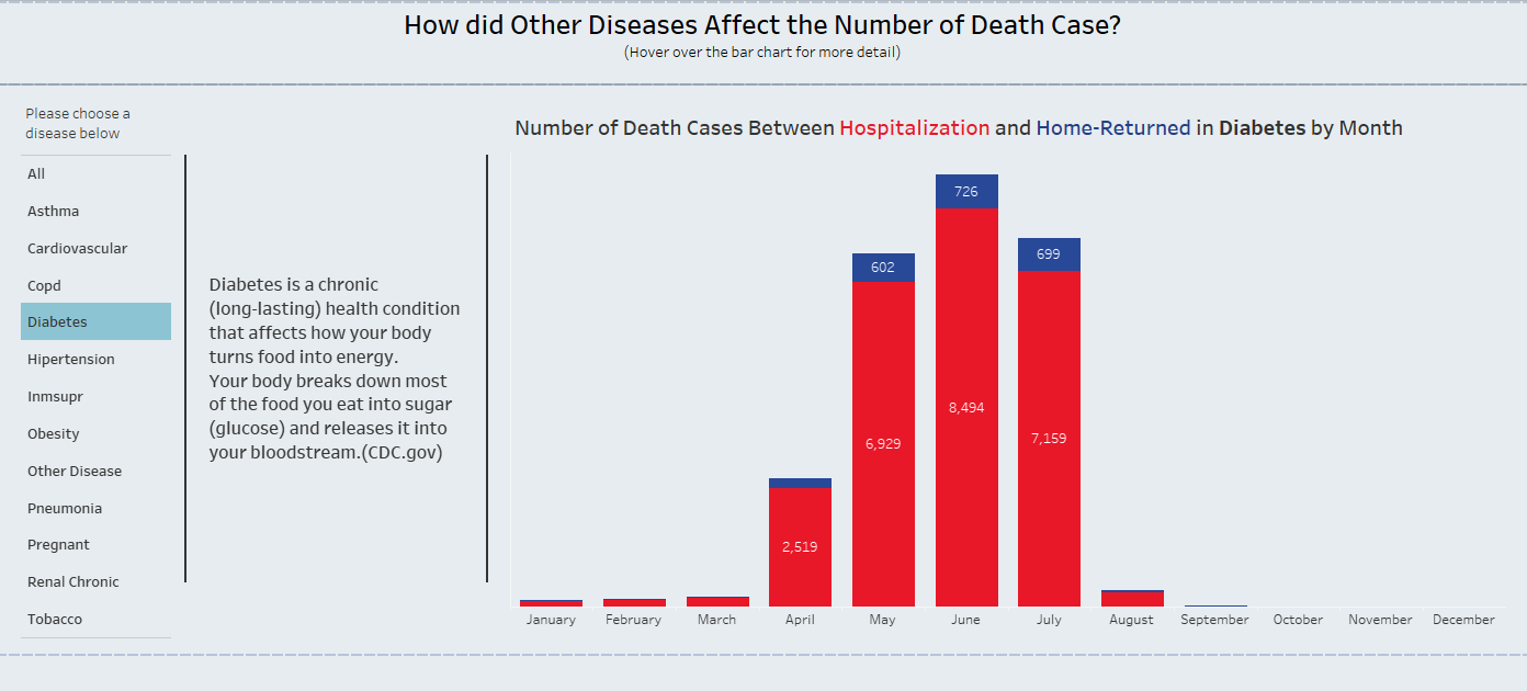
In the next section, I compared which diseases affected the number of death cases the most (Image 9). The user can click on one disease on the left side, then it will show the description of that disease and the bar chart to compare death cases between Hospitalization and Home-Returned type. Diabetes and Pneumonia have the highest death case number.
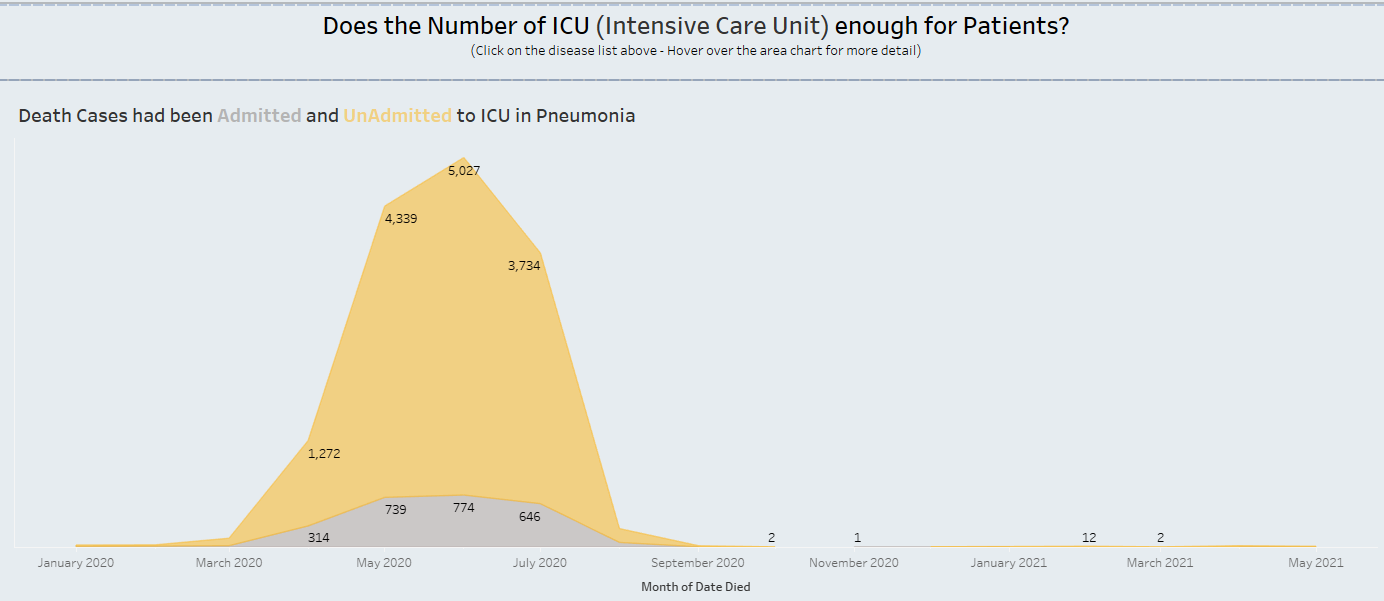
In the last section, I compared number of death cases admitted and unadmitted to ICU for each disease. Most death cases were unadmitted to ICU in Mexico during that time. That was also a reason why the number of death cases were high.
Those are all the vizzes that I built in Tableau Desktop for this project.
5/ Test and Publish on Tableau Public
The last step before publishing the dashboard on Tableau Public is testing. I need to check the number, font, size, formatting, and the interactivity action in the dashboard. One thing that I usually forget is the tooltip. Some places don't need the tooltip; however, to give the audience more details, I need to use the tooltip.
Dashboard Week Day 4 on Tableau Public: https://public.tableau.com/views/Dashboard_Week_Day4/COVID19_Mexico_DB4?:language=en-US&:display_count=n&:origin=viz_share_link
Thank you for reading my Dashboard Week Day 4 blog. This is the last blog for the Dashboard Week series. December 1st, 2023 is also the last training day for DSNY 5 team. It is the time to look back what I have learned at The Data School. I am very grateful to all coaches who supported and trained the team during 4 months at The Data School. 4 months is not too long and not too short, but I have all good memories with The Data School. 4 training months ended but the journey with data is still continuing with more interesting challenges ahead.
See you in the next blog!