


Interactive dashboard was one of my favorite topics when I was in training at The Data School. It helps the audience or the stakeholder get insight faster based on the color, filter, and actions, ... I usually apply Gestalt Principles in building visualization in Tableau. The Gestalt Principles help the audience focus on the points quickly the presenter would like to transmit.
In this blog, I will discuss the Similarity Principle in the list of Gestalt Principles. When there are many data points in the scatter plot, the color, size or shape would be very helpful. In a few seconds, the audience can distinguish the similarities and differences between data points. There are many ways to color the data points, so I will let the audience choose the way to color the data points by themselves. That's the goal I write this blog to share how to color data points dynamically in Tableau.
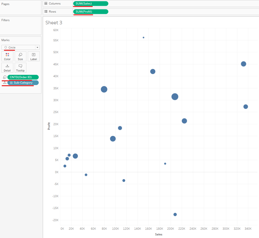
I used the sample SuperStore in Tableau and built the scatter plot with the sum of Sales and Profit in Columns and Rows. I also dragged the Sub-Category in Detail Marks, Count Distinct for Order ID, and dragged it to the Size Marks (Image 1).
Are you ready? Let's get started!
1/ Color Min/ Max values
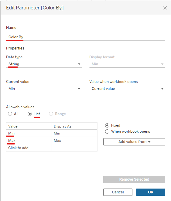
First of all, I created a Parameter with the name Color By. The Data Type is String because I will list some options to let the audience choose. In the Allowable values below, I type Min and Max in separate rows and click OK (Image 2).
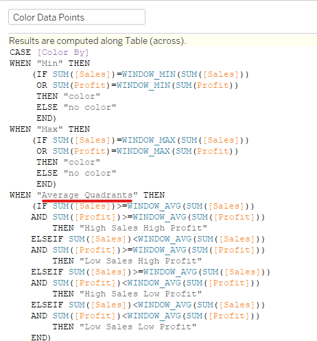
Then, I created a new Calculate Field with the name Color Data Points. I use the CASE ... WHEN because there are many values in the parameter. My goal is to highlight the data points in which the sum of sales or the sum of profit equals the min or max of them. I use the table calculation (WINDOW_MIN or WINDOW_MAX) because Tableau will check the min/ max value in the whole view (Image 3).

Right-click on the Color By parameter and choose Show Parameter. Then, drag the Color Data Points pill to the Color mark. Now I can select Min or Max in Parameter, then the data point will be highlighted in red.

2/ Quadrants
For the quadrants, I divide the scatter plot view into 4 parts. The top right area is "High Sales High Profit". The top left area is "Low Sales High Profit". The bottom left area is "Low Sales Low Profit" and the bottom right area is "High Sales Low Profit".
I added another value in the Color By parameter called "Average Quadrants". Then edit the Color Data Points calculated field by adding WHEN "Average Quadrants" THEN ... (Image 5)
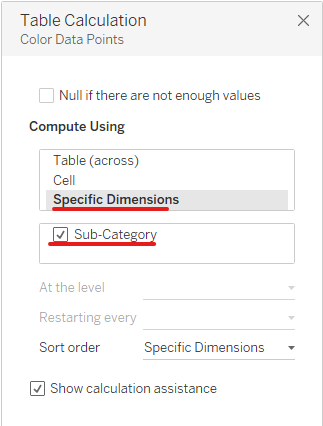
Note that, at the top of the calculated field it says "Results are computed along Table (across)". I right-click on the Color Data Points pill at the color mark and choose Edit Table Calculation. Click on Specific Dimensions and check Sub-Category. It means to color the data points for every Sub-Category (Image 6).
You can also add the Average Reference Line into the view. Now each quadrant will be colored differently (Image 7).

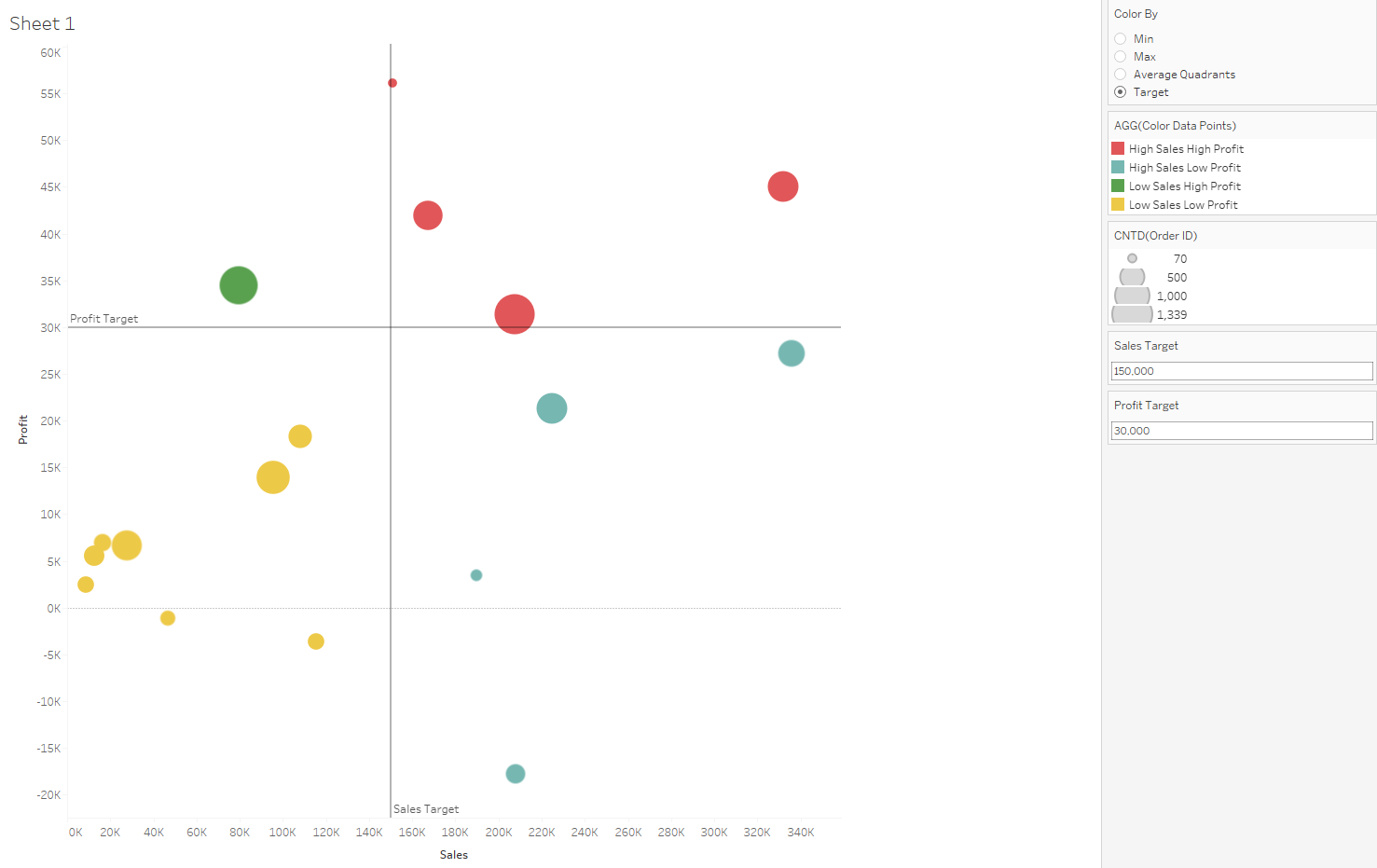
3/ Color By Target
Color by Target is the same as the color quadrant, but in this case, the user can set the sales target and profit target by themselves. To do that, I need to create 2 new parameters. One parameter is called Sales Target and another is Profit Target (Image 8).

I also need to add a new value "Target" in the Color By parameter. When I edit the Color Data Points, I can add "Target" into the CASE... WHEN. Instead of using WINDOW_AVG as the Average Quadrants above, I plug the 2 new parameters in (Image 9). Then click on OK.

I show the Sales Target and Profit Target parameters, so I can adjust the number of sales and profit target. You can also add the reference line and choose one line for the Sales Target and another line for the Profit Target (Image 10).
4/ Color By High Demand orders
For the last part of this blog, I color the number of orders and the metric target. I would like to color the data points that have a high number of orders and are in the range of sales or profit targets. If the sub-category has high demand (high number of orders) with high sales and profit, we would like to keep those sub-categories. However, when the demand for a sub-category is high and the profit is high, but the sum of sales is low, we need to develop those products more.
To do that, I add the "High Demand Good Metrics" and "High Demand Bad Metrics" values in the Color By parameter. I created a new parameter called "Number of Order" to get the number of orders from the user. I also edited the Color Data Points calculated field by adding 2 new WHEN statements (Image 11).

Then, I will test which sub-categories have high-demand orders but get bad metrics. In Image 12, products from Art have high demand but the profit and sales values are not high. In this case, we need to explore which factors caused that problem. It could be from the distributors or the supply of products. The company can look at that insight and find a solution.

Those are some options to let the user color the data points dynamically. There are some complicated cases if we use drill-down scatter plots or color by another level of details. I hope my blog is helpful to you if you want more options for the user to choose. Also, it will give more insight by highlighting the data points.
Thank you for reading and hope to see you soon in the next blog!