


The Task
Day 01 of the famous dashboard week, the last week of our training. Our task today was to create an interactive CV on Tableau public. What a cool way to showcase your skills not only on paper but with a real dashboard.
We started at 9am and had to present the finished products at 4pm, so with one lunch break, only 6 hours for this task.
Step 1: Start with a rough schedule
First, I create a rough timeline, so I know when to move to the next task and to know whether I am still on time. I have learned at the Data School that, especially when there is little time until the deadline, a small plan is very crucial to be able to finish in time.
Step 2: The User Story
Next, I created a user story. This time I am my own client, and I want to use this dashboard to show my career trajectory to colleagues, clients and potential future employers. Since most of us data schoolers are career changers and have had a lot of different experiences, it is always interesting to see the huge diversity in work experience that everyone has.
Step 3: Get Inspired
Next step was to look for inspiration. I looked at blogposts from fellow data schoolers and searched on Tableau Public. When looking at other people’s work, I discover what I like, what I don’t like and what is useful for me. I saw that one colleague had used a Map in his dashboard, and since I have lived and worked in different places, this is something I wanted to incorporate.
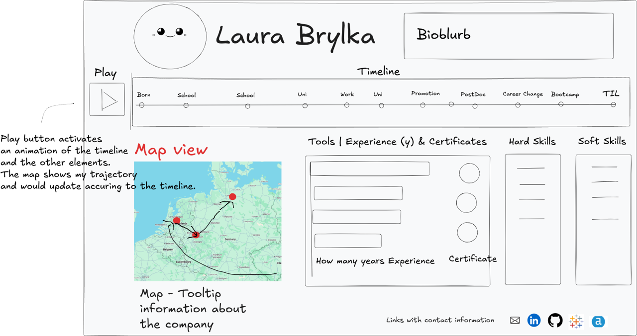
Step 4: The Sketch
I prepared a rough sketch of the elements in Excalidraw. Not everything in this sketch is in scope, but it is also an inspiration of all the things that can be incorporated on a future version.
Step 5: The Data
After that, I prepared the data using my LinkedIn Profile and my CV in Excel. I used this blogpost as inspiration:
https://www.tableau.com/blog/how-create-interactive-resume-tableau
I used Google sheets to enter my data, one sheet for the timeline, one sheet for tool skills, one for certificates. Since these sheets do not have a relationship, I added them as separate data sources. The advantage of using google sheets is that is is very easy to change your data while your worksheet is open and update the data source in Tableau. This part took a bit longer than expected.
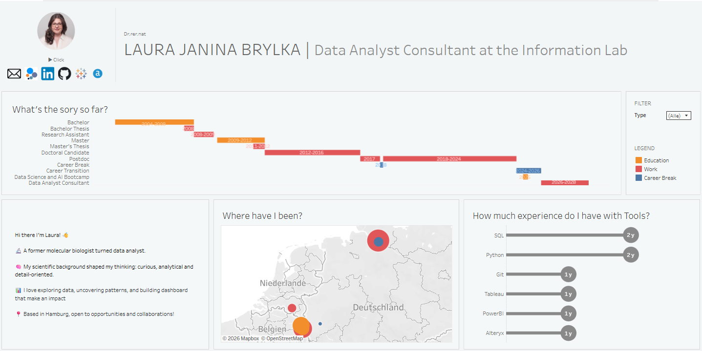
Step 6: Now finally we are building the dashboard!
Now that everything was prepared, I had about 2 hours to build the dashboard. Not everything that I envisioned could be incorporated in the limited time scope, so I focused on building an MVP, a version with the most important charts included, while I did not focus on details like Tooltips.
Step 7: The presentation and feedback
I got a lot of constructive feedback on my dashboard which also inspired me further to build a better version of this! From not changing the colors from the Tableau Standard colors, the placement of the information text over, over some more really cool ideas.
My biggest takeaways
My greatest inspiration is my fellow colleagues. What I really loved about one of my colleagues’ presentations is, that he explained the value of having this dashboard which made his presentation o much more meaningful and engaging.
Another great idea came from a question from a colleague on her dashboard. How do I calculate how much experience I have? My timeline is calculated by the date I first learned the tool and the date today But If I did not use this tool for a while now, this is of course not very accurate. A very good tip from our coach was to connect the tools used to the work experience and use this as the basis of your calculation.