


The Task
For day 2 of dashboard week we were given a really cool dataset! It stems from a scientific exploration of Wikipedia articles on famous people throughout history and contained a massive 2 million rows. The goal was to focus on one specific aspect, find some cool insights, and build a dashboard using the tools of our choice.
Here is a look at my process:
Step 1: Tools & Data Prep
I chose Alteryx as my weapon of choice for data prep and Tableau Public for the visualization, since it’s the best tool for quick data exploration. To keep things focused, I narrowed the dataset down to the Top 10,000 most notable people. (The authors calculated this notability ranking using metrics like article length and the number of language versions).
Step 2: Choosing the Topic
I quickly chose my topic: looking at gender distribution to see the gender bias across notable people on Wikipedia. I drew some quick sketches of what I wanted to see, but I mainly let the data lead me, creating the visualizations first and then piecing the dashboard together bit by bit.
Step 3: A Wild Iterative Process
Now followed a wild iterative process combining data preparation in Alteryx and spinning up visualizations in Tableau to see what was most compelling. Most importantly, I wanted to show the entries sorted by notability and colored by gender to answer one big question: How long do I need to look until I find a woman in the dataset? Scroll down for the answer.
Step 4: Final Polish
After getting all the charts ready, I put the dashboard together. We had a presentation where I got some really great feedback, and I quickly jumped back in to update the dashboard and finish it off!
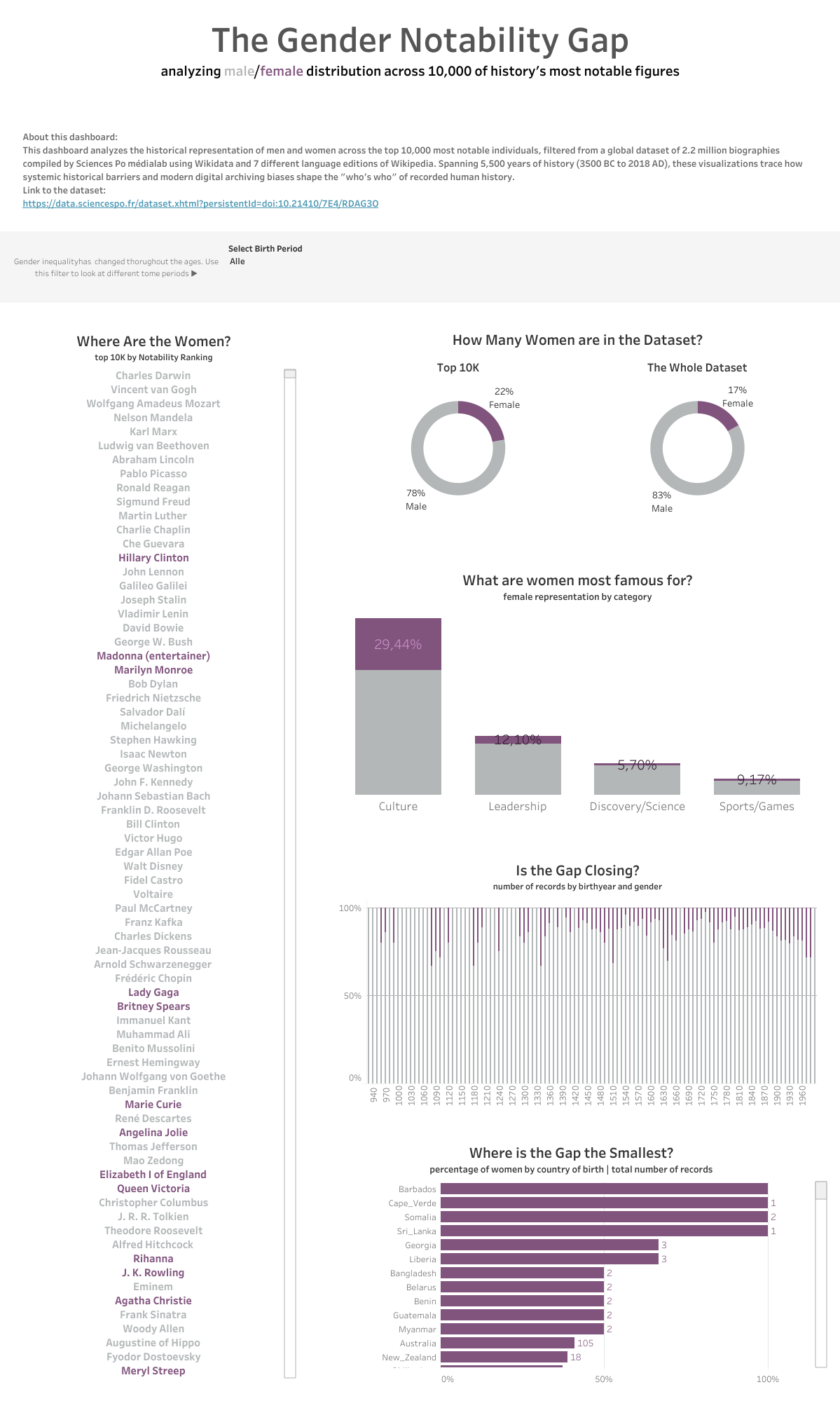
Apparently you need to scroll to entry #25 to find the first woman, Hillary Clinton! You can find the finished dashboard on Tableau Public here.