


1. Start with the Story You Want to Tell
Before you even open Tableau, ask yourself:
What do I want people to learn, feel, or do after seeing this dashboard?
Whether it's uncovering health inequalities in a city, identifying trends in sales, or comparing footballer performance, every dashboard should have:
- A clear purpose
- A defined audience
- Who will be viewing this dashboard? How might this affect what they want to see from it or how they might interact with it?
- A key message or insight
Think of it like building a presentation — your dashboard should have a beginning (context), middle (exploration), and end (conclusion or call to action).
2. Use Layout to Guide the Viewer
The way you lay out your dashboard heavily influences how people read and understand it. Good storytelling dashboards use intentional structure to lead the eye.
A helpful layout approach:
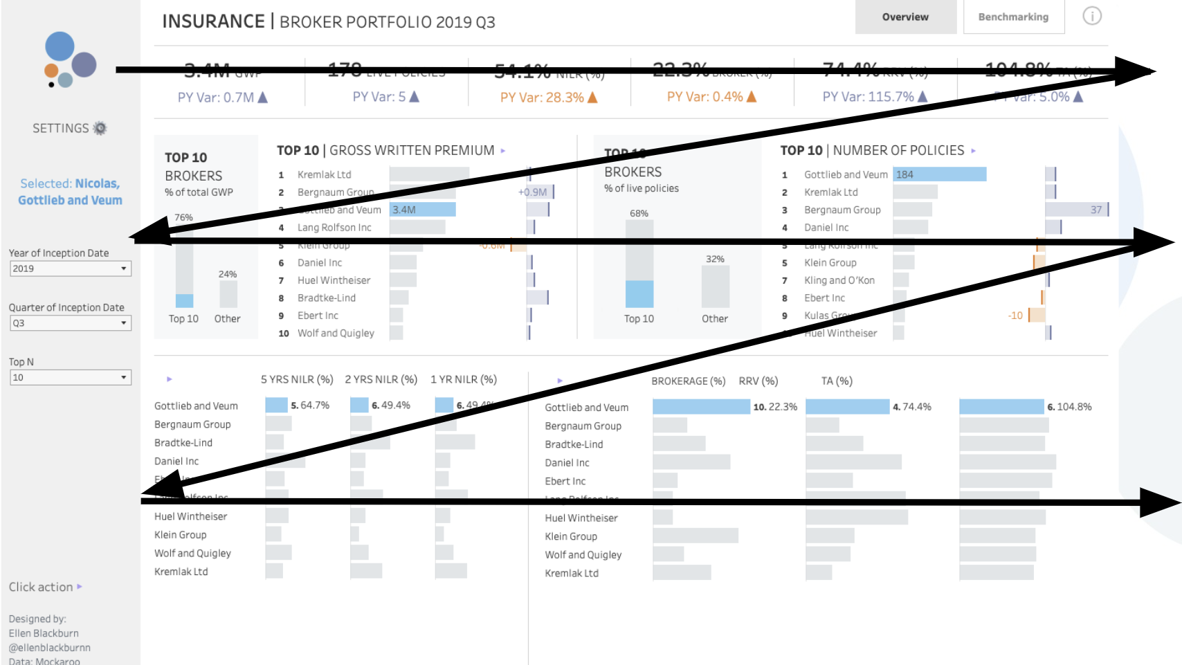
- Top-Left: High-level summary or KPIs (the “headline”)
- Middle: Key visual comparisons or trends (the “body”)
- Bottom or Side: Filters, deep dives, or contextual notes (the “details”)
Use containers in Tableau to structure sections clearly and consistently.
📌 Tip: Use blank space to separate ideas — just like in writing, visual pauses help comprehension.
3. Choose Visuals that Support the Story
Each chart you include should answer a specific question. Avoid adding graphs just because they "look cool" — they should serve the narrative.
Here’s a quick and general rule of thumb of how to show what:
- Overall performance?
- KPI or big number!
- Change over time?
- Line chart!
- Part-to-whole breakdown ?
- Pie or stacked bar (sparingly)!
- Comparisons?
- Bar chart!
- Geographic trends?
- Map!
When in doubt, simplify!!! Clarity always beats complexity.
4. Use Annotations and Titles Like a Storyteller
This is where storytelling really comes alive. Instead of titling a chart “Sales by Region,” title it:
“Southwest Region Outperformed All Others in Q2”
This tells the reader what to look for and what it means — saving them the effort of interpreting it themselves.
You can also use annotations to highlight surprises or insights directly on the chart. Tableau lets you add text boxes, mark labels, or even dashboard callouts — use them to steer attention.
5. Build in Interactivity — But Keep It Purposeful
Filters, highlights, and parameters are amazing storytelling tools when used correctly. They let your audience explore the story themselves.
Examples of useful interactivity:
- Click a region on a map to update a chart below
- Use a parameter to switch between different metrics or years
- Let users filter by demographics or product lines
But don’t overdo it — too many filters or dropdowns can be distracting. Stick to what enhances the story.
6. Test and Share
Once your dashboard is built, test it with someone who hasn’t seen it before. Ask:
- “What do you think this dashboard is telling you?”
- “Was anything confusing or unclear?”
- “What would you want to do next after seeing this?”
If they get your key message without needing you to explain it — you’ve nailed the storytelling.
Final Thoughts
A well-designed Tableau dashboard doesn’t just show numbers — it brings them to life. By structuring your dashboard like a story, guiding the user’s attention, and designing intentionally, you create something that’s not just informative, but compelling.
So next time you open Tableau, don’t just ask “What should I build?” — ask,
“What story do I want to tell?”