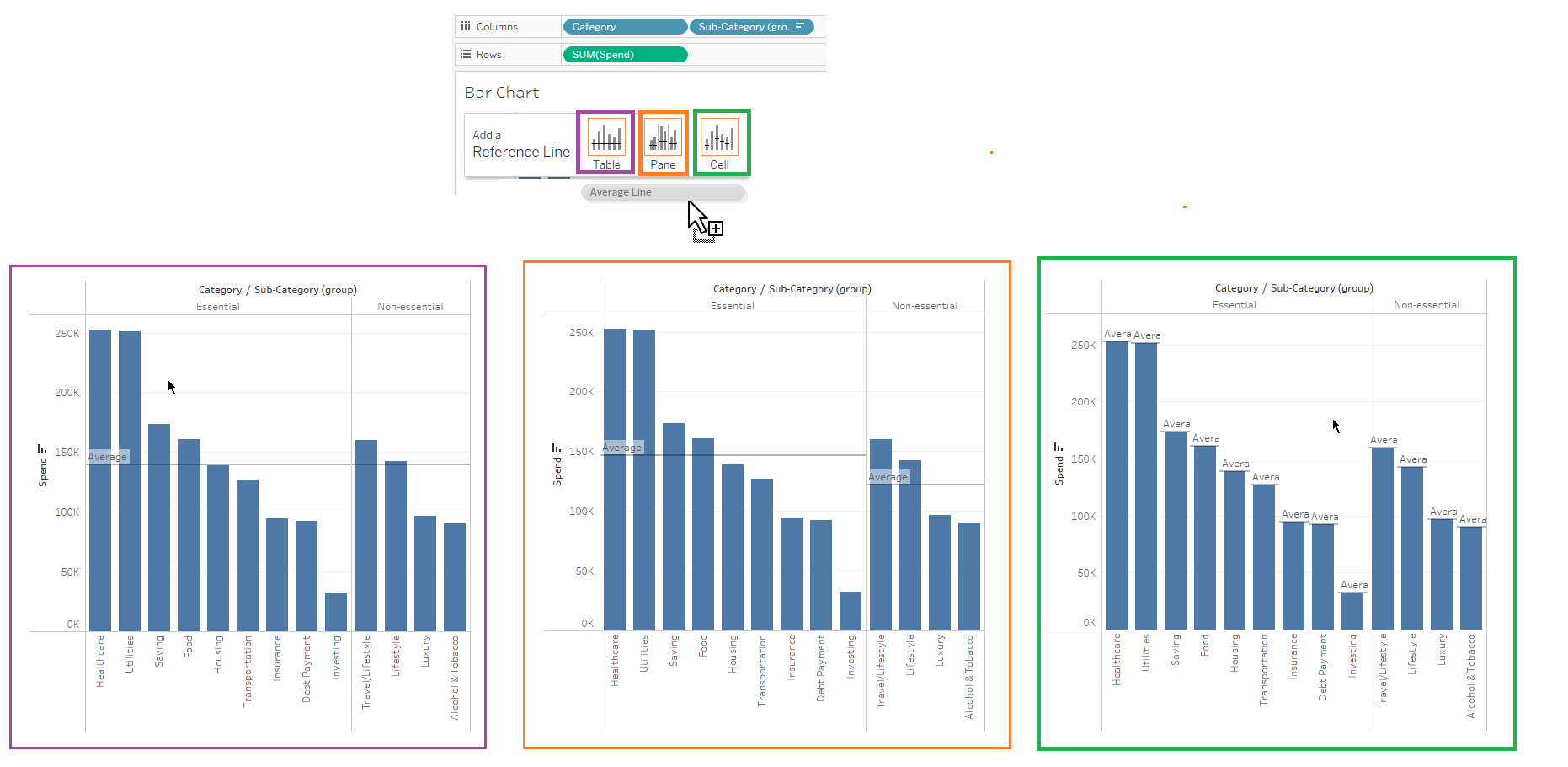
Tableau's analytics pane includes easy to use drag-and-drop analytics tools namely reference lines, totals, forecasts, clusters, box plots and more. Some tools may be available only for specific use or configuration. Once a tool is drag in the view, the Table, Pane and Cell options are shown. And these options will vary depending on the construction of the fields in view.
A Table average line considers the average across the entire table. A Pane average considers each individual pane or dimensional separator. A Cell average line applies to each individual data point or cell.
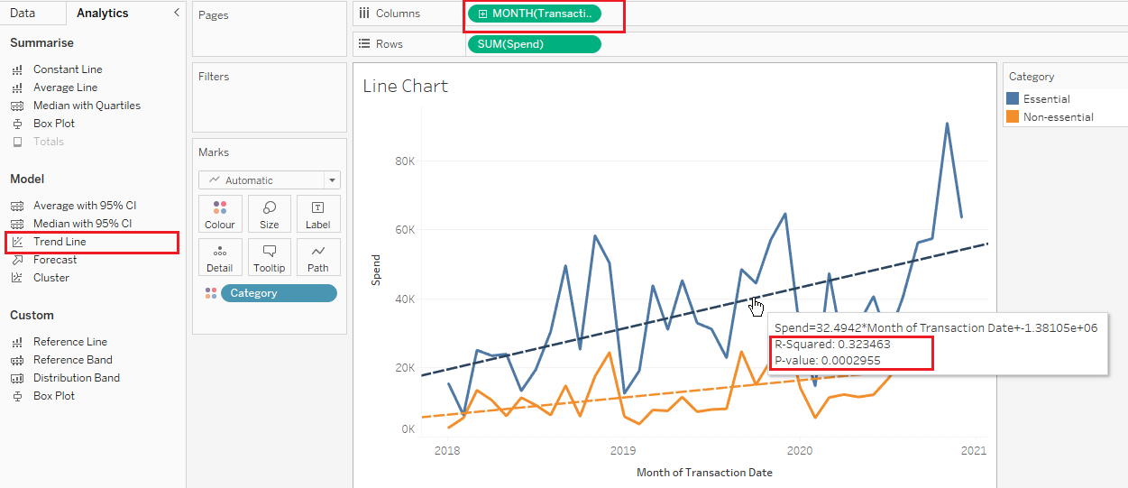
Another analytic tool is the Regression model, which are statistical model which is used to estimate trends or relationship between variables. Regression model in Tableau are represented in the form of trend lines. They involve a dependent variable and one or more independent variable. There 5 types types of regression models that can be used in Tableau and each are used for different purpose.

Linear models are used to visualize a simple linear relationship between variables (either positive or negative). A logarithmic regression line is used when a trend increases quickly and then gradually levels off (positive values only). An exponential regression is used when a rate of change between variables rises at increasingly higher rates (again, this model will only accept a positive value). A polynomial regression lines are used when variables have fluctuating relationships. Power regression line is used when a depended variable (Y) changes at a predetermined rate (positive value).
Another statistical model available in Tableau are the Trend lines. They are used to show the directional trend or "line of best fit" for a series of data points. This can be useful particularly when the data is noisy and the direction can be difficult to determine. Trend lines require 2 continuous variables. Accuracy of trend lines are determined by the R-squared and P-Value. The R-squared explains how the variance of one variable explains the variance of another, ranging from 0-1. The close to 1 means the more accurate. P-value is the probability of obtaining results as extreme as the observed results, ranging from 0-1. The closer to 0 the more accurate it can predict future data points.
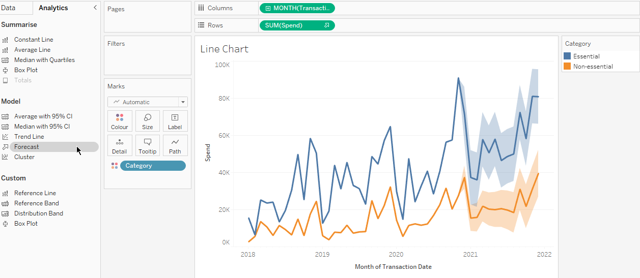
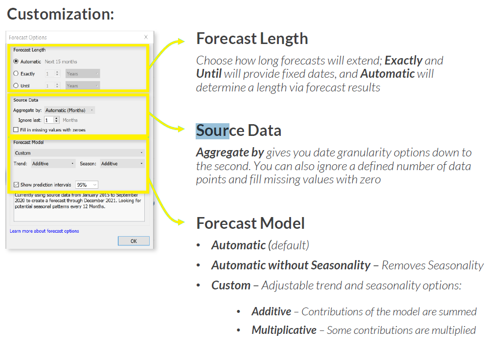
Forecasting algorithms evaluate patters in the historical data to project potential future data points. Tableau utilizes exponential smoothing in their forecasting which iteratively forecast future values of a times series from weighted averages of past values. Tableau will automatically select the best 8 models and will detect seasonality at the grain presented in the view. Exact dates are not supported in Tableau. A minimum number of data points is required for different types of forecasting. At least 5 data points are required for a forecast, at least 2 seasons for seasonality and at least 24 months for a 12-month seasonal cycle.
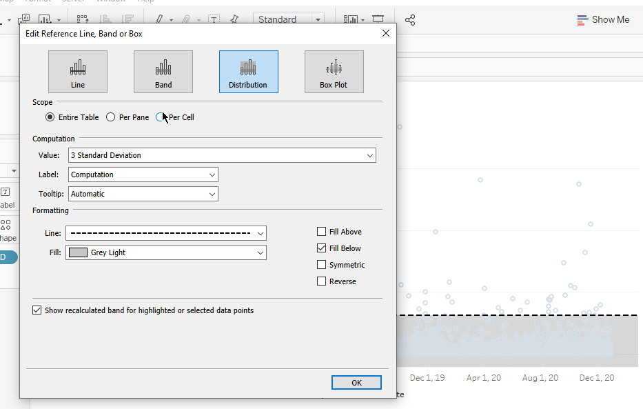
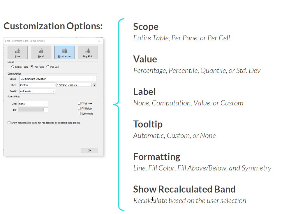
Control Charts are statistical tools commonly used to monitor manufacturing or business processes to ensure they are in a state of control (within limits). Control charts can be generated in Tableau by using reference bands. Typically the limits for a control charts are placed at a 3 standard deviation from the mean. This is known as the normal distribution and covers about 99.73% of all points. Anything outside the bands are called Special cause variation and must be investigated. Creating a control chart is as easy as dragging a reference band and set the standard deviations. There are also customization options to deal with outliers.
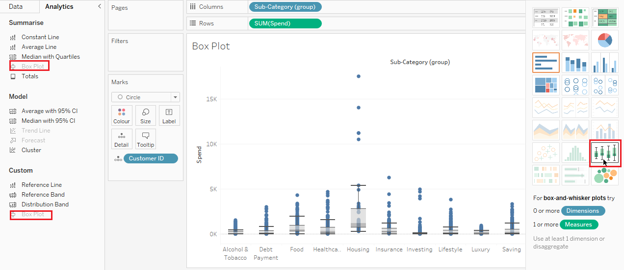
Box Plots are used to visualize the distribution and statistical characteristics of a numerical field, including the minimum/maximum, median, and first and third quartiles. They can show the outliers, whether the data are symmetrical, how tightly the data are grouped and how they are skewed. There are two ways to generate box plot in Tableau, one is through 'Show Me' button and the other is through the analytics pane. Box plots generally require one or more measure and zero or more dimensions. But a dimension or disaggregated measure should be used to get the points.
