


Exploratory data analysis in Tableau doesn’t necessary mean building fancy charts. One useful approach to get around what the dataset means is by creating 6 different tabs or sheets in Tableau and renaming them using these classic research interrogative words or WH-questions in a sequence that will lead deeper into the analysis. The diagram below shows some typical charts within each question that are useful to get insights. As the analysis goes deeper, consequently the charts can be slightly complex too.
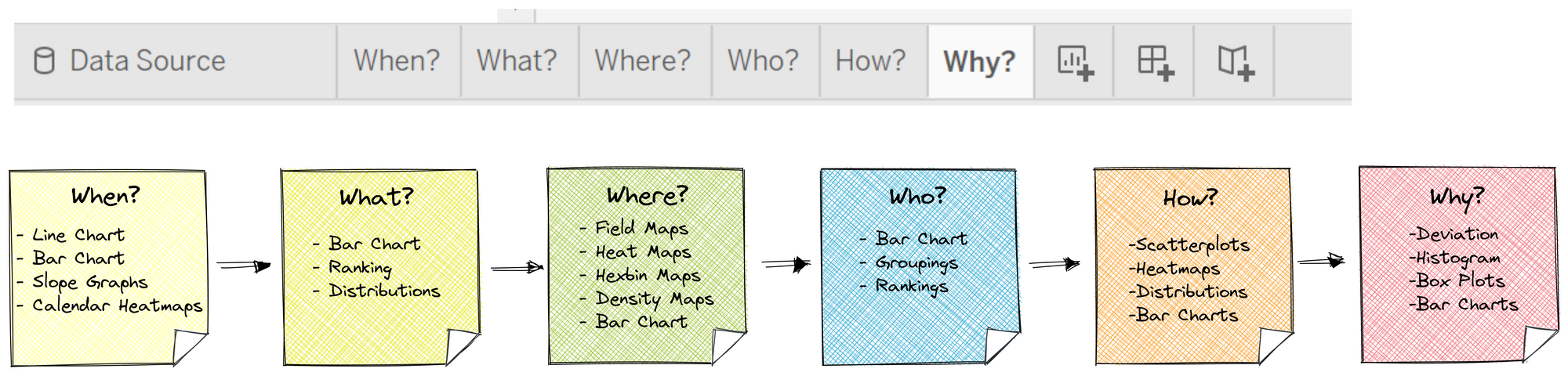
WHEN and WHAT-questions can be time series or frequency data, therefore line and bar charts are commonly use to analyse these. WHERE-questions are usually geographical data which typically uses map as well as bar charts. This step can be skipped if there's no information related to this question. HOW and WHY can be slightly complicated charts like scatter plots and statistical charts. These charts are common charts, easy to build and communicate insights directly. KEEP IT SIMPLE!
So that's one tip the DSDE2 learned from Andy Kriebel on Valentines Day.