Our last dataset for the dashboard week is from #KeepItOn coalition which tracks down internet shutdowns worldwide. I have read their report and they have very interesting KPIs which I want to emulate in my dashboard and use the story mode for the presentation.
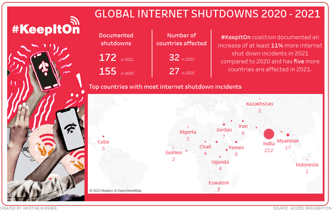
As I initially took a look at the numbers around the world, I noticed India had the most incident and so I read a little about the reasons behind this and it confirmed to the numbers in the data set. Yes, I did some quality check this time. :)
I planned to have an overview of the incidents, then focus on regions and then specifically on India. I used a sunburst chart to show the share of internet disruptions by region and made use of my colleague Frederik's blog on how to represent pie chart in a better way. Blogs are indeed useful.
I like to use the story mode to present my dashboards because it sort of structure the flow of thought of the analysis given that we only have 5-minutes window for present.
Over all this was the most "successful" project that I made during the week. I learned from the previous feedbacks and I also balanced my time and expectation, so I kept a simple dashboard with a story.
Here's the edited version of the STORY I made for this project.