


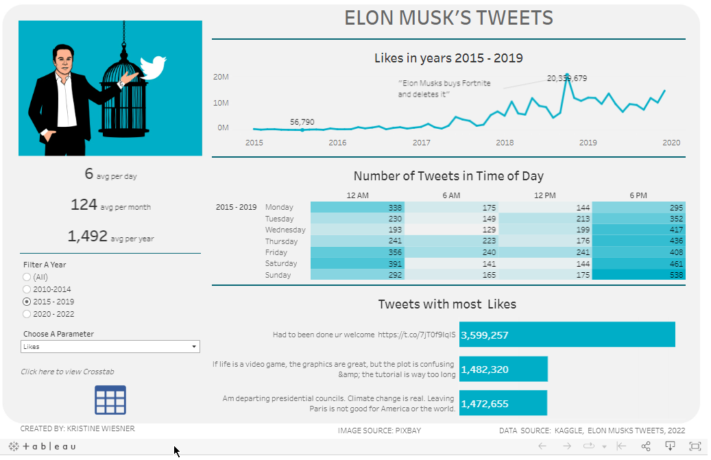
Our second dataset for dashboard week was about Elon Musk's tweet taken from the Kaggle site. This is another first, I have not made a dashboard for text analysis before.
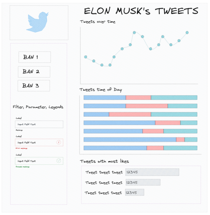
I planned to build a simple dashboard that will show tweet parameters (#like, #retweets and #replies) over some period, which time of the day he tweets the most and which tweets garnered most likes.
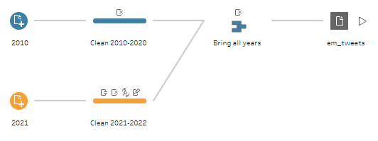
It took me some time to clean the 13 data sets. I just selected the fields I needed but I was missing some years when I did the wildcard union in Tableau Prep. I asked for help in the group and Tanya was able to reach out. Thanks Tanya!
The cleaned data was pretty much straight forward. As I built the charts, I found some interesting spike in 2018, where there were more reactions than usual. And I did some digging what the fuzz was about. Apparently Mr. Musk bought Fortnight and deletes it. Its also nice to find out things using the visualization. Heres my viz for this project.
Room for improvement and future plans. I would want to clean up my work a little bit more and also consider the feedback from the team. I really want to do sentiment analysis, I would want to develop this work in the future where I can really dig into the texts itself and do some NLP. Fingers crossed.