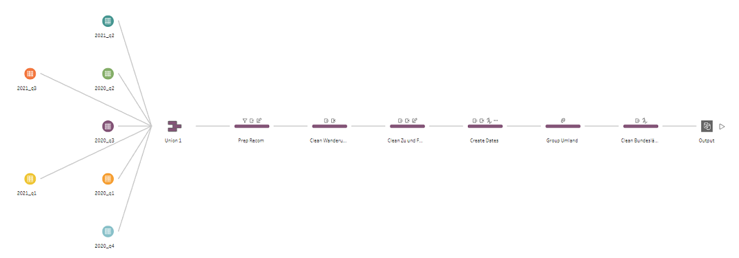
Today we worked on the migration data of Hamburg taken from the official German Data Portal. The data covers the information from 2020 to 2021 (upto Q3 only). I used Tableau Prep to clean the data and also referred to my colleague Oksana who loves working with Prep too.
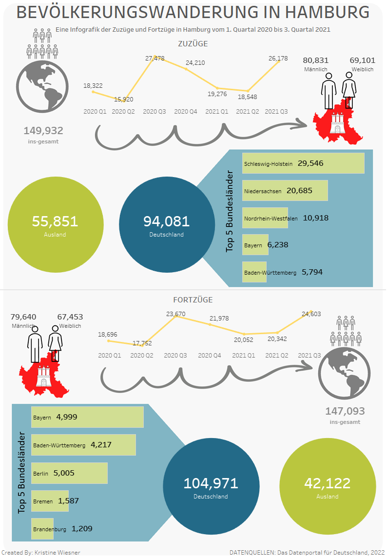
This time I thought of creating a static Infographic for the first time. I planned to show a comparison of the migration (coming in and going out) of Hamburg categorizing them according to gender and origin (international or local). And also wanted to get Top 5 of the 16 states (Bundesländer) where most people are from and moving to.
I am staying in my son's room for the past 4 months as my home office. And today I made use of his drawing board to sketch my idea. 😅

Building the Infograph was relatively easy. I built mainly crosstabs, a bar graph, line chart and BANs with an image object at the background. I did good with time, I managed to break my time for each process from data cleaning, chart building and prepare for presentation.
But I made the deadliest mistake not double checking my totals before uploading it for submission. Apparently, I didn't filter out fields properly that I ended up having different values. I spotted my mistakes while watching other's presentation. Arghh! Quality check is important! Although it was fixed with few filter clicks, I still felt bad about it. Because of this my delivery was also affected, the flow of my thoughts just derailed.
Nonetheless I was over all happy to work on my "creative" side. Here's my final infographic: Bevölkerungswanderung HH