In this tutorial I will be showing you how to create string parameters that allows users to choose between different fields. I’ll also show you a neat trick to change the axis label based on what field is chosen in the parameter! (Skip to step 6 for the axis label trick)
In this example, I will be using the Sample Superstore data. I want to allow the user to choose between seeing the Sales for each region and Profit for each region.
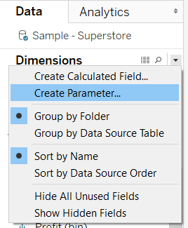
Step 1: Click the little caret (downward arrowhead) near your Dimensions. Click create parameter.
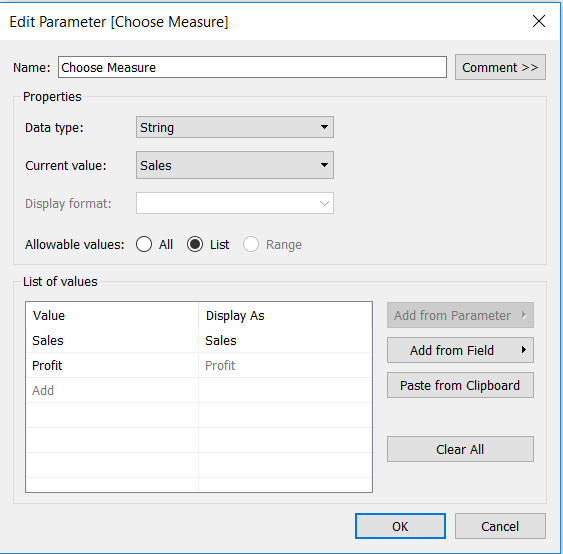
Step 2: Complete the parameter set up with a suitable name. We are doing string parameters in this example, so select String in your Data type. You can leave Current value empty as this will fill in automatically for you. Select List from the Allowable Values section. Then type in the names of the options you want to see in the parameter drop-down in the List of values section. I am going to allow the user to switch between Sales and Profit.
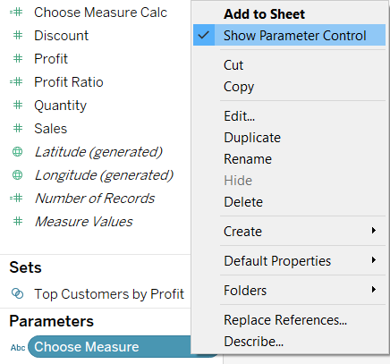
Step 3: Once you’ve set it up, the parameter will show at the bottom-left of your screen. Right-click on your parameter and select Show Parameter Control. This will show the parameter drop down on the right side of your chart area.
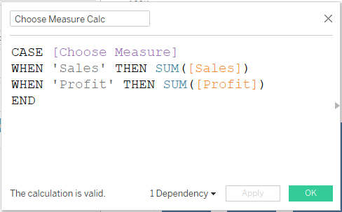
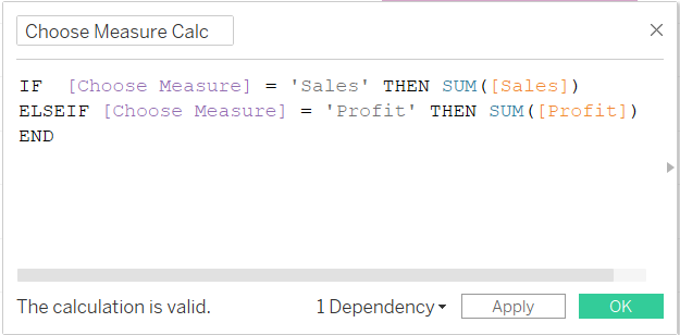
Step 4: Now that we have a drop-down that the user can interact with, we need to create a calculation that links the options in the drop-down with your data. I will be using a CASE function but this step can also be achieved using the IF function, you can use whichever you prefer.
Extra tip: Do you remember in Step 2. under List of values we filled in both Value and Display As? Well this is where it’s important. The string values we entered in our Value section are what we need in our calculations as strings (in the grey text with quote marks’), meanwhile the values in Display As are what the user will see in the drop-down menu. We could have put 1 and 2 instead of Sales and Profit in our Values section, with the drop-down options still displaying as Sales and Profit for the user. This is useful when typing the calculation as we would reduce the chances of spelling mistakes as we can simply type ‘1’ and ‘2’ as our strings.
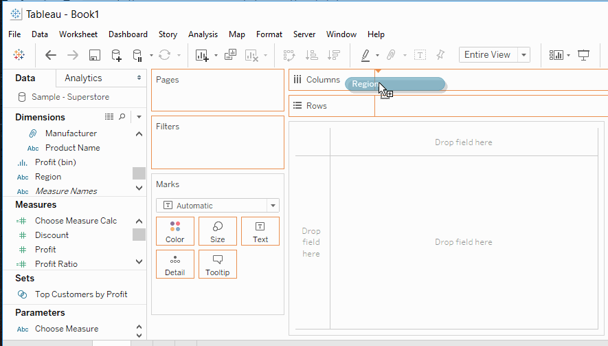
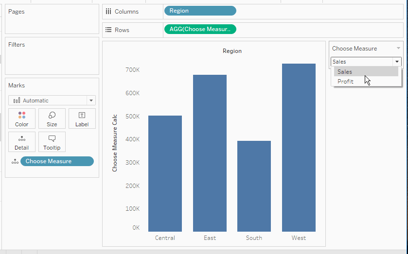
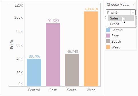
Step 5: Drag Region from your Dimensions onto your Columns shelf as we want to split the view by region. Drag your calculation from Step 4 from the Measures section to your Rows shelf. You should be able to use the drop-down on the right to change the measures between Sales and Profit.
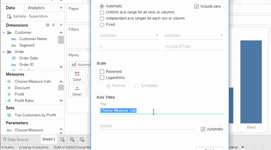
Step 6: This is the part that I had no idea about until I joined the dataschool! It’s a very useful trick to ensure that the y-axis also updates based on whether the user chooses to measure sales or profit. First you want to double click on the existing y-axis label and make the Axis title blank. Then drag your parameter pill onto your rows shelf. This should give you a new y-axis title, right-click on this and select format. Change the default text alignment to sideways. You will see that the parameter name is included as well as the measure name in your axis. Right click on the parameter name in the axis and select Hide field Label for Columns.
Final product: (after a little bit of formatting)
Thanks for reading! If you have any comments or anything is unclear, please just ask.
~Kolsuma