


When you go to the analytics tab and drag the trend line onto your scatterplot Tableau creates a line going through your plots.
But what is it doing and what do the figures mean?
When plotting a linear trend line Tableau uses the equation
y=ax+b
In this equation a is the gradient or regression coefficient.
b is the value of where the line intercepts the y axis.
xi s the value on the x axis being used to calculate y.
y is value of the equation.
R-Squared value or coefficient of determination is a statistical measure of how close data points are to the line of best fit (regression line).
R-Squared= explained variation/ total variation
The R-Squared value is always between 0 and 1 (0% and 100%).
A R-Squared value of around 0% indicates that the line of best fit doesn’t explain any of the variation in the response variable around its mean.
Conversely a R-Squared value of 100% means that the line of best fit explains all of the variation in the response variable around its mean.
Variance measures how far data points are spread out from their mean value.
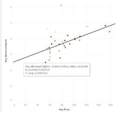
In the above example the R-Squared value is 0.28 (28%). That means that the line only accounts for 28% of the spread of the data points.
R-Squared value is a quantifiable analysis of how well the line of best fit (linear regression model) fits your data. A value closer to 1 (100%) is usually good.
P Value
The P value is the probability of finding the observed results when the null hypothesis of a statement is true.
The null hypothesis proposes that no statistical significance exists between variables in the hypothesis. The null hypothesis is usually the opposite of what were looking to prove (the alternative hypothesis).
The alternative hypothesis is the opposite of the null hypothesis. Proposing that there is a statistical significance between two variables.
The P value is measured against a predetermined significance level. If the p value is less than the significance level then the null hypothesis is rejected, showing that the data provides enough evidence that there is a statistical significance between the values.
The standard significance level is set at 5%(<0.05; less than 1 in 20 chance of being wrong) , 1%(<0.01; less than 1 in 100 chance of being wrong) and 0.1%(<0.001; less than 1 in 1000 chance of being wrong). The P value being less than 0.05 is referred to as statistically significant (a low chance of being wrong). A P value of less than 0.001 is referred to as statistically highly significant (an extremely low chance of being wrong).
Having a really P value <0.05 basically means that any comparisons made between two values on a scatterplot is very low chance of being statistically wrong.
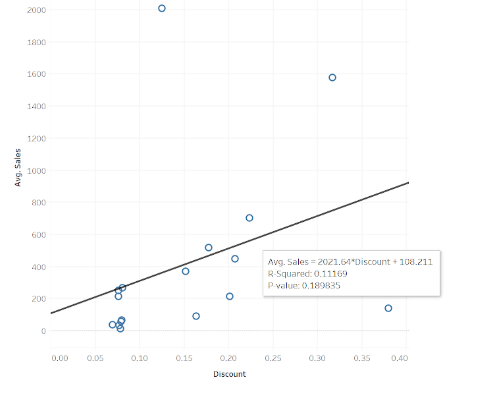
In this example the line of best fit tooltip is providing statistical analysis of the line.
The y=ax+b equation, the R-Squared value and the P value.
In this case the y=ax+b equation is being expressed as:
Avg. Sales = 2021.64 x Discount + 108.211
yis Avg. Sales (value of the y axis)
axis 2021.64 (the gradient) multiplied by Discount (value of the x axis)
bis 108.211 (the value of the point where the line intercepts the y axis)
The R-Squared value is 0.11 (11%) which shows that the data points are not close to the line of best fit.
The P value is 0.18 which is above the significance level of 0.05, meaning the null hypothesis is correct and there is no statistical significance between Discount and Average Sales.