Moving averages are a useful analytical tool for showing trends in a time series where the data contains noise that is likely to distract from general trends. “Noise” refers to the stability of a particular data set. Noisier data regularly contains values that fluctuate compared to the rest, with common sources being stock markets, sales figures, and, as is currently most etched into the public consciousness, viral case figures.
Moving averages smooth out noisy data by calculating and plotting the average of previous entries. As an example, each point on a 30-day moving average would be given by calculating the average of the previous 30 days.
While tedious to calculate by hand, Tableau provides the functionality to create charts using this key analytical tool.
CREATING AN EXAMPLE CHART
In this example, using the Superstore EU sample data, we wish to plot a 13-week moving average in order to assess changes to profits in our sales figures. To start with, we plot our sales data on a weekly basis. While it is possible to read some trends from this view, it is not easily understood at a glance.
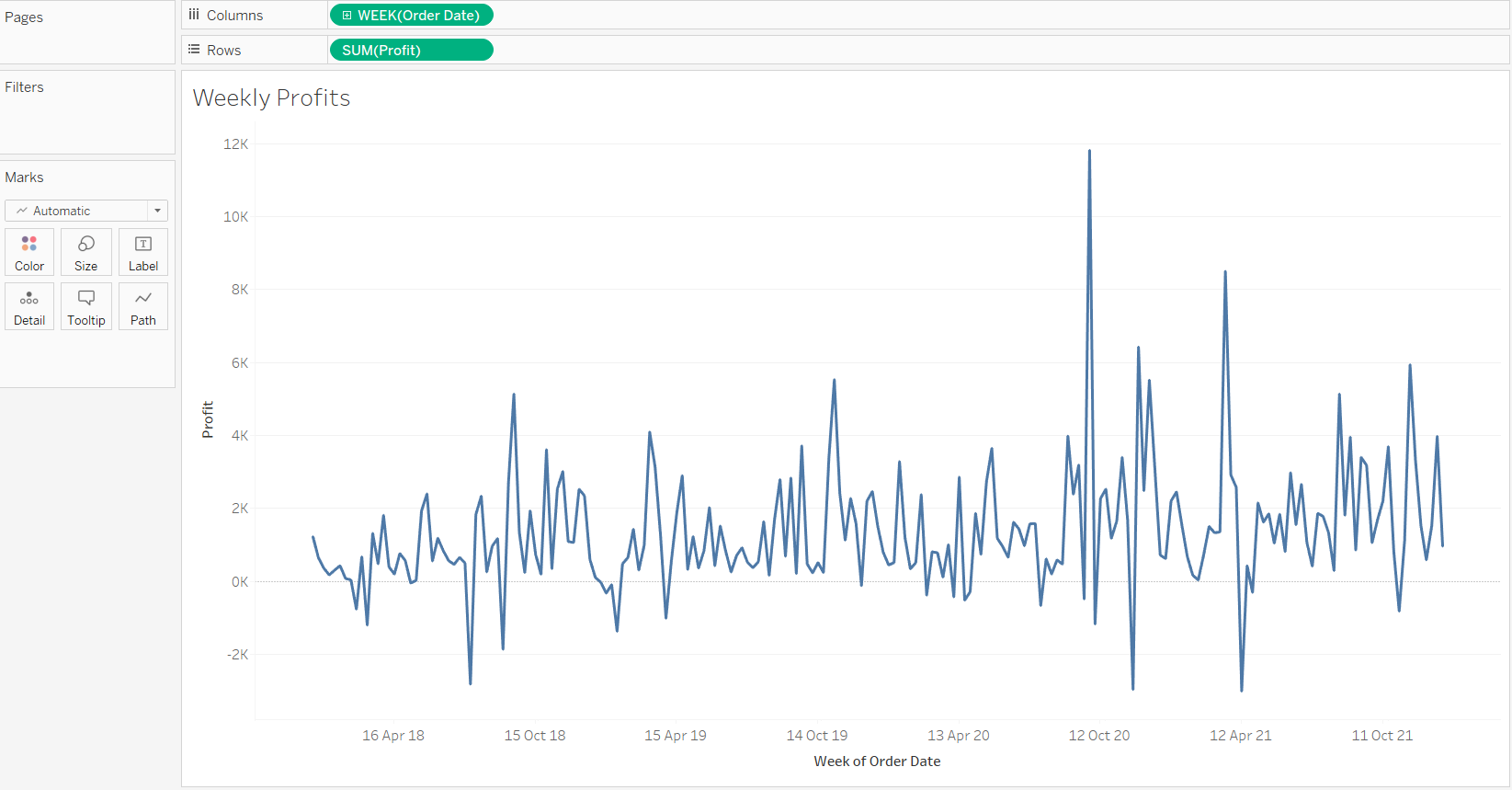
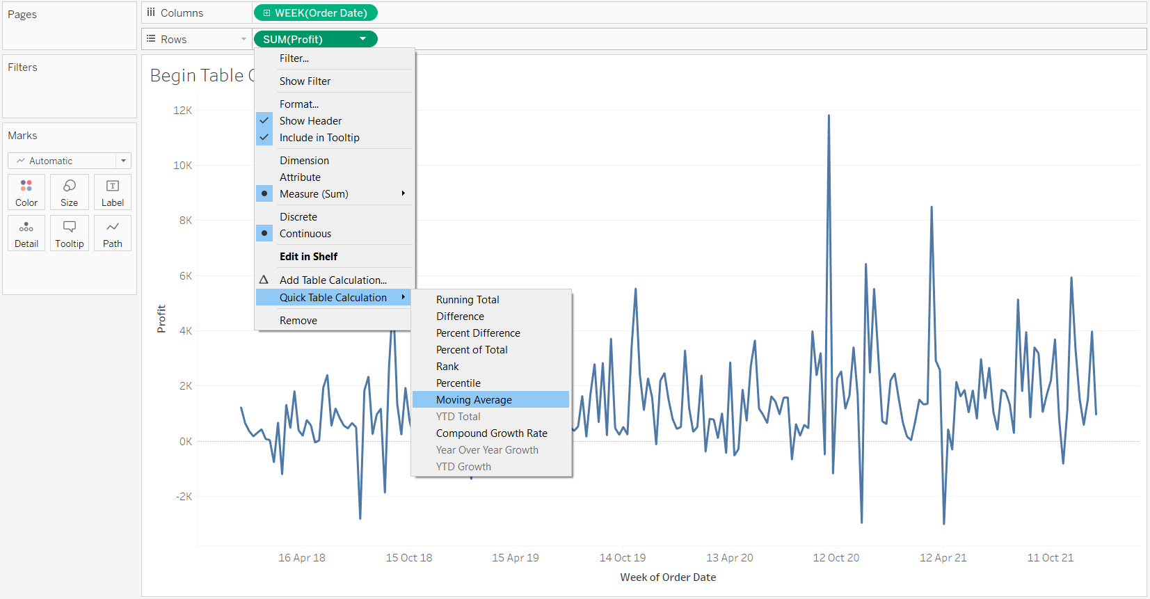
Tableau calculates moving averages using table calculations, so first hover over the table calculations menu on your field as follows and select the “Moving Average” option. Your data will now be set to the default moving average format.
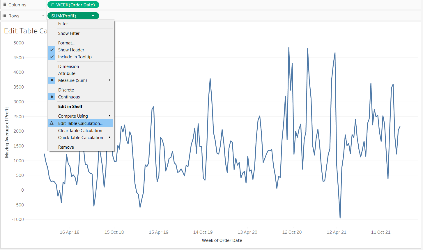
The default format is unlikely to be the right style for your data set, so edit the table calculation in the location shown below.
Here we can reformat our calculation in a few ways. To edit this to the desired format for our example, follow these steps.
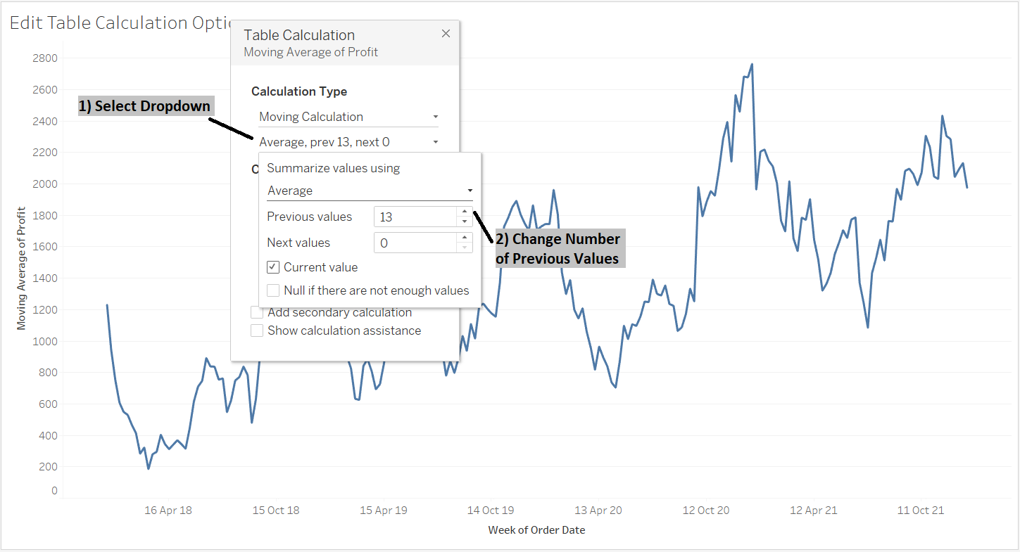
1) Open the second dropdown to access the other relevant formatting options.
2) Change the number in the previous values box to match the number of values your average will be calculated from. For our example, this would be 13.
Selecting these options will now leave you with a 13-week moving average chart. Below shows a comparison of our new moving average (blue) against the original noisy profit data (grey).
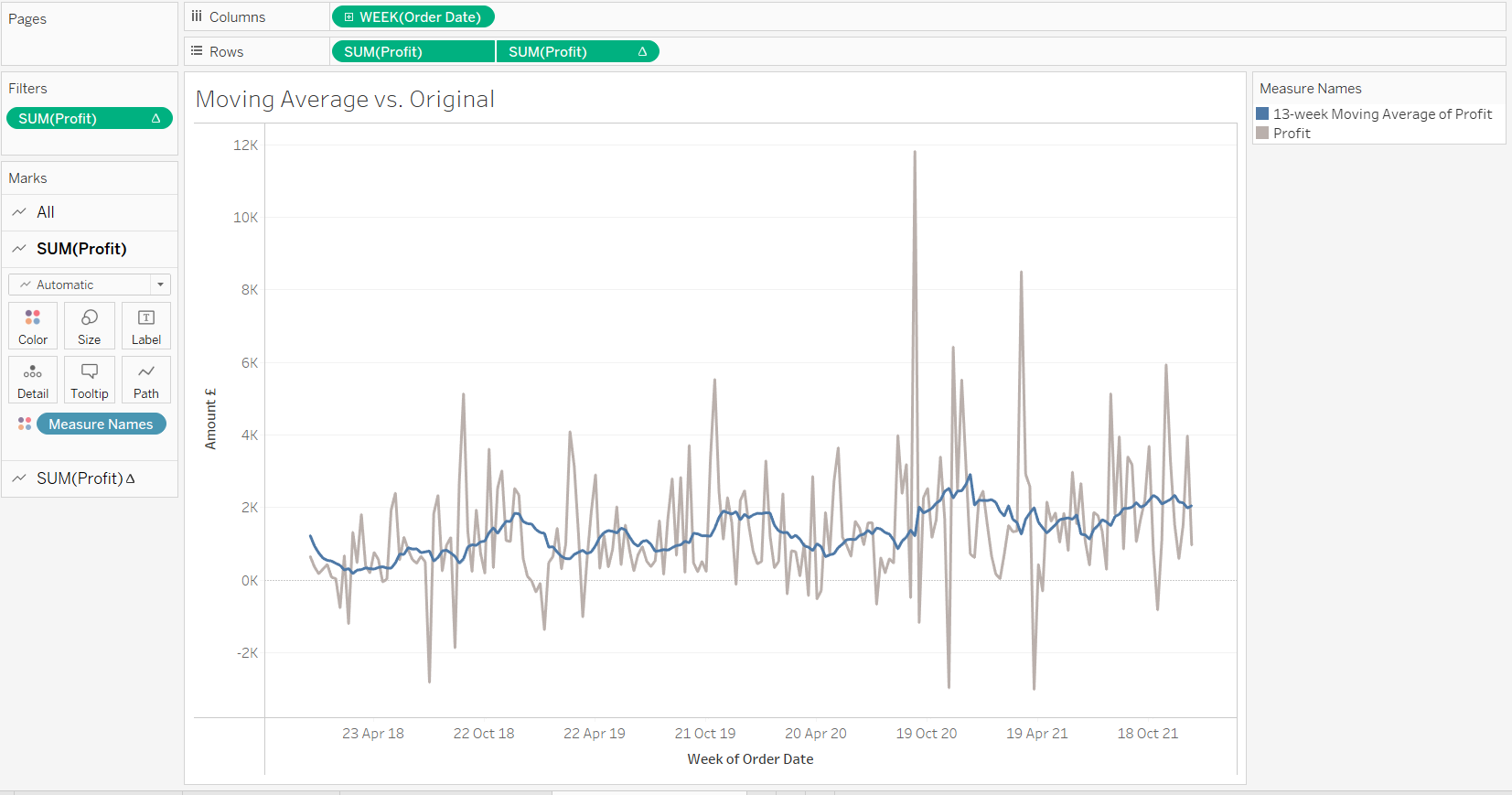
Having used the moving average, we can now much more easily see the general peaks and troughs in our data, indicating that there is seasonality to our sales figures. Thanks for reading!
