


- We must first map out the coordinates of the path the bars will run along. To achieve this we must add a "path" field to the dataset we're working on where every row has the minimum and maximum degrees you want your radial chart to run along e.g. 0 - 270

An easy way to do this is to add 2 new fields named after the min and max degrees, in this example 0 & 180, and pivoting these fields so the min and max degrees are assigned to each row. Make sure to clean up your dataset after the pivot and change this new path to a "whole number" data type.
- Load your dataset into tableau desktop and create a bin from your "path" field:
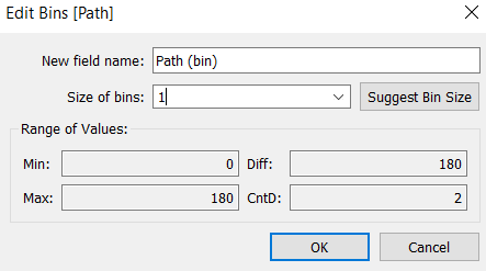
Make the size of your bin 1, what this does is create steps of 1 degrees from your min and max degrees in your bar path. You can change the size of your bins to how your radial bar is constructed.
- Next we will create an index calculation in order to assign values to each row we will put in the radial chart, this is what will create the coordinates the points will fall on.
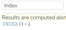
The calculation is INDEX()-1 since the index will begin at 1 and we want the coordinates to begin at 0 to match the path
- Radial charts work through table calculations where the maximum bar length will be 100% of the total. So we will calculate the max of the metric we want to visualise based on what in this case, total sales.
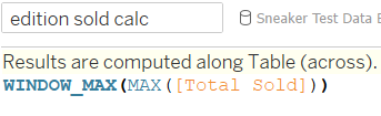
This will return the maximum sales for total sold per detail brought in the visual
5. Duplicate this calculation and rename it to maximum sales which will be used to show the max sales regardless of the details in the visual
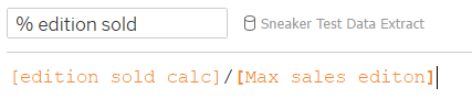
- Create a new calculation dividing these 2 window calculations to get the percentage
- Create a new calculation to rank each detail using rank:
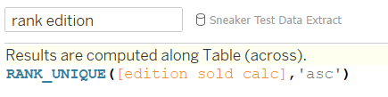
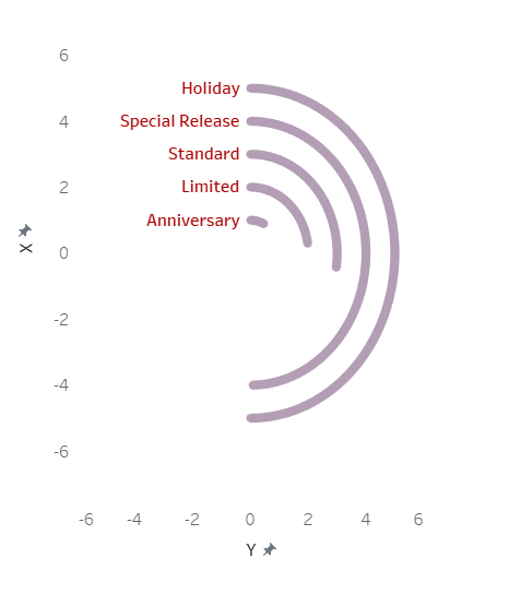
This will split out each detail to create a bar for each row in the detail in this case, each edition will get a bar
- We will now construct the coordinates the bar will run along:
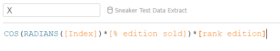
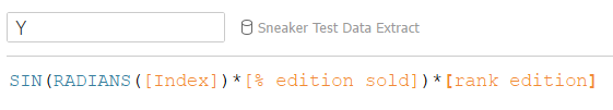
COS & SIN are placed here following the mathematical formula of a circle; RADIANS() converts the index degrees into radians as the COS &SIN functions only work on radian values; the Rank calculation assigns a radius value based on the rank of the detail and finally we multiply by percentage t0 get bar length for each corresponding detail.
- Construct the visual
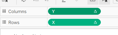
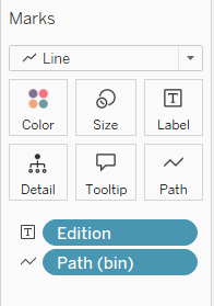
Place the appropriate metrics as shown here to create the foundation of the radial bar chart.
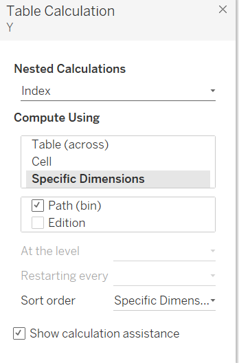
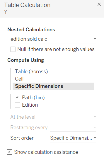
We must now edit the table calculations on X and Y accordingly in order to construct the chart:
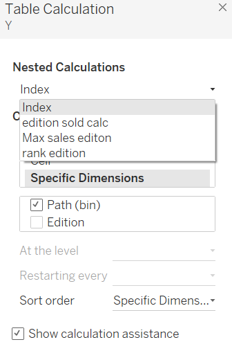
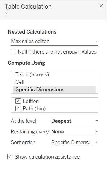
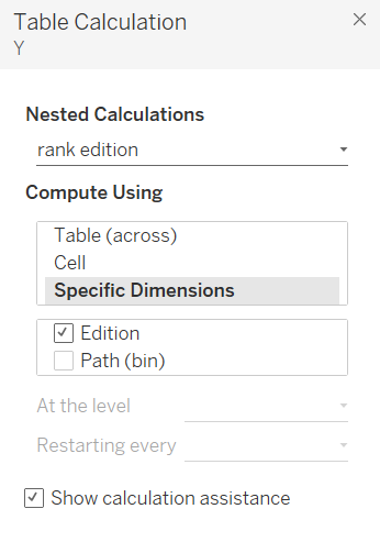
For each nested calculation we will need to specify what dimensions should be acting on it. "Index" and "Edition sold calc" will have only "path (bin)" ticked. "Max sales edition" will have both "path(bin)" and "edition" ticked and finally "rank edition" will have only "edition" ticked. See the pictures below for clarification:
- Repeat these settings on the X calculation and this should construct the radial bar chart.
For further help check out this video guide: https://www.youtube.com/watch?v=Q33wDfJUndI