


In a recent client project, one of the key requirements was to build a dashboard landing page. I was immediately drawn to this task as I loved the visual creativity it promised and saw it as a great opportunity to deepen my understanding of Tableau Server.
The Initial Brief
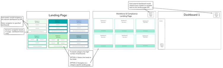
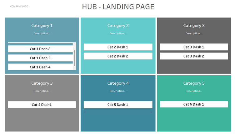
The client suggested a layout featuring tiles representing their six key analytical areas. The idea was simple: selecting a tile would redirect the user to the relevant dashboards. This was a great starting point, but it quickly led us to ask important questions: What happens if the client adds more dashboards? How do we scale this without breaking the design?
Our initial sketches were straightforward with six coloured tiles to distinguish the categories, each containing buttons that would statically navigate to specific dashboards. However, we realised we could only fit about 3–4 buttons per tile before things got crowded. If a category had more than four dashboards, I proposed two options:
- Option A: A button navigating directly to the folder on Tableau Server housing all relevant dashboards.
- Option B: A button navigating to a separate "sub-landing page" specifically for that category.
Given the client’s focus on user-friendliness and encouraging Tableau adoption, Option B was the clear winner. We even considered adding a "Most Visited" button using Postgres data, though the client eventually decided this wasn't necessary for this phase.
The Challenge: Static vs. Dynamic
While the client liked the design, they raised a vital question: How adaptable would these pages be as they develop more content? In our first draft, the buttons were fixed to specific URLs. Manually adding new buttons or tiles every time a dashboard was created seemed like a maintenance nightmare. We needed a more dynamic solution.
The Solution: A Data-Driven Menu
After brainstorming with our coach, we landed on a much more elegant approach: using a bar chart as a menu.
In this setup, each "bar" represents a dashboard. This chart is powered by a simple table containing the dashboard’s category, title, description, and URL. By using Dashboard URL Actions, clicking a bar takes the user directly to the correct report.
Why this works better:
- Scalability: Whenever a new dashboard is created, the client simply adds a row to the underlying table. The bar chart updates automatically, adding a new bar to the menu.
- Efficiency: This removed the need for separate sub-landing pages. We now have a scrolling menu within the main landing page, filtered by category.
- Clean Design: The interface remains clean and organised, regardless of how many dashboards are added.
This solution provided the client with a professional, easy-to-maintain landing page that can grow alongside their data culture.
I am honestly so pleased with how this turned out. It was incredibly rewarding to take a creative spark from the initial brief and evolve it into a technical solution that solves a real problem for the client. Seeing the transition from a static design to a fully dynamic system was a highlight of the project for me, and I’m proud to deliver a tool that is both visually engaging and built to last.