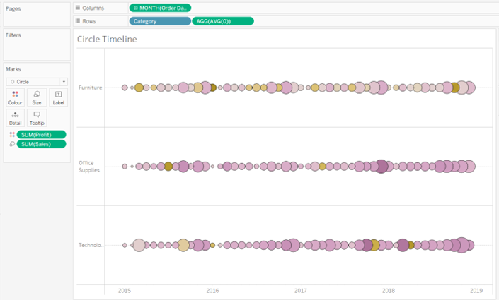
After 19 days of Data School, I had a quiz today to check my level of learning in Tableau. Among the tasks were some charts I had never built before. Among them was a Circle Timeline. Since I really liked the chart, here are the instructions (Sample Superstore).
What is a Circle Timeline?
A circle timeline or bubble timeline is a way to display a series of dates on a timeline with a measure used to size the circles and, optionally, another measure to color the circles. A circle timeline combines a time series, a dot plot, and packed bubbles into the same view.
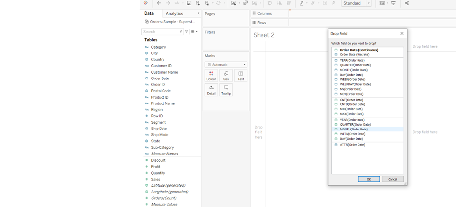
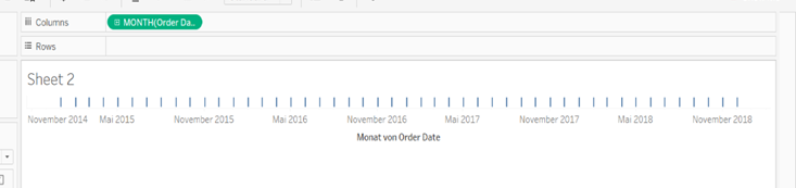
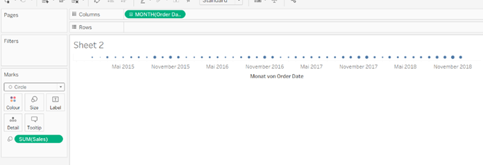
1.Right Click and Drag “Order Date” to the Columns and going to choose continue with month.
=
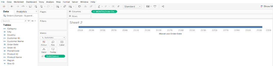
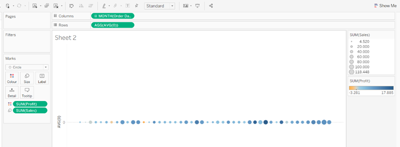
2. Going to put Sales on the Size
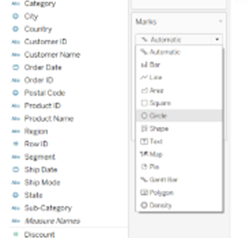
3. Change the Mark from “Automatic” to “Circle”
=
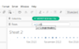
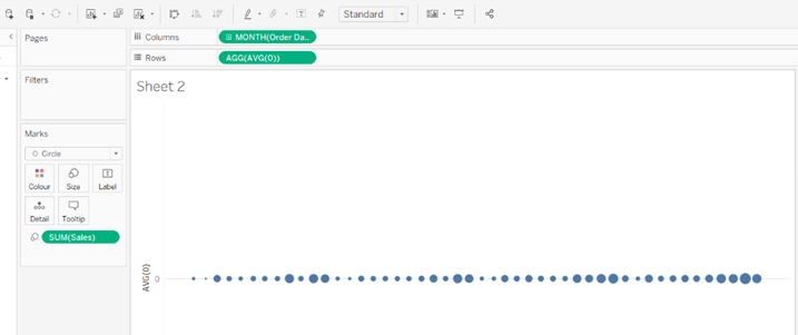
4. Dobbel Click on the Row and create a calculation AVG (0)
=
5. Now You can Colour the Circle by a new Measure (drag profit on the colour)
6. Now you can split for example by category
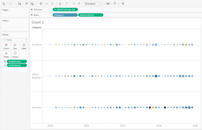
7. From now on you can format everything according to your wishes. Here for example size, colour and Borders.